I've been so busy with my own book that I've fallen behind in writing reviews for books I've read. So I'm in "review mode." I posted two reviews this morning, but I'm up to seven now, so scroll down to see what's new.
In
Emotional Content: How to Create Paintings That Communicate Gerald Brommer discusses the differences between classic, intellectual and romantic approaches to painting. The key question is "What do you feel?" for the artist who wishes to paint more expressively. Select and edit your subject, making mini-thumbnails to record your impressions. Brommer emphasizes the importance of sketching to explore the subject, using color and temperature dominance and tonal values and textures. Watercolor collage is used in demonstrations. A sense of place, mood, weather and season can all contribute to the emotional content of your work. Brommer's books are always filled with useful tips and techniques.
 Seeing the Light: An Artist's Guide.
 by Betty Carr shows you how to create depth, form and atmospheric light in watercolor and oil paints. Carr is adept at both, as you can see from this beautifully illustrated book. Supply lists are detailed for both watercolors and oils, including advice on plein air necessities. In both media there are exercises and step-by-step demos that are clear and easy to follow. Carr advises you to learn to think in three dimensions, to observe light on form and to use value sketches to help you see light and shadow on a subject. She recommends simplification of shapes and value patterns. This is a good book withi lots of information and helpful tips.
Carol Cooper's book,
Watercolor: No Experience Required, is an easy guide to getting started in watercolor. The supply list is basic and very good, except that it allows cheap pan colors, which I don't think is a good idea, even for beginners. Also, the beginner doesn't need so many colors; a maximum of seven should do the job, if they're the right colors. A workspace layout is shown that could be helpful to the beginner. There are numerous well-done illustrations, including hands-on photos. Demos are simple and doable. Subject matter includes landscape, flowers, still life and textures. Composition is given very little attention, but the section on color, though brief, is clear. This is a good basic book that doesn't confuse beginners with fancy techniques and tricks.
 Watercolor Secrets
 by Charles Reid is the work of a master painter. The book is filled with many sidebars of tips and tricks for Reid's spontaneous style of painting and is lavishly illustrated with sketches from his watercolor sketchbooks. His distinctive, personal approach is clear throughout in subjects of all kinds, both indoor and plein air. His supply list is brief, but more than adequate. This beautiful book is not for the beginner in watercolor technique, but it's a joy to behold.
 Painting Crystal and Flowers in Watercolor
 by Susanna Spann is filled with her stunning artwork and many mini-demos throughout. The book includes a detailed list of supplies, but it's clear from the beginning that this book is not for the spontaneous watercolor painter. The primary subject is special effects in still life using watercolor. Design and color are touched upon, along with painting from photographs, marketing and exhibiting. The strongest point in Spann's book, in my opinion, aside from her magnificent artwork, is her emphasis on doing thumbnail sketches to plan paintings.
John Lovett
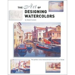
's
The Art of Designing Watercolors is subtitled "All you need to know to create more powerful paintings." The book contains demos and many illustrations throughout with an emphasis on design. From the "hows and whys of design" to tools of design (the elements and principles) and design tools in action, Lovett covers the essentials very well. Only one page is designated for supplies, so beginners need to look elsewhere to understand the basics. However, this book is a good one for an artist who needs to understand how to incorporate structure into pictures for more effective expression.
 Work Small, Learn Big!: Sketching with Pen & Watercolor
 is an International Artist Publishers' collection of preparatory studies by seventeen artists from around the world. The book is a compilation of sketches backed up by photographs and slides, emphasizing the importance of these preliminary works to the execution of fine artwork. There are numerous illustrations and step-by-step demos. Each artist has distinctive choices of materials and media. Styles range from loose and spontaneous to highly detailed with many notes. Selling tips and artists' bios are included. One of the most important messages in the book is that "Mistakes don't Matter" in the sketchbook.
Thanks to George Bussinger at
McCallister's Art Store for making these books available for review.
Labels: beginner, book reviews, books, communication, design, drawing, expression, landscape, McCallister's, oil painting, painting, still life, temperature, value, watercolor, watercolor techniques


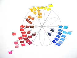
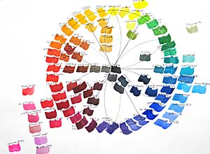 Finally I've finished the watercolor wheel I started for my class several weeks ago. I did blue first, then added red the following week and yellow a week later. (Click on the "color wheel" label below to see the three work sheets and watercolor wheels that I painted last month.) Today I filled in orange, green and violet secondary colors and the neutrals in the center. I finished it in my studio so the class wouldn't lose painting time next week. I'll show them the finished wheel, explain a couple of things and they can examine it more closely later if they wish. Mind you, I'm not advocating having or using all these colors. I want to show that there's a continuum around the color wheel that reveals temperature relativity from one color to the next. This is a good exercise for your "color eye," to see if you can distinguish between warmer and cooler colors and see how their neighbors on the wheel influence their temperature. The colors around the perimeter of the wheel are mostly high tinting-strength, high-intensity colors. Except for a few colors in the red area, outside the perimeter are the low tinting-strength, high-intensity colors. Inside the wheel are the low-intensity colors and neutrals.
 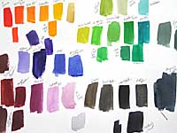 Here's the test sheet for the colors I did today. It doesn't matter whether you make a wheel or swatches, but this is a good way of learning about your paints. As I said in an earlier post, the color wheel above is similar to the one I made for my first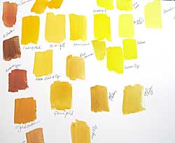
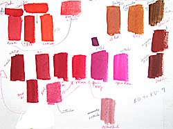 Last Monday we explored reds in watercolors, as we did last week with blues. Here's the chart that I did in class, explaining the paint characteristics of each pigment and the relative temperature as I went along. I let the class help me decide where a color belongs. I wish we had full-spectrum lighting in our classroom, because the colors tend to look "off" and I have to remember to mention this. Lighting makes a huge difference when you're exploring colors.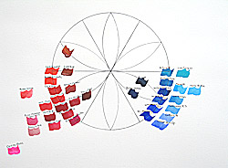


 Barbara McGuire has written
  Helen Van Wyk's
 Barron's