l s

Wednesday, January 28, 2009

Facebook--some surprises for a newbie

This morning the snow was falling heavily when I awoke. Mid-morning I called and canceled lunch with a friend and emailed my daughter that we wouldn't be baby-sitting this evening. I fixed a mocha for my husband when he came inside after clearing the snow off the driveway. I know I had a lot of things I could have done, but I got the bills paid yesterday and caught up on a lot of errands the day before. I felt like doing something different.

So I explored Facebook. My son told me at Thanksgiving that I should sign up, which I did, but I didn't have a clue what to do with it, so I didn't go back until today. After nosing around a bit, I decided it looked like fun, so I invited a few friends on my email list to join. To my great surprise, they did. So I invited a few more. It's amazing. I'm hearing from people I haven't heard from for years. I now have 47 friends on Facebook. A short while ago I asked them to share some of their artwork on Facebook so I could see what they've been doing--and it has started to come in. What fun!

If you haven't tried it, it's easy to get into. Just go to facebook.com and follow instructions. Search for "nita leland" and see if they'll connect you to my page. You may have to ask permission.

I still have a lot to learn.

Labels:

Monday, January 26, 2009

Hithergreen self portraits in watercolor

Most of my students tried their hands at self portraits today. Some had never painted a portrait of any kind, let alone one of themselves. I managed to get quick shots of about half of their paintings. There will be more next week. Portraits can be intimidating, but they all did a good job, at their own skill levels.

This one is a creative take on a self portrait--not what she looks like, but what she does. Mary R. is a woodcarver.

Mary C.'s source was a photograph in which her head was slightly tilted upward. She decided to paint herself with a level gaze instead and did a good job of correcting for the change in the angle of the features. The pupils are a bit larger than necessary, but otherwise, the likeness is good. I like the way she drybrushed the dress. The skin tones are very nice, too.


Karen's contrast between translucent skin and dark hair is very effective here. The richness of the paint in the hair doesn't show here.Not to mention her gorgeous green eyes. She lifted a bit of the green she first applied, which let a little more light into her eyes. I love the free brushwork in the background. The blue and sienna colors look good behind her head.


Jane painted someone else's portrait instead of herself and did it well. She has good proportions in the head and face. I like the downward-looking pose. The bangs of the hair are beautifully painted with rich color and bold strokes. I also like the color of the skin and subtle shading. This might need a little more modeling on the neck.


Carol has a great sense of humor and is very creative. Her drawing at left is a mirror drawing that is very detailed. She had foreshortened the hat too much because of the angle of the mirror, but that is corrected here. On the right she painted her portrait in wild colors, starting with a lime green for the shadows.

Pat has a good start on her self portrait, considering that her source is a rather small picture that doesn't have good lighting on her features to show the planes of her face. It isn't finished yet, though, so she can still build up the shadow areas and bring out her features.

Pat photographed herself and put the images on her computer. Then, she painted her features from the computer screen in a monochromatic scheme, as a drawing instead of a painting. The likeness is very good.

Linda's self portrait was taken from a photograph she had taken in the 1970s. What a pretty girl! Now she's a pretty woman and you can see the resemblance. She did an excellent job with the proportions.

Tom's self portrait was probably the best likeness in the class. He really nailed his appearance and captured a lifelike image of himself. He began his painting before class with pale washes of ochre and in a short time had the image down. Then he enriched the washes and shadows and detailed the shirt to finish up. Good job on the glasses, too. Well done!


Nancy's first freehand attempt isn't a convincing portrait, but when she applied herself to measuring proportions, she did a great job. Her drawing for the second portrait is very good and I hope she'll paint that one, too, after having the practice with observation and painting techniques in the other two.

Ron painted his caricature with Picasso-like distortions that he created in Photoshop from a photograph using the "skew" command. As weird as it is, it actually resembles him--and he's a good-looking guy! I like the low-intensity colors he used in his clothing. He's also doing a normal self portrait based on a drawing he made of himself.


Patsy's experience was interesting. She began her self portrait at home using a mirror. She attempted to finish her drawing in class with a small purse mirror. That was a challenge, but the real problem began when she tried to paint and discovered that the overhead lights in the classroom didn't show the facial planes. She will work on it at home with better lighting. The likeness isn't there yet, but it's coming.

How about a round of applause for Hithergreen Center's Exploring Watercolor Class?

Labels: ,

Sunday, January 25, 2009

Watercolor portrait lessons

When I was ten, I learned from the Andrew Loomis book, Fun With a Pencil, that the features on a face have to be in proper proportions to look right. So last Monday for my watercolor class, I began with proportions. There is no perfect proportion, but you can generalize to begin with, then look for differences to create a likeness. I divide the head in half between the top of the skull and the chin, somewhere around the brow bone. The tip of the nose is about halfway between that line and the chin. The mouth is about 1/3 of the way between the nose and chin. Also, there are usually about 5 eye widths across the head. The inside corner of the eye lines up with the side of the nose; the pupil of the eye lines up with the corner of the mouth.

I demonstrated one style of watercolor portrait technique, which I learned from Homer O. Hacker, A.W.S. I painted the blue iris of the eye first, then used Davy's gray and cerulean blue to develop the shadows around the eye, cheeks and neck. After blocking in the planes on the head, I tinted the flesh with color glazes, yellow ochre and cadmium red with a bit of burnt sienna in deeper areas. I brightened up the flesh tones with glazes of permanent rose around the cheeks, brow, chin and tip of the nose. I painted just a little of the hair and did no refining of the features or shadows under the jaw. The demo was about 30-40 minutes.

I also showed the class how to enlarge a photo using a grid that I printed on transparent film. I made these grids in Microsoft Word using "tables" to create grids 8" x 10", 5" x 7", and 4" x 6". The squares on the grids are 1". It's very easy to enlarge your picture, as long as you use the same number of squares vertically and horizontally. I keep my grids in transparent sleeves and slip my photos inside, taking care not to let the photos shift while I'm transferring my image.

I've been wanting to do this portrait of my granddaughter, taken when she was about 3 years old. I printed an 8" x 10" photo to use with my grid. Out of curiosity, I printed two black-and-white images. One is unedited and shows the natural value patterns on her face. The other is a posterized version that breaks up the lights and darks, making it easier to see highlighted areas. It also gives a clearer picture of some of the detail in her eyes.

I placed the 8" x 10" photo into the transparent sleeve. As it turned out, my old HP printer had printed my original out a little larger than 8x10, but the cropping wasn't a problem for my composition. I blocked in my drawing on a sheet of tracing paper, enlarging the squares to 1.5 inches. I used a Prospek drawing tool, an inexpensive proportional drawing tool, to check critical dimensions, such as the width of the pupils and the placement of each eye.

This is the drawing I'll transfer to watercolor paper using a lightbox or graphite paper. (It still needs a little work around the chin.) It's close enough that I think I can capture the likeness as I paint. The photos I took this afternoon for this post are all slightly distorted, but you can get the general idea of how proportions and grids work in painting portraits. I hope this will help someone.

Labels: , , , , ,

Freezing acrylics

It has been so cold in Ohio this month, at one time descending below 0 degrees Farenheit. This morning it was 15 above. We've had a few warmer days, barely up to freezing, but will probably have even more cold ones over the next few weeks. I've had email questions in the past about freezing acrylics to keep them workable and have advised against the practice. Recently, I came across an email I received a while ago from Mike Townsend of Golden Paints: "Acrylic paints can freeze and in turn may not return to usable product. We do design the paints to withstand 5 freeze/thaw cycles (literally frozen solid and then allowed to return to room temperatures) or more as part of our quality control, but this is more so to prevent paint from going bad during shipment or storage. It's generally not a good idea to continually freeze the paints if one can avoid it."

So it isn't a good idea to leave your acrylic paints and mediums in your car during sub-freezing temperatures. This would include cars parked in unheated garages that might drop in temperature over a period of time.

Labels: , , ,

Friday, January 23, 2009

Book reviews--new books on acrylics

There are a lot of books on making art with acrylic paints, but until now I hadn't found any that provided useful information about the different acrylic mediums available. These two books fit the bill for me and now have a permanent place on the bookshelf in my studio. I use acrylic mediums mostly for collage, and now feel I can use them more effectively and branch out into textures and other applications.

Nancy Reyner's book was released by North Light early in 2008. Acrylic Revolution: New tricks and techniques for working with the world's most versatile medium provides information on setting up tools and materials for working with acrylics, along with a comprehensive glossary. This is a "techniques book," with detailed information and illustrations using different acrylic viscosity and textures. A few paintings by various artists are included in a gallery, showing different approaches to painting with acrylics. Reyner explains the behavior of the mediums, how to deal with quick drying paints and mediums, and how to finish the artwork with varnish, a step many artists skip over. I especially like Guy Kelly's design, which unifies the pages of complex demos and hands-on photos.


Patti Brady's book, Rethinking Acrylics: Radical solutions for exploiting the world's most versatile medium. (North Light, 2009) is worth the price just for the chart on page 23, showing the effects of 15 different mediums, with a short description telling in a nutshell what each does. I also like the information on how acrylic paints are made, although I know a lot of artists aren't interested in this. Brady provides information and techniques not included in the Reyner book, as well as demonstrations by 28 acrylic artists. Want to print acrylic paint film (skins) in your ink jet printer? Need to know more about interference and metallic acrylic paints? Want to try encaustic with acrylic? It's all here, and more.

Both artists are active in the Working Artist Program of Golden Artist Colors, Inc., but the books may be used by artists who work with other products.

Another book on acrylics, which I haven't read, seems to be popular with painters: Rheni Tauchid's The New Acrylics: Complete Guide to the New Generation of Acrylic Paints. (Watson-Guptill, 2005.) The author is employed by Tri-Art, a Canadian paint manufacturer. If you've used this book, please leave a comment telling us about it.

Labels: , ,

Thursday, January 22, 2009

Not getting up to speed

I really thought I would be steaming ahead full speed by now, following the new year, but it isn't happening. Well, that isn't exactly true, since I'm going at a pretty good pace, but some things are still on the back burner--like blogging. I felt very smug that I got my 2008 records sorted and in a box, so I can attend to tax matters when the time comes. Then, I learned that a package I shipped to Washington state on Dec. 31 still hadn't arrived by Jan. 13, and I couldn't find the receipt to track the package. I spent hours looking at every piece of paper in the box and it didn't turn up. Since I had shipped a number of packages in December, I didn't recall which shipper I had used, so I called around and finally found the one that had the record. The package was on the truck to be delivered that day. But I didn't get anything else done for hours.

Then, our kitchen sink stopped up and we had to wait a couple of days for repair. Then.... Oh, rats, it just goes on...the water softener overflowed and there was a delay in service on that. And it has been bitterly cold, which is no surprise in Ohio in January, but just adds to the tension. What would I do without hot mocha?

My Hithergreen class is in full swing. The lessons on portraits have gone well. Two weeks ago I discussed the proportions of the head and features. This has been their main hangup, along with foreshortening. On Monday this week, I brought in a portrait-in-progress of my granddaughter to show them how I used a grid to enlarge the photograph. Then I started a portrait demo of a fashion model, to show them one way to do portraits--washing in the shadow planes with Davy's Gray, then glazing with flesh tones, a combination of yellow ochre and cadmium red. The final touch was a splash of permanent rose on the cheeks, forehead, tips of the nose and chin. I try not to take too much time in demonstrating, because they don't have much time to paint in a 2-hour class.

Their assignment is to do a self-portrait or caricature for next week, which should be fun. I don't plan to finish the demo, but I'm looking forward to working on my granddaughter's portrait. Time, where art thou?

Labels:

Thursday, January 15, 2009

Ancient Wisdom:Emerging Artist: A Business Plan for the Mature Artist

Artist Sue Smith has written an awesome series of articles on art marketing on her Ancient Artist blog, Ancient Wisdom:Emerging Artist: A Business Plan for the Mature Artist. Bookmark this one. It's filled with inspirational ideas for jump-starting your creativity, as well as excellent plans for discovering your intentions and goals as an artist--at any age.

Labels: , ,

Sunday, January 11, 2009

A color curiosity

Color synesthesia has always intrigued me. I've read about people who identify musical notes by color, but I've never met anyone who has this capability. Recently I ran across the term "grapheme color synesthesia," which refers to the ability to perceive letters and numbers as colors. Wikipedia has an article that describes this phenomenon from the point of view of several people who experience it. I always thought it would be confusing to have color sensations while reading or speaking, but most synesthetes are comfortable with it and sometimes use colors as memory prompts for names and words.

Labels:

Saturday, January 10, 2009

Mr. Pig--end of the story

Valiant Mr. Pig tried in vain to out-pedal high winds a few days ago, but he lost the race, in spite of his flying colored scarf. First, he lost a blade on his front wheel, then apparently the back wheel vibrated so hard it broke away from the welded frame and hung uselessly flapping in the breeze. At the same time, the screws that kept Mr. Pig upright must have shaken loose, and he toppled to the ground, to be buried under a layer of snow. He was in pretty bad condition, so we had to let him go. It was a fun ride, Mr. Pig. R.I.P.

Labels:

Friday, January 09, 2009

Color reference cards

Several people have asked me about the color reference card system discussed in Confident Color. Here it is. It's very simple. The box is a photo storage box from Michael's or any other photo or craft store. Most of the cards stored in it are watercolor minglings I did while trying out color schemes for paintings. Through the years these samples piled up and tumbled off the shelf from time to time.

Now, they're organized into categories, such as Color Schemes (and subsections), Color Design, Paint Tests, etc. A portrait painter would probably have sections on flesh tones and eye colors. A landscape painter might want to keep track of mixtures for greens or fog or skies. Quilters and collage artists might find this system useful, too. My cards are nearly all watercolor paper, so I can see how the paint will look on the surface I paint on. They are 4" x 6", but could be a little bigger in the photo box if you prefer. The system is easy to set up and inexpensive. I enjoy making new cards for paintings, but also, it's fun to browse through them to rediscover color combinations I've had success with in the past.

Labels:

Thursday, January 08, 2009

Choices

Art or craft?

Fine artist or illustrator
Classical or jazz musician
Ballet or modern dancer
Poet or scribbler
Painter or decorative artist
Professional or amateur
Serious artist or Sunday painter
Competition or not
To sell or not
Starving artist or fat cat
Marketing or aesthetics

Does it matter, if you love what you do?
Does it have to be "either/or"?
Can you cross the line?

Labels:

Tuesday, January 06, 2009

More on art studios

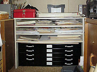
I forgot to mention in my posting on studio storage that there are more studio setup tips on my Web site. For more photos, visit my studio, which is mostly furnished with inexpensive storage items from WalMart, Home Depot, Office Depot and Lowe's. I found a metal blueprint storage cabinet at a liquidation sale and had a case with shelves built around it. 
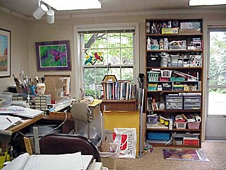
The drafting table now faces the window, looking out over my quarter-acre woods. The clutter hasn't changed much, though.

No doubt you have a tidy studio with everything in its place, right?

Labels: ,

Monday, January 05, 2009

IRS phishing scam

This is important enough to spread as far as you can. Feel free to pass it on. Snopes.com reports that an email has been circulating, supposedly from the IRS, requesting recipients to download a form to fill out in order to receive a stimulus check from the government. It's a scam. The IRS doesn't contact you by email. Opening the attachment (or any from an unknown source) can be like opening a can of worms--or viruses--or other Internet nasty. Here's the IRS page with details on how to report a phishing email or Web site.

I have found Snopes.com to be highly reliable in exposing scams and false reports on the Web for many years. When in doubt, I always check Snopes. The other day I had an email claiming that do-not-call lists for cell phones would expire the first week in January. I checked Snopes--not so. It's good to have them doing the research and looking out for us.

Labels: , ,

Sunday, January 04, 2009

Climb every mountain

I'm chuckling as I reread the article on pages 50-51 of Art-to-Art Palette publication, Fall-Winter edition of 2008-2009. When Ben Rayman emailed me that he wanted to do my profile for the magazine and needed early photos, I sent my mountain-climbing photo as a joke. I should have known better. I was startled to see this photo from 1953 takes up a whole page. The article is based on questions from an email interview and includes personal background information I don't usually share with the public.

The 148-page publication includes a feature article on Tom Lynch, (pages 25-29) showing several of his watercolor-on-canvas paintings. Many other artists are profiled, one of my favorites being Elizabeth Layton. Cover artist Herb Reed attended one of my workshops in Dallas a couple of years ago, where he created a watercolor monotype featured on page 102 of Confident Color. Articles include calligraphy, photography, pottery, dance, poetry, writing, and cuisine. There are art tips from Pat Rayman on making leaf sun prints and a step-by-step demo on painting white iris by Joan Crawford Barnes. The emphasis is on the Midwest, centered in Ohio and surrounding states, but there are ads and articles from national institutions, as well.

The Marketplace Section has been printed as a separate publication, listing many museum and art center exhibit schedules for 2009, and classes and workshops offered by artists throughout the country.

To order Art-to-Art Palette email Ben Rayman. The publication ships with an invoice to be be paid on your receipt of the magazine.

Labels:

Saturday, January 03, 2009

What if?

I love Mary Buek's blog, "What if I ...?" She posts experiments in collage daily and has some great new ideas to try. Her descriptions of her ideas and process are insightful and a pleasure to read. I look forward to reading it daily. I found her blog when Google Alerts notified me she had mentioned one of my books. That was a nice surprise, too.

Labels: , ,

Friday, January 02, 2009

Studio storage suggestions

Several people have emailed me with ideas for studio storage. Lori Call recommended a cabinet from Ikea in the office furniture department. The Alex storage unit holds 15" x 22" half sheets and possibly up to 18" x 24" papers. Maureen Bean suggests using a bicycle rack for storing canvases. Sharon Quarles bought merchandise-display shelves from a department store. These units come in many sizes and shapes. Watch for store liquidations, and see what you can find to store your papers and art supplies.

Labels:

Look on the Bright Side

Here's a list of 100 Tiny Tips to Improve Your Mood--a good way to start the New Year. I'm in a pretty good mood--I've been going through my 2008 records and sifting out what I'll need for taxes this year. Just about finished with it. Also, just about done with adding accumulated links to my Web site, something I keep promising myself I'll do on a daily basis and instead, I let them pile up. Not a good idea. Maybe a good idea for a New Year's resolution, though.

Labels:

Thursday, January 01, 2009

Transitioning into the art world

Holidays are all about family around here and that's the way I like it. However, our son from Boston left yesterday afternoon, so I've been clearing the decks and the decorations so I can get back to art and writing.

Art wasn't altogether forsaken, though. We took Jenna to the Dayton Art Institute last week to see the museum for the first time and enjoy the Experiencenter, a special room set up for children to work with art materials and relate art to letters of the alphabet throughout the room. She was delighted. The exhibition will be in place until October. We explored the museum and enjoyed a collection of creches from around the world, as well as the paintings, some of which she said were bigger than her daddy's car. Yes, they were.

On Monday, we drove to Cincinnati to the Contemporary Arts Center and viewed two interesting exhibitions. Maria Lassnig is an 89-year-old Austrian artist whose figural paintings and abstracts are startling and thought-provoking. She considers all of her artwork to be self portraits, even those that have no apparently human content. You can google her name to find many artworks and bibliographical information online. The exhibit runs until January 11, 2009.

Another intriguing exhibit at the CAC was the Discarded Spider series by Carlos Amorales. The artist creates digital shapes from his photographs and other images, assembling them into striking compositions. Many include the same shapes, but in widely differing arrangements.

I've heard from several artists about my article in Watercolor Artist magazine, based on a chapter in my new book, Confident Color: An Artist's Guide to Harmony, Contrast and Unity. The article is a good example of the material in the book, compressed for the magazine format. It gives an idea of the informative content of the book. Take a look. Be sure to visit the demo pages by Dave Daniels taken from the book.

Labels: , , , , ,