l s

Friday, December 08, 2006

More Art Book Reviews
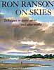
ranson skiesRon Ranson on Skies (Studio Vista, 1998) is for landscape painters in any medium who love to feature skies. The book shows techniques mostly in watercolor, but does include instruction on some other media, along with excellent photographs of cloud formations and many wonderful sky paintings. This is a great reference for landscape painters. I'm a sky freak myself and love paging through this book to look at the photos and paintings.
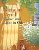

color&light in oilsColour and Light in Oils by Nicholas Verrall and Robin Capon (Batsford, 2004). The pages on Understanding Oils are very informative and user friendly, even to a beginner in oils like me. There aren't many swatches for visual comprehension, but the artwork throughout is dazzling, but not overwhelming as a possible goal for an artist to strive for. Verrall and Capon cover painting color and light, different types of subject matter and the working process, with a few demos scattered throughout the book in two or three stages.


digital canvasThe Digital Canvas: Discovering the Art Studio in Your Computer. (Abrams Studio, 2006.) This book by Jonathan Raimes almost makes me want to sell all my painting gear and just play with my computer. It's dazzling and I really think I could do it with this book as my text. The book has page after page of brilliant color effects with simple computer screen shots to show the tools for achieving them. Probably not for beginners, but definitely for creative computer artists.

embracing child artBarbara McGuire has written Embracing Child Art. (Krause, 2001) to give adults ideas on how to encourage a child's natural creativity and ultimately help them to make a few treasured objects. There are wonderful suggestions for guiding Little Artists and helping them create projects with their own art to last a lifetime. The best part of the book is page after page of wonderful examples of child art.

van wyk color-mixingHelen Van Wyk's Color Mixing the Van Wyk Way: A Manual for Oil Painters (Art Instruction Associates, 2000) has quickly become a classic since it was first published in 1995. She keeps the color concepts simple, emphasizing primarily color temperature and comparing a few basic palette choices for simple still lifes and portraits. This book would help beginners in oils to understand their colors and master color mixing of specific pigments.

van wyk color recipesHelen Van Wyk's Favorite Color Recipes. (Art Instruction Associates, 2000) expands somewhat on the previous book and introduces a greater variety of subjects with color recipes in oil paints that are her recommendations for painting them. This book ale effects in this book are understood, the painter would be well advised to develop a more personal palette of colors.
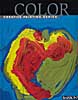

barron's colorBarron's Creative Painting Series: Color. (2005) by Gemma Guasch and Josep Asunción contains a wealth of useful information on color and numerous beautiful reproductions of masterpieces to illustrate the use of color throughout art history. I love that part of the book, but I don't think the demo paintings do it justice. Maybe it's just the design of the book. Check it out, though, because it has a lot to offer.

Once again, thanks to McCallister's Art Store for providing books for my reviews.

Labels: , , , , , , , , , , , , , , , ,

Wednesday, December 06, 2006

Art Book Reviews

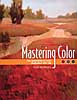
Vicky Murry's Mastering Color: The essentials of color illustrated with oils. (North Light, 2006) This book offers solid color theory applicable to all media. The book is beautifully illustrated with swatches and paintings by the author. The section on supplies and equipment is concise with a nice comparison of different ways oil-painting techniques--direct, indirect, plein air and alla prima. The basic palette is limited and very effective. There's a nice little section on color schemes, a subject often neglected in painting books. Murry explores individual colors and introduces a few design concepts, with a variety of helpful hints along the way.


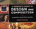
A Painter's Guide to Design and Composition by Margot Schulzke (North Light, 2006)includes the work of twenty-six contemporary masters who describe their process of designing their artwork. This is a beautiful book with lots of demos and color illustrations, but I find it a little confusing. The design-and-composition objective tends to get lost in the plethora of different techniques. I enjoyed reading it, but probably won't include it in my personal art library.


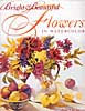
I love Jean Uhl Spicer's book, Bright & Beautiful Flowers in Watercolor (North Light, 2004.) If I were a flower painter, this is how I would want to do it. Spicer's supplies and equipment section is concise and complete. Her basic palette of colors is fairly limited and well balanced. The chapter on color covers the basics in such a way that I think beginners can grasp the concepts quickly. The chapter on composition isn't quite as accessible, but the remainder of the book, which includes various transparent watercolor techniques, tips and demonstrations, is very good. Way to go, Jean.

Labels: , , , , , , , , , ,

Friday, September 08, 2006

Mini Book Reviews

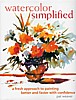
  • Having had an opportunity recently to take a second look at watercolor simplifiedWatercolor Simplified by Pat Weaver, I decided to update an earlier review. As I said before, the book may be a bit intimidating for beginners. The photos of the artist's studio are a bit too much for a "simplified" approach to watercolor. The supplies are basic, but the text seems to assume that you already know how to use watercolor. There are discussions of the Golden Mean and a good section on drawing, with emphasis on planning and value sketching. More for intermediates, I think, but rich with useful material for that level. I do admire Weaver's bold way with watercolor.


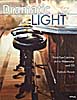
  • dramatic_lightDramatic Light: Paint Eye-Catching Art in Watercolor and Oil strikes me as a good book for artists looking to incorporate light effects in their work without laboring over every facet in a crystal vase or every ripple in the water. In other words, Patrick Howe makes painting light doable for most painters in watercolor and oil. After a good section on Preparing and Planning, which includes many tips and techniques, Howe covers Transparency, Translucence, Luminosity, Light and Reflection with demonstrations and mini-demos. The text is easy to understand and the demos illustrate the text well. The conclusion includes material on the business of art. This one is a keeper.
  • Labels: , , , , , , , ,

    Monday, August 07, 2006

    Watercolor with ink line

    Fun, fun day in class today. Before I did the ink lesson, I showed them my latest treasured tool. A genuine, Nita Engle Windex spray bottle that I bought at a gas station along the Interstate on my trip to Michigan. I had given up on ever finding one after my last one broke. Most stores sell the big pump sprayers, which don't allow you to do the little spritzy things that create interesting textures. Nita Engle uses one to make trees without a brush. The class was delighted to see what you can do with the sprayer. There will no doubt be a run on Windex at truck stops and gas stations everywhere.

    The ink lesson was fun, too. I took some India ink (permanent, lightfast pigmented ink) and several tools: a crow-quill pen, a bamboo pen, a broad-nib pen, a piece of mat board, some flexible bamboo sticks from a placemat and a 1/2" flat synthetic watercolor brush that I use only for the ink. First, I taught them what I learned about using ink with watercolor: You use watercolor lightly to tint ink drawings or use ink lightly to enhance watercolors. You don't let the two compete for dominance. I don't know if this is an actual "rule," but it seems to work.

    It doesn't matter which you put down first, but the first layer should be dry before adding the other medium. I like to do a loose, splashy watercolor and add light, feathery lines using the flexible bamboo stick. This gives a fresh, spontaneous look to the watercolor. If someone prefers to do a detailed drawing, then they make a better picture if they just tint areas of it, rather than trying to color inside the lines.

    Those who tried the ink-and-watercolor technique had great fun with it and did nifty paintings. Some of these folks have struggled finish paintings that satisfied them, but they were well pleased with the results of the new technique. The variety of work in this class--subject matter, techniques, colors--continues to delight me. Each student is growing at his or her pace; they have, for the most part, given up comparing themselves with others and have started to see how they are progressing on their own.

    One student had a big problem with shadows this week, so that's the lesson for next week. Stay tuned. It's the last class of this session, but we're going right into the next session the following week, with the class more than half full already. It's a great group and they enjoy each other tremendously. One student brought pineapple-upside-down cake to share today. It was sooooo good.

    Labels: ,

    Monday, July 31, 2006

    LA Experimental Artists at Viva Gallery

    Visit this site to view an exhibition of experimental artwork by a group of twelve California artists who meet monthly at VIVA , the Valley Institute of Visual Arts in Sherman Oaks. The media include collage, assemblage, mixed media, watercolor on Yupo, fabric arts and more in both realistic and abstract styles. Click on the images to see the detail in larger versions of the artwork.

    Labels: , , ,

    Monday, July 24, 2006

    Book Review: The Painter's Handbook

    The revised and expanded version of The Painter's Handbook by Mark David Gottsegen was published this year by Watson-Guptill. This updated technical reference on all media includes information on hazardous materials and safety in the studio. The book bears a close resemblance to The Artist's Handbook, the classic Ralph Mayer reference book that is still available. However, the Gottsegen book has more current information. Some of the old techniques used in the past are described in both books, so you might want to reference both if you're interested in these. However, you'll want to know what improvements have evolved through the years in different media.

    I was disappointed in the chapter on pastels, with several pages on making your own and just one paragraph on commercial pastels. (I couldn't find a word on the difference between hard and soft pastels). On page 27, where a variety of media are described and compared, there is just one sentence about pastel.

    I was bothered by some minor innacuracies. On p. 24, the author states that rough watercolor paper is called "not," but I believe that term is used for cold-press paper. On p. 37 we learn about "adonized aluminum," a typo that shouldn't appear in a technical book. An * with text in bold type are used throughout the book to call attention to specific dangers, but on p. 58 there is no such marking on the text referring to lead-white paint. On p. 126 it is stated that ultramarine was "accidentally discovered" in 1828, but my sources say that chemists in France and Germany had been making a concerted effort for some time to combine known components of ultramarine into a suitable substitute and were spurred on by a reward offered for the best formulation. These are minor points, but a bit worrisome in a technical reference.

    The book covers a broad range of topics, from stretching canvas and paper to framing, with great detail in pigment descriptions. If you're interested in the technical side of art, you should probably have The Painter's Handbook in your library.

    Labels: , ,

    Silk scarf painting

    For what it's worth, here's my first silk painting. It's a fascinating process. The first week of class I forgot about it and dashed in more than an hour late, something I never do. The students (six in the class) had transferred their drawings to their 48" lengths of stretched silk and were applying gutta resist to the lines. I didn't want to hold things up, so I did a freehand drawing on my silk, whipping up some spirals, stars, suns, moon and wiggly lines. The gutta had to dry, so we were told plan our colors for the second session, which was last week. I figured my favorites would work well with the design--blue-green, red-orange and yellow, plus some red for richness. We painted our scarves last week, then the instructor showed us how to bundle them up when they were dry so she could take them home and steam them to set the color. I was surprised this week to see that the steaming had enriched the colors. The gutta was still in the lines, though, so you couldn't really see what it would look like. I painted a color wheel spiral on a little round of silk (what is it with spirals this month?). While it was drying, I went home (5 minutes away) and washed the gutta out of my scarf, ironed it, and took it back to show the class. If you're an experienced silk painter, don't look. If not, please share my excitement at trying something new that was fun and gave me a halfway decent result. I'd like to do this again in a workshop, but it isn't something I want to set up in my studio.
    p.s. I took the photograph with the panorama feature on my digital camera and it really worked great. Otherwise, the image would have been tiny.

    Labels: ,

    Monday, July 17, 2006

    Painting on Silk

    This morning I went to my second class on silk painting. Last week we learned some of the basics and then painted resist lines with water-based gutta (which is like masking in watercolor) on our stretched silk scarves, about 10" x 40" long. I was late to class, thinking it didn't start until this week, but they called me and I dashed over. I had to come up with a design really fast. I did a series of six big spirals rolling across the fabric, plus stars, moon, sun and some squiggles. This week we painted the design on the silk. I started with yellow in the center of each spiral and gradated the color through orange to red around the spirals and put a turquoise background on it. It's a little sloppy, but very colorful and was fun to do. I kept forgetting that I didn't have to paint up to the resist lines, but should let the color spread to the lines. After my painting was dry, I removed it from the stretcher bars. According to the teacher's instructions, I rolled it up with a thin cotton sheeting and made a small bundle, which was then wrapped tightly in newsprint. The instructor took our bundles home with her to steam them in a big kettle to set the colors. I'll put a digital image of my scarf on my blog when I get it back next week.

    Labels: ,

    Monday, February 27, 2006

    Experimenting with oil pastels and watercolors

    My Monday watercolor class surprised me today with some new pieces they worked on while I was away for two weeks teaching workshops. Some of them met at the class site one week and some worked on their own. I love it when they do that! I surprised them in turn by bringing oil pastels for them to experiment with. They did small drawings on rough watercolor paper, some just lines and some with shading. Then they painted watercolor washes over the oil pastel. The pastel acted as a resist and stood out brightly from the washes. Some of them added colored oil pastel to dry watercolors to enhance areas, which looked really nice. Our critique period was fun today with show-and-tell of the new technique and the recent paintings. The class is growing by leaps and bounds.

    Labels: , ,

    Sunday, December 11, 2005

    Colored pencil musings

    Colored pencil intrigues me. I can recall using colored pencils when I was a child, but I never liked them much because the colors were so weak. I didn't know there was such a thing as "artist's colored pencil," or maybe there wasn't back then. It always seemed to me it would be easy to do colored pencil drawings, but now that the pencils are better, the finished works look more like paintings--and they don't look easy. Several years ago I was exhibiting in an art fair where a colored pencil artist was working on a piece about 18" x 24". The fair lasted two-and-a-half days and wasn't well attended, so she spent nearly the entire time working on the piece. At the end of the weekend she had completed a section less than six inches square. It was beautiful, but I realized that I don't have the temperament for colored pencil--it takes too long. I read somewhere than one artist takes thirty hours, still another works for three months on a colored pencil piece. I admire that kind of persistence, but I guess that's why I'm a watercolor painter. There's no denying the beauty of colored pencil, though. Look at these pieces by Janie Gildow.

    Labels: , ,

    Monday, November 14, 2005

    Water-mixable oils

    Because I'm a watercolor painter I'm attracted to the idea of oil paints that can be cleaned up with water instead of solvent. Many traditional oil painters don't have a very high opinion of this medium, but I don't have enough experience with oil painting to know the difference. Ignorance is bliss. I love painting with water-mixable oil paints. Over the past three years I've taken two brief workshops in oil painting using them. The instructor used regular oil paints in the first workshop and acrylics in the second, so there was no instruction in the water-mixable oils per se. The first time out I used too much water and Winsor & Newton paints. This last time I added some Holbein colors and used only a very little bit of water, except for cleanup. I preferred the Holbein paints. They seemed creamier and more consistent in handling from one color to another. While I respect acrylics and like to use them with collage, I think if I had to choose a painting medium other than watercolor, I would go with water-mixable oils. They would be better for travel, since you can't carry solvents when flying; and I think there might also be a benefit in plein air painting. If you want them to dry more quickly, there is a drier fluid available. I don't know if you can use Liquin and Alkyd paint with water-mixable oils, but they say you can combine them with any oil paints, so I don't see why not. However, you have to switch to solvents when you add these to the mix.

    Labels: , ,

    Sunday, October 09, 2005

    Ramblings on watercolor and gouache

    Both watercolor and gouache are water media. Theoretically, the difference between them is that with transparent wc you work light to dark laying thin glazes and washes on paper; gouache is opaque (dense), so you build up layers with brushstrokes, working dark to light. In actual paints, however, the distinctions are not so clear. Pigments used in all media are generally the same, so if you're using a certain color in watercolor, it's made from the same pigment used in gouache, oil or acrylics.

    It's confusing to watercolor painters to learn that some pigments in transparent watercolor are highly opaque, for example, the cadmiums, cerulean blue and chromium oxide green. These pigments are naturally opaque, so they have more covering power than most watercolor paints. But they aren't as dense as gouache. Gouache has additives that make the paint more dense and opaque.

    A gouache painting looks more like an oil or acrylic than a watercolor, although it's possible to make a watercolor that looks like gouache simply by using less water and more paint. The concern with either method is that thick paint may crack or break off the surface, which is one reason a more rigid support is needed, such as heavy illustration or watercolor board.

    Transparent watercolor as a pure medium takes a lot of abuse these days from artists doing mixed watermedia and gouache. They claim watercolor's old-hat and everything has already been "done" in the medium. I don't agree with that. I love the splash and spatter of watercolor and the texture of the paper, the richness of a fine wash. There's nothing, absolutely nothing, as fine as a pure watercolor masterfully painted. I'm disappointed when I go to big watercolor shows and find most of the paintings appear to be acrylics or opaque watercolor. I can remember when the best artists in the country painted pure transparent watercolors and they were amazing.

    I'm going to try some gouache, because I really haven't given it a fair trial yet. But I can't see myself giving up my watercolors.

    Labels: , , ,

    Thursday, October 06, 2005

    Workshop Day Four

    Today Donna did a demo on gouache, illustrating the differences between transparent watercolor and gouache. You work light-to-dark in watercolor and dark-to-light in gouache. Watercolor is lightened with water; gouache is lightened with white gouache. Watercolor is darkened through mixtures; gouache is darkened through the use of dark, bright pigments. Too much water weakens the covering power of gouache, so she taps a sponge to remove some of the water from her flat brush before she picks up pigment. She did a partial demo, then sent us back to work and continued with her painting after lunch. I find it hard to watch demos for 3 hours, even with breaks. Most students seem able to make the transition from design analysis to putting paint on the paper, although I haven't seen any masterpieces yet, including my own. I decided I had rushed into color too quickly yesterday, so today I did a black-and-white positive/negative shape plan with paint, followed by a three-value plan that I liked. I used a different color scheme from yesterday and got about halfway through the small picture. Still too soon to tell how it will turn out. I can understand why one might choose to use this medium for the opacity and brushstrokes, but I miss the spontaneous splash and transparency of watercolor. Donna used to do pure transparent watercolor but now she tends to be somewhat dismissive of the medium, and I have a hard time with that. I feel watercolor should be honored for its own qualities, just like pastel or colored pencil are, and not downgraded just because it has limitations compared to some other media. To each her own, right?

    Labels: , , , ,

    Monday, September 26, 2005

    Trying something old for a change

    Artists are always looking for something new and creative to do. Why not try something old--like suminagashi? The subtle Japanese art of marbling has been around for hundreds of years but it seems to have been pushed into the background by fancy marbling having specific patterns and bright colors. One thing I like about suminagashi is that you can use plain water as the surface instead of having to mix wallpaper paste or carageenen. I decided to try this technique a couple of weeks ago. I followed directions in a book, but my attempt was a complete failure. I was so disappointed, but I was determined to make it work. The ink I was using kept sinking and the more I added, the more it sank. It was frustrating, because the book said you could use almost any kind of ink or paper, but nothing I tried would work.
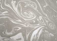

    I found a couple more books in my library and some sites on the Internet that gave instructions, and I figured out what I was doing wrong. So I tried again. This time it worked. I found just one kind of ink that worked for me and one type of paper, so I didn't bother to experiment with materials. Instead, I played around with colors and subtle organic patterns.

    Here are the materials I used: a plastic box 10" x 15" with 1 1/2" of water in it.
    two oriental-style brushes with hair 1" long
    Bombay India Ink, black and colors
    Kodak Photo-Flo 200 dispersant (also called surfactant)
    a small plastic palette with six wells

    Put 1 teaspoon of ink in one well and 1 teaspoon of water in another. Add 1 drop of dispersant to the water and stir well. Load one brush with ink, the other with water. Then just barely touch the tip of the color brush to the water. A pale spot of ink will spread on the water. Touch the tip of the dispersant brush to it and it will force the ink into a ring. Touch again with the paint brush, and continue to alternate brushes until you're ready to make your print. Reload your brushes if necessary. Any disturbance to the surface--a toothpick pulled across it or a puff of air--will move the ink into patterns.

    I used sumi-e paper, printing on the rough side. The paper should be smaller than your water container or it will catch on the sides and spoil the pattern. Hold the paper at diagonal corners and roll it onto the surface decisively from one corner to the other. After you lift the print, place it on a board or tray and rinse it in the sink with an indirect spray of water to remove excess ink. If you don't rinse, the excess ink will soak into the paper and make the print fuzzy. Lay prints on newspapers and paper towels to dry. (Set these up before you begin the process.)

    You can skim the water with a strip of newspaper and make another print, but I got better results when I changed the water for each one.


    The organic forms and delicate colors fascinate me. The patterns show up best when you lay the marbled papers on a white surface. I plan to use my marbled papers in collage and even to write letters on them.

    Go to this link on the art of Japanese marbling, Suminagashi. Here's a site with more step-by-step instructions.

    Have fun!

    Labels: , ,