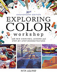
l s

Monday, August 10, 2009

Why Design?

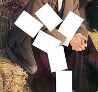
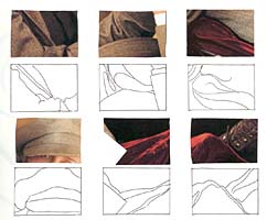
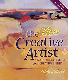
We continued with design fundamentals in the Hithergreen class today. I teach the elements and principles of design set forth by Maitland Graves in The Art of Color and Design more than 50 years ago and taught by Edgar A. Whitney, with a couple of my own modifications. We're discussing two elements or principles each week. For homework, the students will bring in pictures--ads, photos, or artwork--that show the elements or principles at work. The students are taking this seriously. At critique they were more aware of today's topics: line and shape. These sketches illustrate the two elements of design. Next week we'll cover value and color. The New Creative Artist includes an chapter on design, including formats and more(pp. 78-101). (See column at right for a link to the book.)

Labels: , , ,

Monday, August 03, 2009

Viewfinder design

This beginning design exercise is what we did in my class today. Students learn to discern shapes, lines, and patterns in abstract images. They develop a sense of the type of design they like, so they can search for it in their source material.
Start with a 35mm slide mount, a stencil knife, and a magazine advertisement. Use almost any type of magazine. I prefer women's fashion magazines, because I like curving, organic shapes found in the folds of fabric. Some people like the hard edges of car or technical magazines. Move the slide mount over the page until you see an abstract design you like. (You're not looking for pictures!) Then, copy the design inside a small rectangle traced in your sketchbook. If you like, cut out the original and paste it next to your sketch. After you have collected a lot of these, you can see your design preferences: geometric, organic, pattern, etc. Use the designs as structure or background for a painting, quilt, scrapbook page, or other artwork.

Labels: ,

Thursday, July 30, 2009

Design class--formats

Monday's first class in a new design series was about formats for your artwork, meaning the size, shape and proportion of your support. We talked a bit about the golden mean, but I don't stress this, because people get so torqued about the math component. Manufacturers make few supports in the GM. We also talked about using the rule of thirds or rabatment to locate the focal point in a rectangle. These are shown on pp. 98-99 of The New Creative Artist. Everyone seemed more aware during critique of the points we covered in the lesson. I hope to see a few more light bulbs go off during the series.

Labels: , , , ,

Wednesday, July 30, 2008

Preparing for another adventure

Seems like I just got home and off I go again. In about ten days I'll be flying to Green Bay, Wisconsin, where I'll rent a car and drive north to fabled Door County to the Peninsula Art School to teach a 3-day Exploring Design workshop. I've heard so much about the beauty of the area and the wonderful art it's known for. Here's a description of the class--there are still a few spaces available.

EXPLORING DESIGN: CREATIVE CHOICES (MM807)
M-W, Aug 11-13, 9am-4pm
Open to All Levels
collageDesign is the secret to more powerful artwork. Instead of struggling to make a painting work, learn how to use design principles and color organization to create more expressive art. In this workshop you will try new design ideas in your current media and experiment with monotype, collage and mixed media in a relaxed and fun atmosphere with no competition or pressure to perform. Every day begins with a short demo and ends with a class critique. Activities are based on The New Creative Artist, Exploring Color and Creative Collage Techniques.

Labels: , ,

Sunday, June 10, 2007

How not to design a web site

Every artist who has or would like to have a web site should read Charley Parker's rant on web site design. He hits the nail on the head on nearly every point. I reread it this morning, including the 88 comments, which were interesting, too. Most felt the article was right on. Some didn't like the negative approach and sarcastic tone (which, by the way, isn't at all typical of Charley's posts). A few were highly critical or downright nasty, almost as though they missed the point entirely.

Take some time to read the entire article and the comments. There's a lot of valuable information there and it's free. It looks like Charley is planning to follow up this post with helpful how-to articles, soon to be released. Stayed tuned.

Labels: , , ,

Sunday, May 06, 2007

Book Review: Geometry of Design

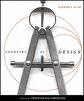
Geometry of Design: Studies in Proportion and Composition by Kimberly Elam (2001) is one of a series entitled "Design Briefs: Essential Texts on Design" published by Princeton Architectural Press. This book has helped me to understand how the golden section works in fine art and design. There are diagrams on every page showing the golden section in nature, ancient art, human proportions and contemporary design. Many pages have transparent overlays showing how lines of the golden section triangles and rectangles fit onto the scheme of an effective art piece or design. I wrote about design grids in connection with Emily Carr on February 20, which was also enlightening. I can see many benefits from thinking about design this way, although I'll admit it isn't easy to do the math. I don't think it has to be exact, but it does help to find hot spots for major and minor focal points in art and to understand why some formats are more pleasing than others to look at. I think the little Elam book will be a handy reference for me in the studio.

Labels: , ,

Tuesday, February 20, 2007

A useful design tool

Several weeks ago when I was reading Emily Carr's writings I came across her reference to a book called How to See Modern Pictures by Ralph M. Pearson, published in 1925. Carr seemed to think highly of the book so, although I knew it wouldn't be considered "modern" today, I was curious how it might have influenced her work. I located a copy on the Internet and found it very interesting. I discovered a design tool that I think will help my students with composition.

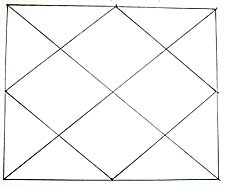
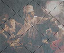
This grid consists of two diagonals from corner to corner and a rectangle or diamond shape connecting the mid-points of the four sides. The diamond-shaped areas within create optimal areas for locating major and minor focal points. The lines suggest movement and turning points across the surface. My students often place objects in dead center or to avoid that, too close to the edge. I'm hoping this grid will help them to avoid these pitfalls.

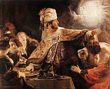
Pearson describes the division of space in such a way that you can locate your important areas within sections of a grid that is simple and easy to use. I selected a Rembrandt painting at random (The Feast of Belshazzar) to see how it might fit into the grid. It was a good fit. I've read that Renaissance artists revived the practice of using various grids, especially in laying out complicated subjects and large compositions.

I've taught both the rule-of-thirds and rabatment (See The New Creative Artist.), which locate "sweet-spots" at the intersections of lines, but I think I prefer this method of using an area rather than a spot.

Labels: , , , , , ,

Friday, January 19, 2007

Creative expression

Canadian artist Emily Carr was influenced by a book written by Ralph M. Pearson, How to See Modern Pictures (1925). Here is a passage from the book:

The Creative artist...begins to draw with his conceptual vision turned inwards searching the storehouse of his mind. That storehouse is well-stocked for he has made preliminary studies in plenty--probably has drawn a model accurately in order to possess himself of all knowledge of details. And now he is ready to use his material to create a picture. The inner fire burns. He comes to his canvas filled with a suppressed power that urges hand to vital, swinging expression. Does he feel the bending weight of sorrow? His hand flows the bend of sorrow into line. No thought of detail. Hardly a glance at the model. The feel of sorrow flowing into form! His problem becomes one of controlling the exuberance of spirit, of holding it to the slow, laborious process of organization, of conserving the force in him to hour after hour, and day after day, and week after week perhaps, of controlled release.... What was in him has gone into the work, where, 'if his power has been great enough', it will live forever. Thus is the felt nature of a thing eternalized into design.

Labels: , , , , , ,

Friday, December 08, 2006

More Art Book Reviews

ranson skiesRon Ranson on Skies (Studio Vista, 1998) is for landscape painters in any medium who love to feature skies. The book shows techniques mostly in watercolor, but does include instruction on some other media, along with excellent photographs of cloud formations and many wonderful sky paintings. This is a great reference for landscape painters. I'm a sky freak myself and love paging through this book to look at the photos and paintings.


color&light in oilsColour and Light in Oils by Nicholas Verrall and Robin Capon (Batsford, 2004). The pages on Understanding Oils are very informative and user friendly, even to a beginner in oils like me. There aren't many swatches for visual comprehension, but the artwork throughout is dazzling, but not overwhelming as a possible goal for an artist to strive for. Verrall and Capon cover painting color and light, different types of subject matter and the working process, with a few demos scattered throughout the book in two or three stages.


digital canvasThe Digital Canvas: Discovering the Art Studio in Your Computer. (Abrams Studio, 2006.) This book by Jonathan Raimes almost makes me want to sell all my painting gear and just play with my computer. It's dazzling and I really think I could do it with this book as my text. The book has page after page of brilliant color effects with simple computer screen shots to show the tools for achieving them. Probably not for beginners, but definitely for creative computer artists.


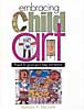
embracing child artBarbara McGuire has written Embracing Child Art. (Krause, 2001) to give adults ideas on how to encourage a child's natural creativity and ultimately help them to make a few treasured objects. There are wonderful suggestions for guiding Little Artists and helping them create projects with their own art to last a lifetime. The best part of the book is page after page of wonderful examples of child art.


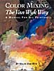
van wyk color-mixingHelen Van Wyk's Color Mixing the Van Wyk Way: A Manual for Oil Painters (Art Instruction Associates, 2000) has quickly become a classic since it was first published in 1995. She keeps the color concepts simple, emphasizing primarily color temperature and comparing a few basic palette choices for simple still lifes and portraits. This book would help beginners in oils to understand their colors and master color mixing of specific pigments.


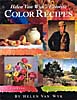
van wyk color recipesHelen Van Wyk's Favorite Color Recipes. (Art Instruction Associates, 2000) expands somewhat on the previous book and introduces a greater variety of subjects with color recipes in oil paints that are her recommendations for painting them. This book ale effects in this book are understood, the painter would be well advised to develop a more personal palette of colors.


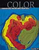
barron's colorBarron's Creative Painting Series: Color. (2005) by Gemma Guasch and Josep Asunción contains a wealth of useful information on color and numerous beautiful reproductions of masterpieces to illustrate the use of color throughout art history. I love that part of the book, but I don't think the demo paintings do it justice. Maybe it's just the design of the book. Check it out, though, because it has a lot to offer.

Once again, thanks to McCallister's Art Store for providing books for my reviews.

Labels: , , , , , , , , , , , , , , , ,

Wednesday, December 06, 2006

Art Book Reviews

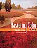
Vicky Murry's Mastering Color: The essentials of color illustrated with oils. (North Light, 2006) This book offers solid color theory applicable to all media. The book is beautifully illustrated with swatches and paintings by the author. The section on supplies and equipment is concise with a nice comparison of different ways oil-painting techniques--direct, indirect, plein air and alla prima. The basic palette is limited and very effective. There's a nice little section on color schemes, a subject often neglected in painting books. Murry explores individual colors and introduces a few design concepts, with a variety of helpful hints along the way.


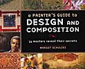
A Painter's Guide to Design and Composition by Margot Schulzke (North Light, 2006)includes the work of twenty-six contemporary masters who describe their process of designing their artwork. This is a beautiful book with lots of demos and color illustrations, but I find it a little confusing. The design-and-composition objective tends to get lost in the plethora of different techniques. I enjoyed reading it, but probably won't include it in my personal art library.


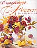
I love Jean Uhl Spicer's book, Bright & Beautiful Flowers in Watercolor (North Light, 2004.) If I were a flower painter, this is how I would want to do it. Spicer's supplies and equipment section is concise and complete. Her basic palette of colors is fairly limited and well balanced. The chapter on color covers the basics in such a way that I think beginners can grasp the concepts quickly. The chapter on composition isn't quite as accessible, but the remainder of the book, which includes various transparent watercolor techniques, tips and demonstrations, is very good. Way to go, Jean.

Labels: , , , , , , , , , ,

Thursday, October 19, 2006

More on cropping


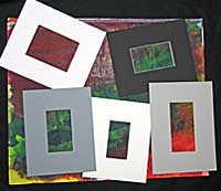
Cropping can be a useful project when you're feeling blocked or don't have much time to paint. Last weekend I cut 60 small mats in assorted colors from scraps I begged from the framer. The openings ranged from 2" x 5" to 6" x 10" with 2 1/2" borders. I gave each student in my watercolor class two mats to play with on their old paintings.

This is a great way to train your eye to see design. Just a small nudge one way or another can make a big difference in a composition. Isolate areas that work, so they aren't diminished by the stuff that doesn't. You can cut out the cropped parts and mat them or just use this as an exercise to strengthen your design awareness.

My Logan mat cutter makes it easy to create small mats without measuring. I'm sure you can do it with the less expensive models, but I like the squaring arm on the 750 that assures correct alignment. I haven't cut mats for several years and thought it might bother my arthritic hands, but that didn't seem to be a problem at all.

Labels: , ,

Monday, October 02, 2006

Cropping--Surprise! Surprise!

In watercolor class today we spent the first part of class discussing the details of our first exhibition and reception. The class is so responsive to helping and all want to have a good show. I helped some folks decide which paintings to have framed and others to determine mat colors and sizes. Nearly everyone worked on current paintings, so we had a critique, as usual, at the end of class. I spoke briefly about how no painting is really a failure. You can keep working on it to see what new techniques you can learn. And you can also find interesting compositions within the painting that might be worth developing, just by sliding small mats around the picture and cropping to isolate little compositions. We found several lovely landscapes in one artist's throw-away painting. So don't give up on your pieces just because they haven't measured up to your original vision. Somewhere in that composition there might be a little gem.

Labels: , ,

Friday, September 08, 2006

Mini Book Reviews

  • Having had an opportunity recently to take a second look at watercolor simplifiedWatercolor Simplified by Pat Weaver, I decided to update an earlier review. As I said before, the book may be a bit intimidating for beginners. The photos of the artist's studio are a bit too much for a "simplified" approach to watercolor. The supplies are basic, but the text seems to assume that you already know how to use watercolor. There are discussions of the Golden Mean and a good section on drawing, with emphasis on planning and value sketching. More for intermediates, I think, but rich with useful material for that level. I do admire Weaver's bold way with watercolor.


  • dramatic_lightDramatic Light: Paint Eye-Catching Art in Watercolor and Oil strikes me as a good book for artists looking to incorporate light effects in their work without laboring over every facet in a crystal vase or every ripple in the water. In other words, Patrick Howe makes painting light doable for most painters in watercolor and oil. After a good section on Preparing and Planning, which includes many tips and techniques, Howe covers Transparency, Translucence, Luminosity, Light and Reflection with demonstrations and mini-demos. The text is easy to understand and the demos illustrate the text well. The conclusion includes material on the business of art. This one is a keeper.
  • Labels: , , , , , , , ,

    Wednesday, August 30, 2006

    Catching up on my reading

    I've been so busy with my own book that I've fallen behind in writing reviews for books I've read. So I'm in "review mode." I posted two reviews this morning, but I'm up to seven now, so scroll down to see what's new.
    Gerald Brommer In Emotional Content: How to Create Paintings That Communicate Gerald Brommer discusses the differences between classic, intellectual and romantic approaches to painting. The key question is "What do you feel?" for the artist who wishes to paint more expressively. Select and edit your subject, making mini-thumbnails to record your impressions. Brommer emphasizes the importance of sketching to explore the subject, using color and temperature dominance and tonal values and textures. Watercolor collage is used in demonstrations. A sense of place, mood, weather and season can all contribute to the emotional content of your work. Brommer's books are always filled with useful tips and techniques.
    Betty CarrSeeing the Light: An Artist's Guide. by Betty Carr shows you how to create depth, form and atmospheric light in watercolor and oil paints. Carr is adept at both, as you can see from this beautifully illustrated book. Supply lists are detailed for both watercolors and oils, including advice on plein air necessities. In both media there are exercises and step-by-step demos that are clear and easy to follow. Carr advises you to learn to think in three dimensions, to observe light on form and to use value sketches to help you see light and shadow on a subject. She recommends simplification of shapes and value patterns. This is a good book withi lots of information and helpful tips.
    Carol CooperCarol Cooper's book, Watercolor: No Experience Required, is an easy guide to getting started in watercolor. The supply list is basic and very good, except that it allows cheap pan colors, which I don't think is a good idea, even for beginners. Also, the beginner doesn't need so many colors; a maximum of seven should do the job, if they're the right colors. A workspace layout is shown that could be helpful to the beginner. There are numerous well-done illustrations, including hands-on photos. Demos are simple and doable. Subject matter includes landscape, flowers, still life and textures. Composition is given very little attention, but the section on color, though brief, is clear. This is a good basic book that doesn't confuse beginners with fancy techniques and tricks.
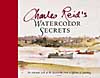
    Charles ReidWatercolor Secrets by Charles Reid is the work of a master painter. The book is filled with many sidebars of tips and tricks for Reid's spontaneous style of painting and is lavishly illustrated with sketches from his watercolor sketchbooks. His distinctive, personal approach is clear throughout in subjects of all kinds, both indoor and plein air. His supply list is brief, but more than adequate. This beautiful book is not for the beginner in watercolor technique, but it's a joy to behold.
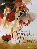
    susanna spannPainting Crystal and Flowers in Watercolor by Susanna Spann is filled with her stunning artwork and many mini-demos throughout. The book includes a detailed list of supplies, but it's clear from the beginning that this book is not for the spontaneous watercolor painter. The primary subject is special effects in still life using watercolor. Design and color are touched upon, along with painting from photographs, marketing and exhibiting. The strongest point in Spann's book, in my opinion, aside from her magnificent artwork, is her emphasis on doing thumbnail sketches to plan paintings.

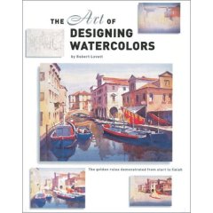
    John LovettJohn Lovett's The Art of Designing Watercolors is subtitled "All you need to know to create more powerful paintings." The book contains demos and many illustrations throughout with an emphasis on design. From the "hows and whys of design" to tools of design (the elements and principles) and design tools in action, Lovett covers the essentials very well. Only one page is designated for supplies, so beginners need to look elsewhere to understand the basics. However, this book is a good one for an artist who needs to understand how to incorporate structure into pictures for more effective expression.
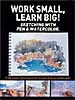
    work small learn bigWork Small, Learn Big!: Sketching with Pen & Watercolor is an International Artist Publishers' collection of preparatory studies by seventeen artists from around the world. The book is a compilation of sketches backed up by photographs and slides, emphasizing the importance of these preliminary works to the execution of fine artwork. There are numerous illustrations and step-by-step demos. Each artist has distinctive choices of materials and media. Styles range from loose and spontaneous to highly detailed with many notes. Selling tips and artists' bios are included. One of the most important messages in the book is that "Mistakes don't Matter" in the sketchbook.

    Thanks to George Bussinger at McCallister's Art Store for making these books available for review.

    Labels: , , , , , , , , , , , , , , ,

    Wednesday, August 23, 2006

    "No rest for the wicked!"

    My mother used to say that. I must have been very bad. It has been such a busy week that I've missed my Curves workouts twice, something I never do. Our son is visiting from Colorado, so I'm trying to spend some time with him. However, I already had two classes scheduled and a meeting with my North Light editor in Cincinnati, so something had to go. I'm going to be baby-sitting for a couple of days, too, so not much time to catch up. Well, everything is happening pretty fast, so I guess it's true that time flies when you're having fun. (Nothing like a blog full of clichés.)

    Started a new watercolor class on Monday with 25 students. Most of them are returnees from previous classes. Four of my beginners have joined the class and there are a couple of newbies. We talked about the continuum of design from realism to non-objective painting. I had found some good examples of abstract design artwork to show them. Then I taught them about making grids to get their drawings in the correct proportions on their paper. Critique was fun. They're getting more and more consistent with their finished paintings. They seem to be doing more paintings and are improving accordingly.

    The beginner class wound up today. I feel bad about not taking them to the next level, but I can't do two classes per week on a regular basis. So this one just comes up during the summer for eight weeks. Four of the ten in the class have moved into the intermediate group and the others say they'll be working on their own until next time.

    Our son leaves in the morning and I may have to spend the day gaining strength for the baby-sitting marathon. It isn't that long, but I'm not in the routine anymore and a three-and-a-half-year-old can be unpredictable. But, I'll manage. I just may not be able to blog for a couple of days.

    Labels: , ,

    Tuesday, July 11, 2006

    Perception & Composition

    That's the subtitle of Picture This, a book on design by Molly Bang published in 1991. As Rudolf Arnheim says in his introduction, this book is an eye-opener for adults. It isn't just a picture book for children. Yesterday I guided my watercolor class through the first part of the book, in which the author selects shapes and colors to represent some of the characters and settings for "Little Red Riding Hood," explaining why a small red triangle works for Red, but a big one is too unyielding for Mother and how to make the forest background of straight, vertical trees look more threatening by tilting the trees and leaning one over to frame a corner and close Red in. Each page is a startlingly simple visual representation of an easily digested design concept. I had forgotten I had this book until I was sorting books for my sale. I decided to try it out on my intermediate class, telling them I was going to read a bedtime story. (We meet after lunch--a good time for naps when I talk too long.) It was fun to watch the expressions on their faces as the design unfolded--the rapt attention of children would describe them, including surprise and delight at the turn of every page. I'll continue with the book in class over the next couple of weeks, as I think it's making important points in design that will stick with the students. Unfortunately, the book is out of print, but can be found online at used bookstores. It was reprinted in 2000 as Picture This: How Pictures Work and is available from booksellers in both hard and soft covers.
    Labels: , , ,

    Saturday, February 25, 2006

    Collage workshops amaze me

    People get soooo creative in a collage workshop. The four-day workshop I just finished teaching in Dayton had students of all skill levels. Everyone worked very hard at learning new techniques. As a result there were quite a few fine pieces. Yesterday at a meeting of the Tri Art Club, which sponsored the workshop, the chairman showed pieces by several of the participants. It felt very good to get that feedback and know that the class was pleased with their work and willing to share it with artist friends. Techniques ranged from magazine and colored paper collage to rice paper techniques and making monotype papers for collage. I also taught a session on design elements and principles that apply to all art media. Amazing how little of that is taught in workshops these days. Now I must unpack all my collage materials and pack everything I need for my Exploring Color class starting this week at the Fairborn Art Association.

    Labels: , , , , , , ,

    Monday, February 20, 2006

    A whirl of collage

    Last week's collage workshop in Baton Rouge was the greatest. It's awesome how easily people get into collage once they understand the basic materials and processes. Collage is non-intimidating to beginners and useful to more skilled artists who want to master design and color. First we talked about setting up a workspace conducive to collage techniques. Then the class made magazine theme collages to learn about adhesives and supports for collage. Day two was devoted to design and color with Color-aid or other solid colored papers as the "palette." On the third day we moved on to rice and mulberry papers, using them to laminate or overlay supports. The next day was great fun as the class created monotype papers with acrylics or watercolor paints to use in their collages. The final day was a wrap-up of techniques with discussion of copyright and exhibition issues pertinent to collage. There was no "pressure to perform." The idea was to do a lot of pieces using as many different techniques and materials as possible. Most pieces were a half-sheet (15" x 22") or smaller. Everybody in the workshop completed one or more pieces every day for five days. This week I'm teaching the same workshop in a four-day format in Dayton. Today was the first day and it looks like we're on a roll. I love teaching this workshop!

    Labels: , , , ,

    Friday, February 03, 2006

    Painters and graphic designers


    This is on my mind because I'm awed by the graphic designer and the layout artist who just finished the layout for my new book, The New Creative Artist . (Publication date is mid-July) The book is a real challenge for designers because it is both text- and image-heavy, so it's hard to strike a balance on every page. I'm amazed at the creative things the designer has done with color and other elements to make everything fit and flow. My hat is off to the fine artists of graphic design.

    The book is nearly ready to go to the printer. I have some kudos for my editor, too, but that's for another day.

    Labels: , , ,

    Saturday, January 28, 2006

    Colors and lines are forces and the secret of creation lies in the play and balance of those forces." --Henri Matisse

    Labels: , , ,