posted by Nita at 5:24 PM
0 comments
![]()
![]()
Friday, September 30, 2005
On doing your own thing in a workshop
Yesterday I responded to an email list member who was upset because she felt that her teacher wanted her to paint like he does. The following is an edited version of my reply.
Cloning is very common with some art instructors. Often students think they would like to paint like a certain artist, and that's why they choose him or her as their instructor. Some instructors encourage this; it is very flattering. Thus, the more the student's work looks like the instructor's, the more affirmation the instructor gets. This is one of the reasons most exhibitions have a rule disallowing any work done in a workshop.
I've seen instructors get annoyed with students who try to "do their own thing" in a workshop. The attitude is, "If you don't want to do what I do, why are you here?" To some extent, they have a point. Perhaps you should pay attention and do what the instructor is doing instead of what you already know how to do. You will--I promise you--learn some worthwhile things in the workshop, even if it happens to be what you don't want to do. You'll learn some new tricks with brushes and paint that you can apply later in your own work. You might learn something new about design and color, too.
It isn't the purpose of a workshop to produce paintings to show and sell. It's to learn what a certain teacher can teach you. I have a slightly different take on weekly classes, though, as I feel in that situation it's the job of the teacher to help the student become the artist each one is capable of being, and not a clone. So it boils down to finding the right instructor who will work with you to bring out your best and help you overcome your weaknesses.
Read my web site article, Ten Tips on Taking a Workshop for more thoughts on workshops.
Next week I'm taking my third workshop this year. I've been so out of painting with all the baby-sitting the past three years that I'm trying to get myself revved up again. I took from Judi Betts, whose style is very distinctive and different from mine, but I did all the exercises everyone else did. I took oil painting from Charles Gruppe and the only way I departed from his method was to paint a cemetery and the desert instead of boats in New England. (He couldn't imagine why anyone would want to paint such things!) The next one is with Donna Zagotta in watercolor. I don't know what to expect but have been told she's a good teacher and I know I'm a good student, so I will learn from her.
Labels: workshop
posted by Nita at 3:05 PM
0 comments
![]()
![]()
Thursday, September 29, 2005
How many new colors do we need?
I finally got the 15 new Winsor & Newton watercolors tested that McCallister's Art Store provided me. My tests aren't scientific and my results are subjective. I test for transparency, tinting strength, spreading quality, reaction to salt and staining property.
As I look at my chart, I'm struck first of all by the brilliance of the fluorescent Opera Rose, which is in my mind a gorgeous, though useless, color for watercolor painters. I've seen so few who could handle Holbein's Opera and I try to keep my students away from it. It doesn't reproduce well, as it is out of the gamut for 4-color printing, so artists who use it are invariably disappointed in their color reproductions.
There are some very nice low-intensity pigments that would work well with the low-key palettes in my Exploring Color system of compatible colors. I especially like Potter's Pink, Perylene Green, Terre Verte Yellow Shade and Perylene Violet. Unfortunately, the Perylene Violet isn't even close to Thioindigo Violet, which it supposedly replaces.
Cerulean Blue Red Shade is a nice addition. I used to alternate with other brands when I wanted that color, although it isn't all that different from Cerulean Blue.
Phthalo Turquoise istoo close to Winsor Blue Green Shade to be worth bothering about. It seems to be an attempt to get a one-pigment blue-green, but I'd rather have Rembrandt's Turquoise Blue, a mixed pigment, on my palette to fill that slot. It sits right between Winsor Blue Green Shade and Winsor Green and is one of those colors that makes my heart beat faster. I know I can mix it with WGBS and WBGS but it's wonderful to have it right at hand when I want it.
Lemon Yellow Deep appears to be a rather delicate color, and I like it. I'm afraid it will confuse my beginning students, though, as it doesn't seem to have the tinting strength of Winsor Lemon, which they need for my split-primary color-mixing system. The Turner Yellow may be worth further investigation. It has a softness to it that I like.
Winsor Orange Red Shade is vibrant and might make a nice change from Cadmium Scarlet, which is one of my favorites. But I don't like the Winsor Red Deep, which reminds me of Grumbacher's Cadmium Red Deep, a murky, difficult color in watercolor.
The remaining colors, Brown Ochre, Magnesium Brown, Mars Black and Yellow Ochre Light might have their place on some artists' palettes, but I don't see them anywhere on mine. They're all easily made with mixtures of other earth pigments on the palette. The black is a possible exception. I tend to be biased against black because I've never found a good one in watercolor, so I'll give it a try.
As for the discontinued colors, the only one I'll miss is Thioindigo Violet, as it's such a great red-violet. Perylene Violet is too low-intensity to take its place.
If WN's objective is to "increase the spectrum across the range," there are just two places where I feel they fall short. On my 12-pigment color wheel, made up mostly of Winsor & Newton colors, I use Rembrandt Turquoise Blue for blue-green. None of WN's colors fill that slot, as they are either too opaque or lacking the tinting strength I need. Please note that on WN's 4-color printed chart the representation of Phthalo Turquoise is misleading and looks more like the color I want than the actual paint does. (I know how hard it is to reproduce color with CMYK, but I feel that the current printed chart isn't nearly as accurate as the previous one was.)
At blue-violet I use Old Holland Blue-Violet. This is also a mixed-pigment color, but there is no WN color close to this one. Ultramarine Violet is too red and too weak in tinting strength for the colors I use in the expanded palettes in my book, Exploring Color.
Ongoing efforts to improve colors are admirable, but I deplore the continual offering of new colors by some manufacturers as pure marketing that doesn't serve the needs of artists. Students carry around dozens of tubes of colors they don't need and can't use until they've learned basic color mixing. Once they've mastered mixing with six colors, they hardly need any others, as they can mix nearly everything they want. If artists are looking for a magic color, I tell them there is only one: Winsor & Newton Burnt Sienna. If they ever change that one, I may have to give up painting.
That said, it's always fun to play with new colors and now and then something I haven't used before jumps onto my palette and stays for awhile. Nothing wrong with that, as long as it works.
Labels: color wheel, exploring color, green, McCallister's, paint, paint quality, split primary, tutorials, watercolor
posted by Nita at 10:58 AM
0 comments
![]()
![]()
Watercolor paper--what works?
Over the past few years I've been lamenting the lack of a good, friendly watercolor paper for beginners. The old Bienfang Watchung paper was so user-friendly. It was hard enough to allow corrections, very white, and affordable. Unfortunately, it wasn't acid-free or pH neutral, so my beginning paintings have all discolored. And, of course, the paper is no longer available. Two other excellent, reasonably priced papers have also gone by the wayside: Grumbacher Capri and Arches Archette. Both were a little more expensive than Watchung, but had the look of a more professional grade of paper.
The good news is that most student papers are now pH neutral or acid-free, so they won't discolor or soften over time. The bad news is that they make streaky watercolor washes and soak up the paint so even relatively non-staining colors can't be lifted. More experienced painters use them without problems, but they're frustrating for beginners. My students have a hard time with Strathmore pads, Winsor & Newton Cotman and Canson Montval papers. I've always liked Montval, but it's too smooth for beginners, who need a paper with more tooth that will hold water on the surface longer. When Watchung, Capri and Archette disappeared, I switched to Bockingford, which was also relatively smooth but still made good washes. Guess what. Bockingford is gone, or at least no longer imported into the U.S.
If student artists stick with 140# or higher papers they can paint on both sides and cut the cost in half. I've noticed a trend toward my students working smaller now that paper prices have escalated and that's too bad. There isn't anything wrong with doing small paintings, but the freedom and spontaneity of working with watercolor on half sheet or larger size papers is missing on a small format.
Here's my short list of favorite papers (140# or 300# cold press):
Arches--tough and scrubbable, off-white
Winsor & Newton--whiter than Arches, a little less tough, but a lovely paper
Fabriano Uno--a little off-white, less rough and tough, but a nice paper
Langton by Daler-Rowney--good paper, a little less expensive, but not easy to find
Whatman--long a favorite of many watercolor painters in the U.K. and U.S.; a good paper
There are many more papers available, but I haven't tried them all--too many papers, too little time. Here are some comments I've heard from students and other artists about other papers.
Twinrocker handmade papers--elegant, expensive
Yupo--synthetic "paper" fun to work on but can be frustrating
Fredrix watercolor canvas--gaining in popularity. Why use expensive watercolors on canvas instead of acryics?
Claybord textured panels--haven't tried them yet
Kilimanjaro--problems with washes
Crescent Watercolor Board--smoother than my favorites, like the backing support
Crescent or Bainbridge Illustration Board--only in CP or rough, medium-weight or heavy
What are your favorites? Good or bad experiences with paper? I'm still looking for a reasonably priced 140# cold press paper for beginners.
Labels: tutorials, watercolor paper
posted by Nita at 8:42 AM
17 comments
![]()
![]()
Wednesday, September 28, 2005
Almost wiped out
Have spent most of the past two days updating my web site links and home page. It's a big job. I save mostly art links in my Favorites list to share on my web site and have hundreds--maybe thousands by now--of hand-picked links categorized and alphabetized on my site. New ones have been piling up since spring while I worked on the book. Send me an email if you would like me to add your URL to my listings. Stop by my web site and check out the new book reviews, too.
Tomorrow I think I'll write something about watercolor paper.
Tomorrow I think I'll write something about watercolor paper.
posted by Nita at 10:34 PM
0 comments
![]()
![]()
Bite the Bullet.
If I see one more dried up, twisted tube of watercolor paint in a student's tackle box, it will be too many. The supply list for my class is simple: just 8 colors, a couple of brushes, a palette, paper and water containers. Beginners often bring in materials that someone gave them or they inherited. More experienced artists may not have painted for years, so they haul in everything they used eons ago. Most watercolors have a pretty decent shelf life. But often the old tubes are hard as rocks. Some are made of lead. I set these aside and tell them they should dispose of them, but invariably I see the tubes going back into their kits. Why? I can't imagine.
Some artists slit the tube, spread it open and dab color from the hard chunk of paint inside. They risk ruining good brushes. If you can get chunky paint out of the tube, put it in a palette well with a couple of drops of gum arabic. It may become useable again. But if it's gritty, there isn't much you can do to restore it to its original consistency. There are artists who regrind the paint, mixing it with binder to a creamy consistency. Wouldn't you rather paint?
Another problem with using old paint is that there are a some colors that undergo chemical changes in the tube and become discolored. Also, you won't find discontinued colors on the market, so why use colors you can't replace?
Paints that dry up and become crumbly are usually student colors. Buying student paint is a false economy. The tube may be larger or cost less, but you'll need more paint to achieve anything near the intensity of good quality artist pigments. So, ante up and get the good stuff. You'll see the difference in your watercolor paintings.
Please, throw away those wretched, rock-hard, twisted tubes and use fresh, good-quality paint.
I'll have a rant on paper soon.
Labels: paint, paint quality, tutorials, watercolor
posted by Nita at 10:29 AM
5 comments
![]()
![]()
Tuesday, September 27, 2005
Monday, September 26, 2005
Trying something old for a change
 Artists are always looking for something new and creative to do. Why not try something old--like suminagashi? The subtle Japanese art of marbling has been around for hundreds of years but it seems to have been pushed into the background by fancy marbling having specific patterns and bright colors. One thing I like about suminagashi is that you can use plain water as the surface instead of having to mix wallpaper paste or carageenen. I decided to try this technique a couple of weeks ago. I followed directions in a book, but my attempt was a complete failure. I was so disappointed, but I was determined to make it work. The ink I was using kept sinking and the more I added, the more it sank. It was frustrating, because the book said you could use almost any kind of ink or paper, but nothing I tried would work.
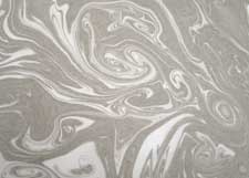 I found a couple more books in my library and some sites on the Internet that gave instructions, and I figured out what I was doing wrong. So I tried again. This time it worked. I found just one kind of ink that worked for me and one type of paper, so I didn't bother to experiment with materials. Instead, I played around with colors and subtle organic patterns.
Here are the materials I used: a plastic box 10" x 15" with 1 1/2" of water in it.
two oriental-style brushes with hair 1" long
Bombay India Ink, black and colors
Kodak Photo-Flo 200 dispersant (also called surfactant)
a small plastic palette with six wells
Put 1 teaspoon of ink in one well and 1 teaspoon of water in another. Add 1 drop of dispersant to the water and stir well. Load one brush with ink, the other with water. Then just barely touch the tip of the color brush to the water. A pale spot of ink will spread on the water. Touch the tip of the dispersant brush to it and it will force the ink into a ring. Touch again with the paint brush, and continue to alternate brushes until you're ready to make your print. Reload your brushes if necessary. Any disturbance to the surface--a toothpick pulled across it or a puff of air--will move the ink into patterns.
I used sumi-e paper, printing on the rough side. The paper should be smaller than your water container or it will catch on the sides and spoil the pattern. Hold the paper at diagonal corners and roll it onto the surface decisively from one corner to the other. After you lift the print, place it on a board or tray and rinse it in the sink with an indirect spray of water to remove excess ink. If you don't rinse, the excess ink will soak into the paper and make the print fuzzy. Lay prints on newspapers and paper towels to dry. (Set these up before you begin the process.)
You can skim the water with a strip of newspaper and make another print, but I got better results when I changed the water for each one.

The organic forms and delicate colors fascinate me. The patterns show up best when you lay the marbled papers on a white surface. I plan to use my marbled papers in collage and even to write letters on them.
Go to this link on the art of Japanese marbling, Suminagashi. Here's a site with more step-by-step instructions.
Have fun!
Labels: art mediums, art/craft, tutorials
posted by Nita at 6:30 PM
2 comments
![]()
![]()
Fabrications by John Emery
Last week I saw the most amazing exhibition of watercolor paintings I've seen in recent years. John Emery does what he calls "watercolor constructions," a combination of trompe l'oeil painting and three-dimensional paper sculpture. Emery does everything with paper and paint, but you would swear you're looking at a small animal's skull on a window sill with an assortment of real bird's nests.
Emery paints still lifes of aged leather journals, making the textured watercolor paper look exactly like old leather covers. He carefully crafts life-sized pens with nibs that look like metal. The journals are written in calligraphic hands in the manner of days gone by. One of his pieces includes an old "wooden" watercolor paint box with cakes of dried paint in the wells. Well, actually, paper painted to look like dried paint.
In addition to his meticulous craftsmanship in his constructions Emery is a skilled watercolor painter, using richly pigmented washes in the backgrounds of his works. His plein air paintings are a striking contrast to the constructions. They are small, very transparent and painted authoritatively with a large brush. Visit John Emery's web site to see a few of his works. Remember that everything you see is made of paper!
Labels: artist, realism, still life, watercolor
posted by Nita at 9:50 AM
0 comments
![]()
![]()
Sunday, September 25, 2005
Moving from Yahoo to Bloggerville
When I first set up my website in 1998 one of the features I liked the most was the Guest Book. I heard from people all over the world, who shared ideas about art and more with me and the visitors to the GB. Eventually, however, a few pests began to spoil it by posting spam and porn messages. There were also a few cryptic messages that looked like code. What was that all about? I have no idea. I deleted the offensive messages, but then I got worried about spammers harvesting the email addresses of innocent visitors to my Guest Book, so I shut it down.
I missed it so much that I started a couple of groups at Yahoo and that was great for awhile. But that, too, got a little burdensome, with members having to sign in and out, set email preferences and so on.
When blogs first started, I thought they might be the ideal way to talk to my art friends without setting up a complicated newsletter program. So I'm finally getting started. Eventually I'll link to my website and I might retrieve the articles I wrote for the Yahoo group. I'm inviting my Yahoo friends to join me. You're welcome, too.
posted by Nita at 4:38 PM
5 comments
![]()
![]()
About Me

- Name: Nita
- Location: Dayton, Ohio, United States

I've been painting and teaching watercolor since the 70s. My bestselling books on color, collage and creativity are published by North Light Books. Please visit my website www.nitaleland.com .
- July 21, 12, 13 from 9-4. Nita Leland's Color Clinic. Evendale Cultural Arts Center, 10500 Reading Road, Cincinnati, Ohio. Contact Susan Gordy.
- To book a 3-day workshop, please email me to reserve a date. Workshops are available in color or watercolor.
My Web Site Links
- Nita Leland WORKSHOPS
- Nita's Web Site
- Nita's Products
- Beginners & Beyond watercolor show
- Mini Book Reviews
- Super Links--Art & More
- Quotable Quotes
- Lines and Colors, Charley Parker
- eSynergy, Brenda Thebeau's blog
- Jennifer King's Blog for Artists
- 100 Must-See Art Blogs
- Brush-Paper-Water watercolor blog
- Carolyn Jourdan, Writer
- Julia Berkley, Quilt artist
- What If I ...?
- Making a Mark
- Ancient Artist
- Artist's Magazine blog
- Michael Bach Optical Illusions
- Carole Segal's Artful Blog
- Art-to-Art Palette Blog
- Art Blogs-4-You
- Birthday Wishes--Party Ideas
- Bushstrokes by Annette Bush
- Art Studio 75604 by Cheryl McClure
- Michelle Himes' Watercolor Blog
- Daily paintings by Elin Pendleton
- 100 Objects or Ten Thousand by Karen Jacobs
- JMG ArtBlog
- lines & colors by Charley Parker
- The Creative Journey Karen Winters
- Creativity in the life of I Hanna
- Alma Stoller fiber artist
- ART NOTES
- I Landscape by Bart Westgeet
Some of my Favorites
Previous Posts
- My 2018 color clinic will be at Evendale Cultural ...
- Color Clinic Coming to Evendale Cultural Center
- Why I Love Artists Who Love Color
- So, here's how it goes as the deadline approaches....
- Well, I hope you haven't been holding your breath ...
- Big Smiles--Exploring Color to be Revised, Updated...
- After a busy few months since my last post, I'm re...
- New 3-day workshop coming up November 7-9. "Advent...
- Jacqueline Sullivan's Color Letter--Fantastic R...
- A Watermedia Collage Series on Trees
Archives
- September 2005
- October 2005
- November 2005
- December 2005
- January 2006
- February 2006
- March 2006
- April 2006
- May 2006
- June 2006
- July 2006
- August 2006
- September 2006
- October 2006
- November 2006
- December 2006
- January 2007
- February 2007
- March 2007
- April 2007
- May 2007
- June 2007
- July 2007
- August 2007
- September 2007
- October 2007
- November 2007
- December 2007
- January 2008
- February 2008
- March 2008
- April 2008
- May 2008
- June 2008
- July 2008
- August 2008
- September 2008
- October 2008
- November 2008
- December 2008
- January 2009
- February 2009
- March 2009
- April 2009
- May 2009
- June 2009
- July 2009
- August 2009
- September 2009
- October 2009
- November 2009
- December 2009
- January 2010
- February 2010
- March 2010
- April 2010
- May 2010
- August 2010
- September 2010
- November 2010
- December 2010
- February 2011
- March 2011
- May 2011
- June 2011
- August 2011
- September 2011
- October 2011
- November 2011
- December 2011
- January 2012
- February 2012
- March 2012
- April 2012
- September 2012
- June 2013
- August 2013
- April 2014
- May 2014
- September 2014
- April 2015
- September 2015
- February 2016
- October 2016
- July 2017
- February 2018
