 Ron Ranson on Skies
 (Studio Vista, 1998) is for landscape painters in any medium who love to feature skies. The book shows techniques mostly in watercolor, but does include instruction on some other media, along with excellent photographs of cloud formations and many wonderful sky paintings. This is a great reference for landscape painters. I'm a sky freak myself and love paging through this book to look at the photos and paintings.
 Colour and Light in Oils by Nicholas Verrall and Robin Capon (Batsford, 2004). The pages on Understanding Oils are very informative and user friendly, even to a beginner in oils like me. There aren't many swatches for visual comprehension, but the artwork throughout is dazzling, but not overwhelming as a possible goal for an artist to strive for. Verrall and Capon cover painting color and light, different types of subject matter and the working process, with a few demos scattered throughout the book in two or three stages.
 The Digital Canvas: Discovering the Art Studio in Your Computer. (Abrams Studio, 2006.) This book by Jonathan Raimes almost makes me want to sell all my painting gear and just play with my computer. It's dazzling and I really think I could do it with this book as my text. The book has page after page of brilliant color effects with simple computer screen shots to show the tools for achieving them. Probably not for beginners, but definitely for creative computer artists.
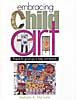 Barbara McGuire has written Embracing Child Art. (Krause, 2001) to give adults ideas on how to encourage a child's natural creativity and ultimately help them to make a few treasured objects. There are wonderful suggestions for guiding Little Artists and helping them create projects with their own art to last a lifetime. The best part of the book is page after page of wonderful examples of child art.
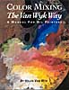 Helen Van Wyk's Color Mixing the Van Wyk Way: A Manual for Oil Painters (Art Instruction Associates, 2000) has quickly become a classic since it was first published in 1995. She keeps the color concepts simple, emphasizing primarily color temperature and comparing a few basic palette choices for simple still lifes and portraits. This book would help beginners in oils to understand their colors and master color mixing of specific pigments.
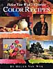 Helen Van Wyk's Favorite Color Recipes. (Art Instruction Associates, 2000) expands somewhat on the previous book and introduces a greater variety of subjects with color recipes in oil paints that are her recommendations for painting them. This book ale effects in this book are understood, the painter would be well advised to develop a more personal palette of colors.
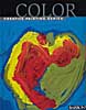 Barron's Creative Painting Series: Color. (2005) by Gemma Guasch and Josep Asunción contains a wealth of useful information on color and numerous beautiful reproductions of masterpieces to illustrate the use of color throughout art history. I love that part of the book, but I don't think the demo paintings do it justice. Maybe it's just the design of the book. Check it out, though, because it has a lot to offer.
Once again, thanks to McCallister's Art Store for providing books for my reviews.
Labels: art mediums, book reviews, books, child art, color, color mixing, color theory, computer, design, landscape, McCallister's, oil painting, painting, still life, temperature, watercolor, watercolor techniques


 Subtitled "The Complete Guide to Color Theory and Application," Tom Fraser and Adams Banks's book
  Caroline Jasper's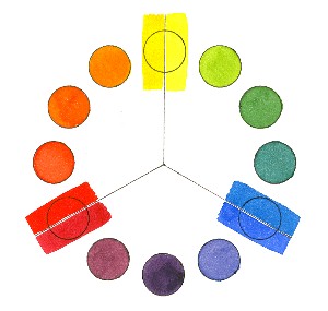
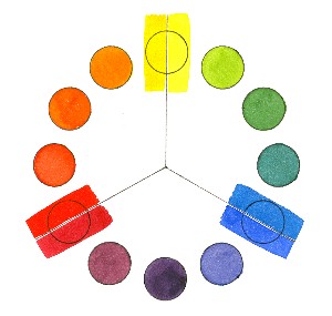 I can tell this is going to be a good class. Aside from the fact that four people arrived late (sigh!) and three were on vacation (a given in Ohio in the winter), the orientation went well. Lots of good questions, several aha! moments and a few jaw-dropping, I-had-no-idea reactions to color facts and theories. Great fun for me! I showed slides on the history of color in art because I think it's very helpful to see where color started (30,000 or more years ago) and how it evolved from decorative and symbolic to representational and expressive. I wound up the session with the