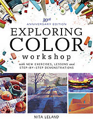
Big Smiles--Exploring Color to be Revised, Updated, Launched in 2016

Labels: art book, exploring color, North Light Books, stefanie laufersweiler
posted by Nita at 3:04 PM
0 comments
![]()
![]()
Nita Leland's blog is about her creative and family life, including book reviews, art links and essays on color, creativity, watercolor, writing, teaching and other subjects.
Labels: art book, exploring color, North Light Books, stefanie laufersweiler
posted by Nita at 3:04 PM
0 comments
![]()
![]()
Labels: beading, color schemes, exploring color
posted by Nita at 9:58 AM
3 comments
![]()
![]()
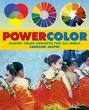 Caroline Jasper's PowerColor: Master Color Concepts in All Media. provides an interesting overview of color concepts not found in many books on color. Personally, I enjoy reading the scientific and historical information. When I wrote my first Exploring Color book (1985) such material was hard to find and took diligent research and a lot of winnowing to cut the information down to size for the first two chapters of my book. When I revised Exploring Color: How to Use and Control Color in Your Painting (1998), I was asked to compress it into fewer pages and had to give up most of that material in order to concentrate on the practical tasks of learning about paint characteristics and using them in artwork. I'm glad to see a fresh book that includes summaries of this interesting background information. I don't agree with her on color wheels and find their use inconsistent in the book, but it's theory, and she's entitled to her opinion. Jasper features several artists in their studios with step-by-step demos of their work. The book includes a broad spectrum (pun intended, sorry) of styles and is lavishly illustrated in color.
Labels: book reviews, color theory, color wheel, exploring color
posted by Nita at 11:11 AM
1 comments
![]()
![]()
 Last night I had a good time speaking at the Fairborn Art Association. This is one of the friendliest groups I know. I've been a member for many years--maybe twenty or longer. I don't get to the meetings often. When I first joined I was on the board of a local group that met on the same night. Nevertheless, they always greet me as a friend and neighbor and I love that.
 Labels: color, color schemes, exploring color, tutorials
posted by Nita at 9:52 AM
0 comments
![]()
![]()
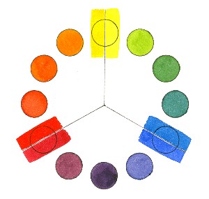
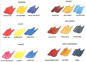
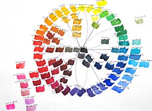 Finally I've finished the watercolor wheel I started for my class several weeks ago. I did blue first, then added red the following week and yellow a week later. (Click on the "color wheel" label below to see the three work sheets and watercolor wheels that I painted last month.) Today I filled in orange, green and violet secondary colors and the neutrals in the center. I finished it in my studio so the class wouldn't lose painting time next week. I'll show them the finished wheel, explain a couple of things and they can examine it more closely later if they wish. Mind you, I'm not advocating having or using all these colors. I want to show that there's a continuum around the color wheel that reveals temperature relativity from one color to the next. This is a good exercise for your "color eye," to see if you can distinguish between warmer and cooler colors and see how their neighbors on the wheel influence their temperature. The colors around the perimeter of the wheel are mostly high tinting-strength, high-intensity colors. Except for a few colors in the red area, outside the perimeter are the low tinting-strength, high-intensity colors. Inside the wheel are the low-intensity colors and neutrals.
  Here's the test sheet for the colors I did today. It doesn't matter whether you make a wheel or swatches, but this is a good way of learning about your paints. As I said in an earlier post, the color wheel above is similar to the one I made for my first Exploring Color book, published in 1985.
Labels: color, color wheel, exploring color, green, paint, temperature, tutorials, watercolor
posted by Nita at 6:35 PM
6 comments
![]()
![]()
Labels: child art, collage, color, color mixing, color wheel, exploring color, temperature
posted by Nita at 3:23 PM
0 comments
![]()
![]()
Labels: color, color wheel, exploring color, paint, temperature, tutorials, watercolor
posted by Nita at 3:17 PM
0 comments
![]()
![]()
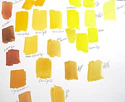
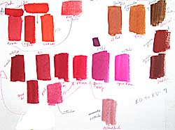 Last Monday we explored reds in watercolors, as we did last week with blues. Here's the chart that I did in class, explaining the paint characteristics of each pigment and the relative temperature as I went along. I let the class help me decide where a color belongs. I wish we had full-spectrum lighting in our classroom, because the colors tend to look "off" and I have to remember to mention this. Lighting makes a huge difference when you're exploring colors.
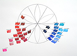
Labels: color, color wheel, exploring color, full spectrum, paint, temperature, tutorials, watercolor
posted by Nita at 2:17 PM
1 comments
![]()
![]()
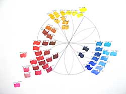
 We almost had a full house for the first session of Exploring Watercolor at Hithergreen Center today. Twenty-one returning students, three newbies, one absentee recovering from surgery and one perpetual absentee. (Don't ask.) I decided to get them more involved with different paints. Most have been with me for two or more years and have had the basic color-mixing exercises. Some have tried other colors and others are still using the basic palette. So today we started with the blues. I should have organized the chart, but just put the colors down as I talked about them, so I hope I can reconstruct the thing and tell you the colors in the accompanying illustration.
Labels: art supplies, color, color wheel, exploring color, paint, temperature, tutorials, watercolor
posted by Nita at 7:51 PM
3 comments
![]()
![]()
Labels: creative artist, exploring color, landscape, perspective, still life, tutorials, value, watercolor techniques
posted by Nita at 8:14 AM
0 comments
![]()
![]()
Labels: book signing, books, creative artist, exploring color
posted by Nita at 7:31 PM
0 comments
![]()
![]()
Labels: color, color mixing, color schemes, exploring color, fiber arts, quilting, temperature
posted by Nita at 8:13 AM
0 comments
![]()
![]()
Labels: color, color wheel, exploring color, green, landscape, paint, tutorials, workshop
posted by Nita at 1:53 PM
3 comments
![]()
![]()
Labels: color, exploring color, homework, paint, tutorials
posted by Nita at 9:27 AM
9 comments
![]()
![]()
 I can tell this is going to be a good class. Aside from the fact that four people arrived late (sigh!) and three were on vacation (a given in Ohio in the winter), the orientation went well. Lots of good questions, several aha! moments and a few jaw-dropping, I-had-no-idea reactions to color facts and theories. Great fun for me! I showed slides on the history of color in art because I think it's very helpful to see where color started (30,000 or more years ago) and how it evolved from decorative and symbolic to representational and expressive. I wound up the session with the split-primary color-mixing system from my book, Exploring Color, showed them how to mix the wheel, explaining the theory behind it. They have homework (groan!). Everyone must study the properties of color and do the charts and color wheel. It will be interesting to see how many get it done. Next week we're going to learn all about paint--characteristics of pigments, paint quality, differences in brands, and more. I love this workshop.
Labels: color, color mixing, color theory, color wheel, exploring color, paint, split primary, tutorials, workshop
posted by Nita at 2:57 PM
1 comments
![]()
![]()
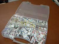
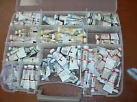 but they were all jumbled. I couldn't make any sense out of the way they were sorted, so I went on a search for a better way to carry my paints.I found this 11" x 15" box at WalMart in the fishing tackle department, called a Plano "Connectable Satchel Stowaway" #3870. It's perfect for all my paints and you can also buy a second one that attaches to this one for more paint or other supplies. The dividers are adjustable for 5-22 compartments. The case itself is very lightweight with a carrying handle. I don't remember what I paid for them, but it was very reasonable--under $25 for both, I think. I'm glad I don't have to face my new class with a handful of plastic bags, when I'm trying to teach them something about organizing and understanding color!
Labels: art supplies, exploring color, tutorials, watercolor
posted by Nita at 11:44 AM
1 comments
![]()
![]()
Labels: books, editing, exploring color, writing
posted by Nita at 7:24 PM
0 comments
![]()
![]()
Labels: color, color mixing, color theory, color wheel, exploring color, split primary, tutorials
posted by Nita at 9:28 AM
0 comments
![]()
![]()
Labels: color, exploring color, tutorials
posted by Nita at 8:51 AM
2 comments
![]()
![]()
Labels: art supplies, exploring color, tutorials
posted by Nita at 5:25 PM
0 comments
![]()
![]()

I've been painting and teaching watercolor since the 70s. My bestselling books on color, collage and creativity are published by North Light Books. Please visit my website www.nitaleland.com .