Seeing Red
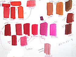
 Last Monday we explored reds in watercolors, as we did last week with blues. Here's the chart that I did in class, explaining the paint characteristics of each pigment and the relative temperature as I went along. I let the class help me decide where a color belongs. I wish we had full-spectrum lighting in our classroom, because the colors tend to look "off" and I have to remember to mention this. Lighting makes a huge difference when you're exploring colors.
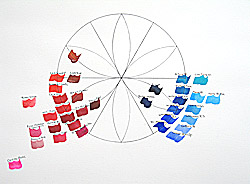
This color wheel gives a better idea of where the colors fit in the continuum around the wheel. The ones on the circle are the best match I can make to the ideal colors. There may be better ones, but I'm just using the ones I have. The colors toward the center are darker, earthier variations of the wheel color. The center color will be black. Around the edges are variations of the main colors, some with weaker tinting strength. Way out at the edge on the left is Opera Rose, a color that is fluorescent and doesn't really fit with the others.
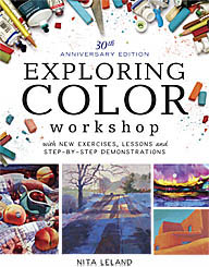
The completed color wheel is shown in my Exploring Color book, first published in 1985 and revised in 1998.
Labels: color, color wheel, exploring color, full spectrum, paint, temperature, tutorials, watercolor


1 Comments:
Love your color days! I have never taught just one color per day and only rarely do full spectrum as you do. I'm gonna try it.
Post a Comment
<< Home