l s

Thursday, December 28, 2006

Rembrandt and the Golden Age of Dutch Art

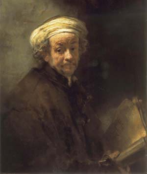
My son and I took in the Rembrandt exhibition at the Dayton Art Institute yesterday. For some reason I expected a small show, but it's a blockbuster and truly awesome. I tried to imagine the very small geographic area of the Netherlands as I studied paintings by the many skilled seventeenth-century artists on display in the show. Room after room of marvelous artworks, curated by subject, beginning with portraits of amazing depth and intelligence. The still lifes are rich and engaging, the landscapes luminous and atmospheric. Genre paintings of biblical times and contemporary life close the exhibit with Rembrandt's "Denial of Peter" as the dramatic finale. Interspersed in smaller spaces between painting exhibits are Rembrandt's etching and engravings, which are a worthy show unto themselves: "amazing" is all I can say about these small works. (Some have magnifying glasses attached to the wall for closer examination--what a great idea. Next time I go to a print show, I'll take my own.) There is still time until Jan. 7 to see the show in Dayton, so don't miss this rare opportunity to see works by the greatest of the great, Rembrandt. The show will move to Phoenix, Arizona and Portland, Oregon. For more about the artists and art, click the link above.

Labels: , , , ,

Friday, December 08, 2006

More Art Book Reviews

ranson skiesRon Ranson on Skies (Studio Vista, 1998) is for landscape painters in any medium who love to feature skies. The book shows techniques mostly in watercolor, but does include instruction on some other media, along with excellent photographs of cloud formations and many wonderful sky paintings. This is a great reference for landscape painters. I'm a sky freak myself and love paging through this book to look at the photos and paintings.


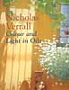
color&light in oilsColour and Light in Oils by Nicholas Verrall and Robin Capon (Batsford, 2004). The pages on Understanding Oils are very informative and user friendly, even to a beginner in oils like me. There aren't many swatches for visual comprehension, but the artwork throughout is dazzling, but not overwhelming as a possible goal for an artist to strive for. Verrall and Capon cover painting color and light, different types of subject matter and the working process, with a few demos scattered throughout the book in two or three stages.


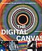
digital canvasThe Digital Canvas: Discovering the Art Studio in Your Computer. (Abrams Studio, 2006.) This book by Jonathan Raimes almost makes me want to sell all my painting gear and just play with my computer. It's dazzling and I really think I could do it with this book as my text. The book has page after page of brilliant color effects with simple computer screen shots to show the tools for achieving them. Probably not for beginners, but definitely for creative computer artists.


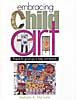
embracing child artBarbara McGuire has written Embracing Child Art. (Krause, 2001) to give adults ideas on how to encourage a child's natural creativity and ultimately help them to make a few treasured objects. There are wonderful suggestions for guiding Little Artists and helping them create projects with their own art to last a lifetime. The best part of the book is page after page of wonderful examples of child art.


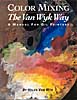
van wyk color-mixingHelen Van Wyk's Color Mixing the Van Wyk Way: A Manual for Oil Painters (Art Instruction Associates, 2000) has quickly become a classic since it was first published in 1995. She keeps the color concepts simple, emphasizing primarily color temperature and comparing a few basic palette choices for simple still lifes and portraits. This book would help beginners in oils to understand their colors and master color mixing of specific pigments.


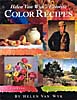
van wyk color recipesHelen Van Wyk's Favorite Color Recipes. (Art Instruction Associates, 2000) expands somewhat on the previous book and introduces a greater variety of subjects with color recipes in oil paints that are her recommendations for painting them. This book ale effects in this book are understood, the painter would be well advised to develop a more personal palette of colors.


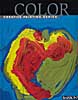
barron's colorBarron's Creative Painting Series: Color. (2005) by Gemma Guasch and Josep Asunción contains a wealth of useful information on color and numerous beautiful reproductions of masterpieces to illustrate the use of color throughout art history. I love that part of the book, but I don't think the demo paintings do it justice. Maybe it's just the design of the book. Check it out, though, because it has a lot to offer.

Once again, thanks to McCallister's Art Store for providing books for my reviews.

Labels: , , , , , , , , , , , , , , , ,

Wednesday, December 06, 2006

Art Book Reviews

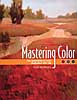
Vicky Murry's Mastering Color: The essentials of color illustrated with oils. (North Light, 2006) This book offers solid color theory applicable to all media. The book is beautifully illustrated with swatches and paintings by the author. The section on supplies and equipment is concise with a nice comparison of different ways oil-painting techniques--direct, indirect, plein air and alla prima. The basic palette is limited and very effective. There's a nice little section on color schemes, a subject often neglected in painting books. Murry explores individual colors and introduces a few design concepts, with a variety of helpful hints along the way.


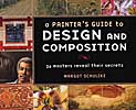
A Painter's Guide to Design and Composition by Margot Schulzke (North Light, 2006)includes the work of twenty-six contemporary masters who describe their process of designing their artwork. This is a beautiful book with lots of demos and color illustrations, but I find it a little confusing. The design-and-composition objective tends to get lost in the plethora of different techniques. I enjoyed reading it, but probably won't include it in my personal art library.


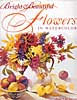
I love Jean Uhl Spicer's book, Bright & Beautiful Flowers in Watercolor (North Light, 2004.) If I were a flower painter, this is how I would want to do it. Spicer's supplies and equipment section is concise and complete. Her basic palette of colors is fairly limited and well balanced. The chapter on color covers the basics in such a way that I think beginners can grasp the concepts quickly. The chapter on composition isn't quite as accessible, but the remainder of the book, which includes various transparent watercolor techniques, tips and demonstrations, is very good. Way to go, Jean.

Labels: , , , , , , , , , ,

Friday, September 08, 2006

Mini Book Reviews

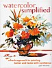
  • Having had an opportunity recently to take a second look at watercolor simplifiedWatercolor Simplified by Pat Weaver, I decided to update an earlier review. As I said before, the book may be a bit intimidating for beginners. The photos of the artist's studio are a bit too much for a "simplified" approach to watercolor. The supplies are basic, but the text seems to assume that you already know how to use watercolor. There are discussions of the Golden Mean and a good section on drawing, with emphasis on planning and value sketching. More for intermediates, I think, but rich with useful material for that level. I do admire Weaver's bold way with watercolor.


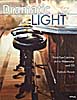
  • dramatic_lightDramatic Light: Paint Eye-Catching Art in Watercolor and Oil strikes me as a good book for artists looking to incorporate light effects in their work without laboring over every facet in a crystal vase or every ripple in the water. In other words, Patrick Howe makes painting light doable for most painters in watercolor and oil. After a good section on Preparing and Planning, which includes many tips and techniques, Howe covers Transparency, Translucence, Luminosity, Light and Reflection with demonstrations and mini-demos. The text is easy to understand and the demos illustrate the text well. The conclusion includes material on the business of art. This one is a keeper.
  • Labels: , , , , , , , ,

    Wednesday, August 30, 2006

    Catching up on my reading

    I've been so busy with my own book that I've fallen behind in writing reviews for books I've read. So I'm in "review mode." I posted two reviews this morning, but I'm up to seven now, so scroll down to see what's new.
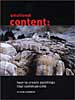
    Gerald Brommer In Emotional Content: How to Create Paintings That Communicate Gerald Brommer discusses the differences between classic, intellectual and romantic approaches to painting. The key question is "What do you feel?" for the artist who wishes to paint more expressively. Select and edit your subject, making mini-thumbnails to record your impressions. Brommer emphasizes the importance of sketching to explore the subject, using color and temperature dominance and tonal values and textures. Watercolor collage is used in demonstrations. A sense of place, mood, weather and season can all contribute to the emotional content of your work. Brommer's books are always filled with useful tips and techniques.
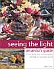
    Betty CarrSeeing the Light: An Artist's Guide. by Betty Carr shows you how to create depth, form and atmospheric light in watercolor and oil paints. Carr is adept at both, as you can see from this beautifully illustrated book. Supply lists are detailed for both watercolors and oils, including advice on plein air necessities. In both media there are exercises and step-by-step demos that are clear and easy to follow. Carr advises you to learn to think in three dimensions, to observe light on form and to use value sketches to help you see light and shadow on a subject. She recommends simplification of shapes and value patterns. This is a good book withi lots of information and helpful tips.
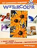
    Carol CooperCarol Cooper's book, Watercolor: No Experience Required, is an easy guide to getting started in watercolor. The supply list is basic and very good, except that it allows cheap pan colors, which I don't think is a good idea, even for beginners. Also, the beginner doesn't need so many colors; a maximum of seven should do the job, if they're the right colors. A workspace layout is shown that could be helpful to the beginner. There are numerous well-done illustrations, including hands-on photos. Demos are simple and doable. Subject matter includes landscape, flowers, still life and textures. Composition is given very little attention, but the section on color, though brief, is clear. This is a good basic book that doesn't confuse beginners with fancy techniques and tricks.
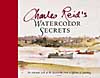
    Charles ReidWatercolor Secrets by Charles Reid is the work of a master painter. The book is filled with many sidebars of tips and tricks for Reid's spontaneous style of painting and is lavishly illustrated with sketches from his watercolor sketchbooks. His distinctive, personal approach is clear throughout in subjects of all kinds, both indoor and plein air. His supply list is brief, but more than adequate. This beautiful book is not for the beginner in watercolor technique, but it's a joy to behold.
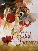
    susanna spannPainting Crystal and Flowers in Watercolor by Susanna Spann is filled with her stunning artwork and many mini-demos throughout. The book includes a detailed list of supplies, but it's clear from the beginning that this book is not for the spontaneous watercolor painter. The primary subject is special effects in still life using watercolor. Design and color are touched upon, along with painting from photographs, marketing and exhibiting. The strongest point in Spann's book, in my opinion, aside from her magnificent artwork, is her emphasis on doing thumbnail sketches to plan paintings.

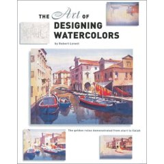
    John LovettJohn Lovett's The Art of Designing Watercolors is subtitled "All you need to know to create more powerful paintings." The book contains demos and many illustrations throughout with an emphasis on design. From the "hows and whys of design" to tools of design (the elements and principles) and design tools in action, Lovett covers the essentials very well. Only one page is designated for supplies, so beginners need to look elsewhere to understand the basics. However, this book is a good one for an artist who needs to understand how to incorporate structure into pictures for more effective expression.
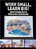
    work small learn bigWork Small, Learn Big!: Sketching with Pen & Watercolor is an International Artist Publishers' collection of preparatory studies by seventeen artists from around the world. The book is a compilation of sketches backed up by photographs and slides, emphasizing the importance of these preliminary works to the execution of fine artwork. There are numerous illustrations and step-by-step demos. Each artist has distinctive choices of materials and media. Styles range from loose and spontaneous to highly detailed with many notes. Selling tips and artists' bios are included. One of the most important messages in the book is that "Mistakes don't Matter" in the sketchbook.

    Thanks to George Bussinger at McCallister's Art Store for making these books available for review.

    Labels: , , , , , , , , , , , , , , ,

    Sunday, August 27, 2006

    American Art Review

    I've been reading the August, 2006, edition of American Art Review. It's one of the best art mags I've read in some time. Several fine recent exhibitions at smaller museums are discussed, including lavish illustrations. I was drawn to it because of a review of the Georgia O'Keeffe exhibition in Vermont's Shelburne Museum (through Oct. 31, which my son viewed and gave high praise.) I was pleased to find Emily Carr in the same issue at the National Gallery of Canada in Ottawa until September 4. The Carr exhibit will travel throughout Canada until 2008. Next stop is Vancouver Art Gallery, opening October 7. There are many other interesting reviews, including Winslow Homer (Museum of American Art at Giverny), Thomas Moran (National Museum of Wildlife Art, Jackson, Wyoming,) and Painters of the Desert Southwest (Booth Museum, Cartersville, Georgia). I'm looking forward to reading the article on Harry Leith-Ross, whose paintings are at James Michener Art Museum in New Hope, Pennsylvania. "Poetry in Design" is the title of the exhibition and from the illustrations in the magazine, this appears to be a fine display of designed realism by an artist new to me.

    Labels: , , , ,

    Tuesday, August 15, 2006

    Painting Shadows

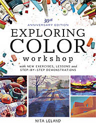
    Yesterday's watercolor class was a brief course in light and shadow. I showed them the text and diagrams on pp. 114-116 in Exploring Color . These pages describe how shadows are a translucent veil that allows the color underneath to show through. Shadows can be a neutral gray color, cool blue or violet, or a warm color suggesting the bouncing sunlight. Next we looked at pp. 68-69 in The New Creative Artist which include definitions of qualities of light from highlight through shade, reflected light and shadow.

    Then I talked about perspective in shadows and how they are harder-edged and darker at the base of the object and become gradually softer and lighter in value as they move away from it. I stressed the importance of establishing at the start where the light is coming from. In plein air this involves careful observation and being aware that the light is changing as you work. You can paint your shadow pattern first in neutral monochrome and then glaze the colors on top. If you're working from photographs or sketches, careful observation is equally important. And if you're changing the light source, you must be constantly aware of how that affects every aspect of the subject. We also talked briefly about how shadows help to describe the surface of a subject, where hard edges suggest corners and soft edges indicate soft contours. This is true of any subject from figures to landscape. Shadows are key to the illusion of reality in your picture.

    Labels: , , , , , , ,

    Monday, September 26, 2005

    Fabrications by John Emery

    Last week I saw the most amazing exhibition of watercolor paintings I've seen in recent years. John Emery does what he calls "watercolor constructions," a combination of trompe l'oeil painting and three-dimensional paper sculpture. Emery does everything with paper and paint, but you would swear you're looking at a small animal's skull on a window sill with an assortment of real bird's nests.

    Emery paints still lifes of aged leather journals, making the textured watercolor paper look exactly like old leather covers. He carefully crafts life-sized pens with nibs that look like metal. The journals are written in calligraphic hands in the manner of days gone by. One of his pieces includes an old "wooden" watercolor paint box with cakes of dried paint in the wells. Well, actually, paper painted to look like dried paint.

    In addition to his meticulous craftsmanship in his constructions Emery is a skilled watercolor painter, using richly pigmented washes in the backgrounds of his works. His plein air paintings are a striking contrast to the constructions. They are small, very transparent and painted authoritatively with a large brush. Visit John Emery's web site to see a few of his works. Remember that everything you see is made of paper!

    Labels: , , ,