l s

Tuesday, August 19, 2008

McCallister's Art Store

I spent more time and money than I planned at the store this morning. It was sad to see things less than perfectly displayed, but I soon discovered that there are still some fantastic bargains to be had. Everything in the store is 57% off this week. Why 57%? George says that's how old he is, so why not?

I bought a few tubes of W&N watercolors, some Zoltan Zabo watercolor paper and four clever art aprons to sell on my web site. He had 5 copies of The New Creative Artist, which I knew I could sell, so I bought those, too. As I strolled the aisles, I realized how much stuff I have in my studio that I haven't used in ages, so I wasn't as tempted as I might have been. I had to stay away from the paper aisle, though. McCallister's has always had the best paper selection I've seen anywhere, and there is still a lot of gorgeous paper there. This would be the time to stock up, except I already have drawers of it collected from previous trips down that aisle. The Golden acrylics are all gone with the wind. There are still lots of Holbein products at this great price. This would be a great time to buy a nice portfolio carrier for artwork, a really good tote or carrier for supplies.

I said goodbye to everyone, but I'll probably go back the last week and maybe even walk down the paper aisle, if the price is right.

Labels: ,

Stepping off the pincushion

Might as well, since I learned yesterday that the books-in-house date for Confident Color has been moved to September 18, three weeks later than previously announced. Maybe that's a good thing, giving me more time to do some publicity. I've fallen behind on everything because of workshops and family obligations.

The workshop at Peninsula Art School in Door County, Wisconsin, was great. What a fabulous facility and beautiful area. I seldom have an opportunity to see much of an area when I'm teaching, but I did manage to drive up the west coast of the peninsula and see some of the beautiful little towns, beaches and marinas. I've heard there are a lot of lighthouses there, but I never saw one. The art school is worth investigating, as they have a well rounded program, including painting, drawing, metal work, classes, workshops, lectures and much more. My workshop was a three-day crash course in color and design, working with collage and monotype techniques. The students worked hard and it looked like they were enjoying themselves.

My regular baby-sitting duties have ended and my days have already filled with other activities. I will so miss the our baby boy's sloppy hugs, wobbly walking around the furniture and wild rides across the kitchen floor in his walker. He'll be a year old on Saturday and I don't imagine he'll admire his birthday cake with restraint once he has tasted chocolate.

I'm going over to McCallister's Art Store for the last time today before they close. I've been putting it off because it makes me sad. I feel bad for the owners and for the artist patrons who have stuck with them for so many years.

Labels: , , ,

Sunday, July 13, 2008

End of an era

McCallister's Art Store is closing its doors. I've had a fifty-year association with the store, originally called Ken McCallister's. When we returned from France, my husband's mother sent me there to have some pictures framed, which was the principal business of the relatively new store. Off to the side was an area that displayed art supplies, but I didn't have any need for them then. Nearly everything I have on my walls was framed at McCallister's. When I began to paint in 1970, I bought my supplies and frames there. Ken expanded and built a new building next door and later on, the older one was retrofitted for workshops. The current owner, George Bussinger, was just a kid when he started working with his father and Ken McCallister at the store. George has always been an enthusiastic supporter of the arts in the area, donating supplies and gift certificates for exhibitions and giving discounts to students. He served on the board for many years and as chairman of the National Art Materials Trade Association and is highly thought of in the industry. It saddens me to see this happen. A combination of factors contributed to George's decision to liquidate. Even though his store has been the best in the tri-state area for many years--and a real candy-store to artists who love to browse among paints and palettes--the advent of big-box craft stores and online art retailers hit most independent stores hard. McCallister's had another disadvantage, a result of Ken's decision to expand on his site rather than moving to a locale more friendly to his clientele. And now, with soaring gas prices, artists are reluctant to go across town on an impulse to browse and buy art supplies. George hasn't decided what he'll do next, but he has several options and I do wish him the best. Starting this week, everything in the store is on sale at 25% off and bigger cuts are coming as the inventory is sold down.

Labels: ,

Friday, December 08, 2006

More Art Book Reviews

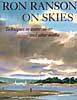
ranson skiesRon Ranson on Skies (Studio Vista, 1998) is for landscape painters in any medium who love to feature skies. The book shows techniques mostly in watercolor, but does include instruction on some other media, along with excellent photographs of cloud formations and many wonderful sky paintings. This is a great reference for landscape painters. I'm a sky freak myself and love paging through this book to look at the photos and paintings.


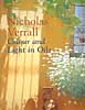
color&light in oilsColour and Light in Oils by Nicholas Verrall and Robin Capon (Batsford, 2004). The pages on Understanding Oils are very informative and user friendly, even to a beginner in oils like me. There aren't many swatches for visual comprehension, but the artwork throughout is dazzling, but not overwhelming as a possible goal for an artist to strive for. Verrall and Capon cover painting color and light, different types of subject matter and the working process, with a few demos scattered throughout the book in two or three stages.


digital canvasThe Digital Canvas: Discovering the Art Studio in Your Computer. (Abrams Studio, 2006.) This book by Jonathan Raimes almost makes me want to sell all my painting gear and just play with my computer. It's dazzling and I really think I could do it with this book as my text. The book has page after page of brilliant color effects with simple computer screen shots to show the tools for achieving them. Probably not for beginners, but definitely for creative computer artists.


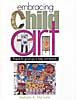
embracing child artBarbara McGuire has written Embracing Child Art. (Krause, 2001) to give adults ideas on how to encourage a child's natural creativity and ultimately help them to make a few treasured objects. There are wonderful suggestions for guiding Little Artists and helping them create projects with their own art to last a lifetime. The best part of the book is page after page of wonderful examples of child art.


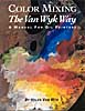
van wyk color-mixingHelen Van Wyk's Color Mixing the Van Wyk Way: A Manual for Oil Painters (Art Instruction Associates, 2000) has quickly become a classic since it was first published in 1995. She keeps the color concepts simple, emphasizing primarily color temperature and comparing a few basic palette choices for simple still lifes and portraits. This book would help beginners in oils to understand their colors and master color mixing of specific pigments.


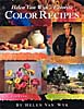
van wyk color recipesHelen Van Wyk's Favorite Color Recipes. (Art Instruction Associates, 2000) expands somewhat on the previous book and introduces a greater variety of subjects with color recipes in oil paints that are her recommendations for painting them. This book ale effects in this book are understood, the painter would be well advised to develop a more personal palette of colors.


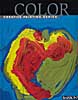
barron's colorBarron's Creative Painting Series: Color. (2005) by Gemma Guasch and Josep Asunción contains a wealth of useful information on color and numerous beautiful reproductions of masterpieces to illustrate the use of color throughout art history. I love that part of the book, but I don't think the demo paintings do it justice. Maybe it's just the design of the book. Check it out, though, because it has a lot to offer.

Once again, thanks to McCallister's Art Store for providing books for my reviews.

Labels: , , , , , , , , , , , , , , , ,

Wednesday, August 30, 2006

Catching up on my reading

I've been so busy with my own book that I've fallen behind in writing reviews for books I've read. So I'm in "review mode." I posted two reviews this morning, but I'm up to seven now, so scroll down to see what's new.

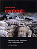
Gerald Brommer In Emotional Content: How to Create Paintings That Communicate Gerald Brommer discusses the differences between classic, intellectual and romantic approaches to painting. The key question is "What do you feel?" for the artist who wishes to paint more expressively. Select and edit your subject, making mini-thumbnails to record your impressions. Brommer emphasizes the importance of sketching to explore the subject, using color and temperature dominance and tonal values and textures. Watercolor collage is used in demonstrations. A sense of place, mood, weather and season can all contribute to the emotional content of your work. Brommer's books are always filled with useful tips and techniques.

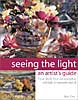
Betty CarrSeeing the Light: An Artist's Guide. by Betty Carr shows you how to create depth, form and atmospheric light in watercolor and oil paints. Carr is adept at both, as you can see from this beautifully illustrated book. Supply lists are detailed for both watercolors and oils, including advice on plein air necessities. In both media there are exercises and step-by-step demos that are clear and easy to follow. Carr advises you to learn to think in three dimensions, to observe light on form and to use value sketches to help you see light and shadow on a subject. She recommends simplification of shapes and value patterns. This is a good book withi lots of information and helpful tips.

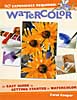
Carol CooperCarol Cooper's book, Watercolor: No Experience Required, is an easy guide to getting started in watercolor. The supply list is basic and very good, except that it allows cheap pan colors, which I don't think is a good idea, even for beginners. Also, the beginner doesn't need so many colors; a maximum of seven should do the job, if they're the right colors. A workspace layout is shown that could be helpful to the beginner. There are numerous well-done illustrations, including hands-on photos. Demos are simple and doable. Subject matter includes landscape, flowers, still life and textures. Composition is given very little attention, but the section on color, though brief, is clear. This is a good basic book that doesn't confuse beginners with fancy techniques and tricks.

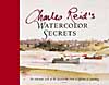
Charles ReidWatercolor Secrets by Charles Reid is the work of a master painter. The book is filled with many sidebars of tips and tricks for Reid's spontaneous style of painting and is lavishly illustrated with sketches from his watercolor sketchbooks. His distinctive, personal approach is clear throughout in subjects of all kinds, both indoor and plein air. His supply list is brief, but more than adequate. This beautiful book is not for the beginner in watercolor technique, but it's a joy to behold.

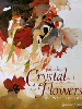
susanna spannPainting Crystal and Flowers in Watercolor by Susanna Spann is filled with her stunning artwork and many mini-demos throughout. The book includes a detailed list of supplies, but it's clear from the beginning that this book is not for the spontaneous watercolor painter. The primary subject is special effects in still life using watercolor. Design and color are touched upon, along with painting from photographs, marketing and exhibiting. The strongest point in Spann's book, in my opinion, aside from her magnificent artwork, is her emphasis on doing thumbnail sketches to plan paintings.

John LovettJohn Lovett's The Art of Designing Watercolors is subtitled "All you need to know to create more powerful paintings." The book contains demos and many illustrations throughout with an emphasis on design. From the "hows and whys of design" to tools of design (the elements and principles) and design tools in action, Lovett covers the essentials very well. Only one page is designated for supplies, so beginners need to look elsewhere to understand the basics. However, this book is a good one for an artist who needs to understand how to incorporate structure into pictures for more effective expression.

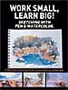
work small learn bigWork Small, Learn Big!: Sketching with Pen & Watercolor is an International Artist Publishers' collection of preparatory studies by seventeen artists from around the world. The book is a compilation of sketches backed up by photographs and slides, emphasizing the importance of these preliminary works to the execution of fine artwork. There are numerous illustrations and step-by-step demos. Each artist has distinctive choices of materials and media. Styles range from loose and spontaneous to highly detailed with many notes. Selling tips and artists' bios are included. One of the most important messages in the book is that "Mistakes don't Matter" in the sketchbook.

Thanks to George Bussinger at McCallister's Art Store for making these books available for review.

Labels: , , , , , , , , , , , , , , ,

Thursday, July 06, 2006

Art retailer's dilemma

I talked to my friend George about the problems with beginners' supplies yesterday, and as I suspected, it was a combination of sticker shock and inexperience. The students did, indeed, present my list, then said they wanted the cheapest materials to fulfill the requirements. Most of the employees there know I hold high standards for supplies, but newer ones made some unacceptable substitutions. Poster paints won't do for a transparent watercolor class! I will definitely have the next class come without supplies so I can indoctrinate them before they go out to buy their materials. Maybe I should work up a chart showing the differences in quality of brushes, papers and paints to make it more convincing. I used to have McCallister's make up kits for me and the students didn't bat an eye at spending $50-60 for it, but it was a problem getting the kits together because I never know how many students I'll have until the first day. Some classes are very small, like this one (10) and some are up to 25. Can't seem to work out the logistics. Anyway, there has to be a better way to do this. Any ideas out there?

Labels: , ,

Friday, May 26, 2006

Lotta art going on

What a great day! I spent the morning with some forty women of the Tri Art Club of Dayton. I've been a member for many years, but haven't been active for awhile because of workshop travel, book-writing, and, of course, baby-sitting my Little Artist. It's a lively group of a wide age-range. Nearly all are active and involved in painting and showing their work. I talked with an eighty-nine-year-old artist who paints and exhibits with her plein-air group and participates in outreach classes with Sinclair community college.

After lunch I went to my favorite retailer's, McCallister's to pick up brushes and see what's new. George Bussinger, the owner, was excited about some new products he found at a recent trade show--pocket-sized sketchbooks with watercolor paper and sumi-ink pencils and brushes. He showed me a retrofitted space at the back of his store that will accommodate on-site workshops and occasional warehouse sales. Speaking of which, the sale is coming up in a couple of weeks--everything in the store will be 25% off! I think this is the best store in the tri-state area, so if you live anywhere near Dayton, it's worth the trip. Check the web site for more information.

Later I went to see the juried show of the Dayton Society of Painters and Sculptors. I had heard both raves and rants about it, but that's usually the way with juried shows. It looked like a pretty good show to me, although I had seen a lot of good paintings in the reject room that might have been my choices. One of the artists in my new book, Lesley Walton, won best-of-show for a very fine pencil drawing.

No more art over the weekend. Must plant annuals. Must trim shrubbery. Must do whatever I can outside, because it's going to be beautiful. I'll save a little time on Sunday to visit Art in the Park at Riverbend Art Center, where I taught watercolor for twenty years before I started teaching national workshops.

Labels: , ,

Thursday, September 29, 2005

How many new colors do we need?

I finally got the 15 new Winsor & Newton watercolors tested that McCallister's Art Store provided me. My tests aren't scientific and my results are subjective. I test for transparency, tinting strength, spreading quality, reaction to salt and staining property.

As I look at my chart, I'm struck first of all by the brilliance of the fluorescent Opera Rose, which is in my mind a gorgeous, though useless, color for watercolor painters. I've seen so few who could handle Holbein's Opera and I try to keep my students away from it. It doesn't reproduce well, as it is out of the gamut for 4-color printing, so artists who use it are invariably disappointed in their color reproductions.

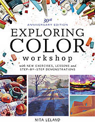
There are some very nice low-intensity pigments that would work well with the low-key palettes in my Exploring Color system of compatible colors. I especially like Potter's Pink, Perylene Green, Terre Verte Yellow Shade and Perylene Violet. Unfortunately, the Perylene Violet isn't even close to Thioindigo Violet, which it supposedly replaces.

Cerulean Blue Red Shade is a nice addition. I used to alternate with other brands when I wanted that color, although it isn't all that different from Cerulean Blue.

Phthalo Turquoise istoo close to Winsor Blue Green Shade to be worth bothering about. It seems to be an attempt to get a one-pigment blue-green, but I'd rather have Rembrandt's Turquoise Blue, a mixed pigment, on my palette to fill that slot. It sits right between Winsor Blue Green Shade and Winsor Green and is one of those colors that makes my heart beat faster. I know I can mix it with WGBS and WBGS but it's wonderful to have it right at hand when I want it.

Lemon Yellow Deep appears to be a rather delicate color, and I like it. I'm afraid it will confuse my beginning students, though, as it doesn't seem to have the tinting strength of Winsor Lemon, which they need for my split-primary color-mixing system. The Turner Yellow may be worth further investigation. It has a softness to it that I like.

Winsor Orange Red Shade is vibrant and might make a nice change from Cadmium Scarlet, which is one of my favorites. But I don't like the Winsor Red Deep, which reminds me of Grumbacher's Cadmium Red Deep, a murky, difficult color in watercolor.

The remaining colors, Brown Ochre, Magnesium Brown, Mars Black and Yellow Ochre Light might have their place on some artists' palettes, but I don't see them anywhere on mine. They're all easily made with mixtures of other earth pigments on the palette. The black is a possible exception. I tend to be biased against black because I've never found a good one in watercolor, so I'll give it a try.

As for the discontinued colors, the only one I'll miss is Thioindigo Violet, as it's such a great red-violet. Perylene Violet is too low-intensity to take its place.

If WN's objective is to "increase the spectrum across the range," there are just two places where I feel they fall short. On my 12-pigment color wheel, made up mostly of Winsor & Newton colors, I use Rembrandt Turquoise Blue for blue-green. None of WN's colors fill that slot, as they are either too opaque or lacking the tinting strength I need. Please note that on WN's 4-color printed chart the representation of Phthalo Turquoise is misleading and looks more like the color I want than the actual paint does. (I know how hard it is to reproduce color with CMYK, but I feel that the current printed chart isn't nearly as accurate as the previous one was.)

At blue-violet I use Old Holland Blue-Violet. This is also a mixed-pigment color, but there is no WN color close to this one. Ultramarine Violet is too red and too weak in tinting strength for the colors I use in the expanded palettes in my book, Exploring Color.

Ongoing efforts to improve colors are admirable, but I deplore the continual offering of new colors by some manufacturers as pure marketing that doesn't serve the needs of artists. Students carry around dozens of tubes of colors they don't need and can't use until they've learned basic color mixing. Once they've mastered mixing with six colors, they hardly need any others, as they can mix nearly everything they want. If artists are looking for a magic color, I tell them there is only one: Winsor & Newton Burnt Sienna. If they ever change that one, I may have to give up painting.

That said, it's always fun to play with new colors and now and then something I haven't used before jumps onto my palette and stays for awhile. Nothing wrong with that, as long as it works.

Labels: , , , , , , , ,