l s

Tuesday, May 13, 2008

The Color Wheel

Charley Parker at Lines & Colors blog has a great article on The History of the Color Wheel with lots of interesting links. Check it out. The color wheel is one of the artist's best tools for learning and working with color. Not everyone agrees, but I haven't found anything that works better for my purposes.

Labels:

Sunday, April 22, 2007

Book Review: PowerColor

Caroline Jasper's PowerColor: Master Color Concepts in All Media. provides an interesting overview of color concepts not found in many books on color. Personally, I enjoy reading the scientific and historical information. When I wrote my first Exploring Color book (1985) such material was hard to find and took diligent research and a lot of winnowing to cut the information down to size for the first two chapters of my book. When I revised Exploring Color: How to Use and Control Color in Your Painting (1998), I was asked to compress it into fewer pages and had to give up most of that material in order to concentrate on the practical tasks of learning about paint characteristics and using them in artwork. I'm glad to see a fresh book that includes summaries of this interesting background information. I don't agree with her on color wheels and find their use inconsistent in the book, but it's theory, and she's entitled to her opinion. Jasper features several artists in their studios with step-by-step demos of their work. The book includes a broad spectrum (pun intended, sorry) of styles and is lavishly illustrated in color.

Labels: , , ,

Tuesday, February 06, 2007

Request for paint names on the color wheel

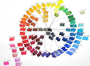
A blog reader asked me to post a larger version of the pigment color wheel so she could read the labels on the colors. Believe it or not, it's better if you don't know the names. The value of the exercise is in using your own paints and testing them to see where they fit on your color wheel. When you buy new colors, before adding them to your palette, add them to your pigment wheel so you can see their relationship to your other colors. Paints with the same names may be very different in various brands. Not only that, what you see on the monitor or in a printout is not a true match for the actual paint color.

I've blogged before about split-primary color-mixing, which may help you if you're struggling with mixing. You'll find just about everything else you need to know about color mixing in Exploring Color. There's even a pigment wheel with color labels on it. Just remember, the printed colors aren't matches for the pigments.

Labels: , , , , ,

Friday, February 02, 2007

The pigment color wheel is finished

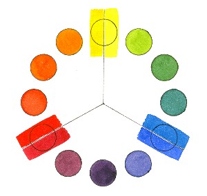
Finally I've finished the watercolor wheel I started for my class several weeks ago. I did blue first, then added red the following week and yellow a week later. (Click on the "color wheel" label below to see the three work sheets and watercolor wheels that I painted last month.) Today I filled in orange, green and violet secondary colors and the neutrals in the center. I finished it in my studio so the class wouldn't lose painting time next week. I'll show them the finished wheel, explain a couple of things and they can examine it more closely later if they wish. Mind you, I'm not advocating having or using all these colors. I want to show that there's a continuum around the color wheel that reveals temperature relativity from one color to the next. This is a good exercise for your "color eye," to see if you can distinguish between warmer and cooler colors and see how their neighbors on the wheel influence their temperature. The colors around the perimeter of the wheel are mostly high tinting-strength, high-intensity colors. Except for a few colors in the red area, outside the perimeter are the low tinting-strength, high-intensity colors. Inside the wheel are the low-intensity colors and neutrals.
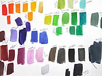
Here's the test sheet for the colors I did today. It doesn't matter whether you make a wheel or swatches, but this is a good way of learning about your paints. As I said in an earlier post, the color wheel above is similar to the one I made for my first Exploring Color book, published in 1985.
Labels: , , , , , , ,

Sunday, January 28, 2007

Exploring Color for Kids

On reading my recent blogs about comparing color temperatures, Laura Lemley of Potomac Valley Watercolorists in the Washington, DC area, emailed the following (used with her permission):

In addition to painting, I teach children 6 to 18 years old. They are just as excited as your adults to learn to recognize the warm to cool range in watercolor paints. I started the 8 weeks of lessons with the color wheel…they learned color mixing for the colors other than primaries. First they arrange all my tubes of a particular color from warm to cool by guessing. The color stripe and name sometimes give them clues. I take off all the caps and I read the name of the color to them as they take turns painting a ½” wide stripe from pure to tint on a “chart” (long narrow strip of watercolor paper. When they see that one is out of place, we mark it to be cut and put in the correct order. Afterwards they select three they like from the chart and do a painting. There was an outstanding painting of a brown red horse in an orange red tall grass field with a warm red tinted sky by an eight year old! The older children chose to make a pop art collage of red objects from magazines to make a bouquet including tints, pure color and shades. If you have any teachers who need ideas, you might pass along my enthusiasm for painting color with your guidance!

What a fun way for kids--or anyone--to play with color. Thirty years ago one of my boys took an introductory art course and they painted one color in each class, attempting to make a perfect color wheel by the end of the semester. No wonder he hated art class! (He turned out to be a fantastic potter, though.)

Labels: , , , , , ,

Tuesday, January 23, 2007

Yellow hits the charts


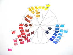
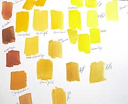
Yesterday we explored yellow watercolor paints, working at discerning between the warm and cool yellows. We all know that yellow is a warm color, but which are warmer and which cooler? Some of them are very close and will no doubt differ between brands. I added in several earth colors, some of which ended up closer to orange than yellow, so that's where I put them on the wheel below.

On the chart above the cool yellows are on the right of the paper and the warms on the left. On the color wheel at right the cool ones are heading toward blue (right) and the warm ones are heading toward red (left). When you're mixing colors, yellow is a hard color to darken without changing it into a greenish-olive or a muddy brownish color. It sometimes works better to use the yellows and yellow-oranges in the earth colors toward the center of the wheel to darken yellows. The mixtures are richer.

Labels: , , , , , ,

Sunday, January 21, 2007

Seeing Red

Last Monday we explored reds in watercolors, as we did last week with blues. Here's the chart that I did in class, explaining the paint characteristics of each pigment and the relative temperature as I went along. I let the class help me decide where a color belongs. I wish we had full-spectrum lighting in our classroom, because the colors tend to look "off" and I have to remember to mention this. Lighting makes a huge difference when you're exploring colors.
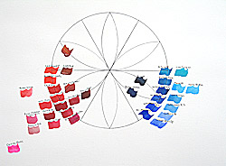
This color wheel gives a better idea of where the colors fit in the continuum around the wheel. The ones on the circle are the best match I can make to the ideal colors. There may be better ones, but I'm just using the ones I have. The colors toward the center are darker, earthier variations of the wheel color. The center color will be black. Around the edges are variations of the main colors, some with weaker tinting strength. Way out at the edge on the left is Opera Rose, a color that is fluorescent and doesn't really fit with the others.
The completed color wheel is shown in my Exploring Color book, first published in 1985 and revised in 1998.

Labels: , , , , , , ,

Monday, January 08, 2007

Singin' the Blues

We almost had a full house for the first session of Exploring Watercolor at Hithergreen Center today. Twenty-one returning students, three newbies, one absentee recovering from surgery and one perpetual absentee. (Don't ask.) I decided to get them more involved with different paints. Most have been with me for two or more years and have had the basic color-mixing exercises. Some have tried other colors and others are still using the basic palette. So today we started with the blues. I should have organized the chart, but just put the colors down as I talked about them, so I hope I can reconstruct the thing and tell you the colors in the accompanying illustration.

Top row: Cobalt Blue, Phthalo Turquoise
Second Row: Winsor Blue (Red Shade), Winsor Blue (Green Shade), Cerulean Blue (Red Shade), Cerulean Blue, Ultramarine (Green Shade)
Third Row: Cobalt Turquoise Light, Manganese Blue Hue, Manganese Blue (genuine), Rembrandt Turquoise Blue, Cobalt Blue, French Ultramarine
Fourth Row: Cobalt Blue Deep, Indigo, Indanthrene Blue, Cobalt Blue Deep
Please note that web colors cannot accurately represent paint colors, so the colors shown aren't exact matches for the chart.

We talked about color temperature, discussing the positions of the blues relative to blue-green, which in theory is the coolest color on the color wheel. I also talked about the transparency or opacity, staining property and tinting strength of each pigment. You will find more information on these properties of paints on my web site here and here, and also in my book, Exploring Color.

This was great fun for me and the class asked great questions. Several said they're looking forward to a new color next week.

We're going to do a color per week for awhile to familiarize them with those they haven't used yet. By the time we're finished, they should be able to find the right place for any color they choose.

Labels: , , , , , , ,

Thursday, July 27, 2006

Learning color mixing in watercolor


Yesterday my beginners had their first adventure with color. They've been practicing washes and brushstrokes, textures and values for three weeks using only Payne's Gray. It's just too confusing to try to figure out color when you haven't learned to handle a brush. Because they're all doing homework and seem to be "getting it," we worked on color theory and mixing a week earlier than usual. I demonstrate my split-primary color-mixing system, painting a color wheel with six colors, while I explain the principles that make it work. They all did a pretty good job of painting their own wheels following the demo. The usual problem is using too much water and weakening the saturation of the hues on the wheel. Their homework this week is to play with colors. It will be interesting to see what they bring in for show-and-tell next week.

Labels: , , , , , , ,

Friday, April 28, 2006

Book reviews on pouring watercolors

  • Pouring Light Jean Grastorf's Pouring Light: Layering Transparent Watercolor focuses entirely on pouring without tricks and experimental techniques. Grastorf's demos are very well done. One of the later demos, "Shell Beach," would have made a good first demo of the processes. The opening pages on supplies and materials are thorough. I like her take on design, too. She works with a very limited palette of three colors in most paintings and has an excellent chapter on color (color wheel with yellow at the top. Yay!). Note well her excellent pages on value studies. She describes the masking techniques clearly, but you must pay attention in every demo to how the process works, otherwise you may get "mud" if the colors mingle too much or the pours are of too heavy consistency. This is in my opinion the best of the three books for breaking down the pouring process into doable sequences.


  • How to Make a WC Paint Itself How to Make a Watercolor Paint Itself by Nita Engle is subtitled: "Experimental Techniques for Achieving Realistic Effects." Nita Engle is the Grande Dame of masking-and-pouring in watercolor. Her paintings are far more complex than Grastorf's and Wallake's and create an illusion that is almost photographic without being filled with picky detail. Her palette is unique and she is the absolute master of her colors. She sprays water, throws and squirts paint, spatters, floats and pours colors in sequences for special effects, after having masked key lights and white areas on the paper. This is a text-heavy book loaded with information as well as technique, but well worth the concentration it takes to work it out. Her watercolors are magnificent. I love this book for intermediate to advanced watercolor painters.


  • Watercolor: Pour It On Jan Fabian Wallake's Watercolor: Pour It On is subtitled: "Let Your Creativity Flow Using Dramatic Color Glazing Techniques." The book has many demos and varied illustrations of creative watercolor techniques. Wallake describes at least thirty techniques and texture washes. There is a good section touching on design with rudimentary color (and a skewed color wheel, which drives me nuts). Wallake shows a palette arrangement similar to that of Nita Engle. There isn't as much detail on pouring in Wallake's work as there is in Grastorf's and Engle's. Both of the latter have more subtlety in their work, but Wallake does love vibrant color. Along with an index, there is useful information on showing and selling your work. The author's explanations are clear and illustrations are instructive. The book is very user friendly and helpful to artists who want to loosen up their watercolor techniques.
  • Labels: , , , , ,

    Thursday, March 16, 2006

    Exploring options in color

    I'm always amused when I'm teaching a new class, whether in watercolor, color, collage or design, to find students who firmly avow that they do things in a certain way and aren't about to change. This isn't typical of every class, but now and then one shows up. All I can do is think to myself, "So, why are you here?" I try to be flexible and help them do what they want to do. Sometimes they come around to trying something different and sometimes they don't. We'll see how this plays out in my current color class. Most of the students are working on pigment studies and learning a lot about paint characteristics. A couple have skipped lightly over these, one saying she already knows all that and the other insisting that she is happy with her limited palette and doesn't like all the bright colors, which hurt her eyes. The first I gave an assignment to paint the four seasons using a different set of primaries for each one to better express the qualities of the season through color. She said, "I always use the same colors for all my paintings." Period. End of discussion. I asked her to try it, showing how Phthalo Blue makes a cooler, more wintry sky than French Ultramarine; how Lemon Yellow with Phthalo Blue makes a spring-ier green for trees. She agreed to try it, but I didn't feel she was happy about it. I looked at her sketches about halfway through and could see the seasons revealed in her colors. She finished them off beautifully and I think she was pleased, albeit a little grudgingly. I found the second student looking at pure-hue color wheels in my workbook and holding her head, as if in pain. She says she just wants to learn to use the colors she has. She doesn't think she needs more colors, because she can do what she wants with what she has to mix naturalistic landscape colors. I turned the workbook to a page where six color wheels show different combinations of primaries, including earth hues. In about two seconds she decided she had to have Indigo and maybe a couple other colors on those wheels. I think both are on the way to opening their minds about exploring color options to get more excitement in their work. We'll see in a couple of weeks what the next challenge brings.

    Labels: , , , , , , ,

    Thursday, March 02, 2006

    Exploring basic color theory

    split-primary color wheelI can tell this is going to be a good class. Aside from the fact that four people arrived late (sigh!) and three were on vacation (a given in Ohio in the winter), the orientation went well. Lots of good questions, several aha! moments and a few jaw-dropping, I-had-no-idea reactions to color facts and theories. Great fun for me! I showed slides on the history of color in art because I think it's very helpful to see where color started (30,000 or more years ago) and how it evolved from decorative and symbolic to representational and expressive. I wound up the session with the split-primary color-mixing system from my book, Exploring Color, showed them how to mix the wheel, explaining the theory behind it. They have homework (groan!). Everyone must study the properties of color and do the charts and color wheel. It will be interesting to see how many get it done. Next week we're going to learn all about paint--characteristics of pigments, paint quality, differences in brands, and more. I love this workshop.

    Labels: , , , , , , , ,

    Saturday, December 03, 2005

    Color bias

    Color wheels are based on the properties of light, but pigments aren't pure like light is. Their characteristics vary in transparency, intensity, tinting strength, granulation, viscosity and staining properties. As important as these characteristics are, they aren't the key factor in color mixing. Each pigment also has a distinctive color bias that influences mixtures. Understanding color bias is essential to successful color mixing.

    The dictionary says bias is a "preference or an inclination." When you call Alizarin Crimson a bluish-red, you're saying that it is a red that leans toward blue. Most pigments have such inclinations. Determine the bias in a paint color, and you can control mixtures incorporating that color. For example, to mix a good violet or purple, use a bluish-red and a reddish-blue. A yellowish-red or greenish-blue would add yellow to the mixture and dull the color, because yellow is the complement (opposite) of the color you're trying to mix. Yellow is also the third primary color, so when you want to mix bright colors, make sure there are only two primaries in the mixture.

    For a more detailed explanation of color-mixing see the split-primary color-mixing system on my web site or my book, Exploring Color.

    Labels: , , , , , ,

    Wednesday, November 30, 2005

    The logic of color

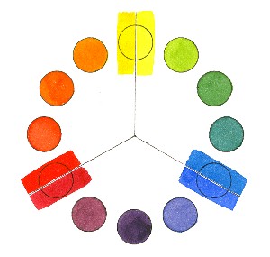
    Newton started it when he connected the ends of the prism to make the first color wheel. Some time later someone else noticed that certain colors, designated "primary colors," could be used to mix other colors in paint. Eventually, another individual discovered the nature of complements, opposites on the color wheel. Understanding these characteristics of color is key to good color in artwork. Some people have an intuitive sense for color, but if something isn't working, they find it hard to solve the problem without going to color theory. Granted, the rules we know about color are "theories," but they're based on principles that work in the real world. There have been hundreds of color theories based on three to six "primaries,"; there are color wheels, color solids, color triangles and color bars. One theory that has stood the test of time is the color wheel based on twelve hues. This wheel gives you the primaries, the secondaries (colors mixed from two primaries) and the tertiaries (colors mixed from a primary and the secondary next to it). If the mixtures don't give you the results you want, it isn't the theory that's at fault--it's the paint. Our pigments aren't pure, spectral colors like the colors of light. Their density and handling characteristics sometimes get in the way. If you want to become a master colorist, study the properties of color, learn the characteristics of your paints and use the logic of the color wheel.

    Labels: , , ,

    Wednesday, October 19, 2005

    Neutral colors--an oxymoron

    Neutrals are achromatic, meaning they have no color. Black, gray and white. Anything else is chromatic, having color, from shocking pink to beige. At least that's how it's stated in color theory. But artists have their own ideas about neutrals and usually this means they're looking for a color bias instead of a flat black, gray or white: a bluish-black, a greenish-gray or a pinkish-white. These are more interesting than the neutrals you find in a tube of flat black or gray paint. So how do you mix exciting neutrals?

    The rule in color theory is that neutral gray or black is the result of mixing two complementary (opposite) colors on the color wheel. It works in theory, but not in paint. Very few colors can be described as exact opposites and almost none are true hues in the color scheme sense. Sometimes you get black or gray when you mix, but often you get brown or umber. The paint colors are actually "near complements" and make a mixture with a bias toward one of the two colors in the mixture. This color combination makes a more vibrant mixture.

    One thing to remember about mixing neutrals is to use only the colors that are already in your painting. Plan your colors before you paint to make sure you can get your full range of values, color and neutrals. Mingle the colors you've chosen. Don't decide at the last minute to throw in a tube neutral or it will stand out like a sore thumb.

    Labels: , , , ,

    Thursday, September 29, 2005

    How many new colors do we need?

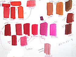
    I finally got the 15 new Winsor & Newton watercolors tested that McCallister's Art Store provided me. My tests aren't scientific and my results are subjective. I test for transparency, tinting strength, spreading quality, reaction to salt and staining property.

    As I look at my chart, I'm struck first of all by the brilliance of the fluorescent Opera Rose, which is in my mind a gorgeous, though useless, color for watercolor painters. I've seen so few who could handle Holbein's Opera and I try to keep my students away from it. It doesn't reproduce well, as it is out of the gamut for 4-color printing, so artists who use it are invariably disappointed in their color reproductions.

    There are some very nice low-intensity pigments that would work well with the low-key palettes in my Exploring Color system of compatible colors. I especially like Potter's Pink, Perylene Green, Terre Verte Yellow Shade and Perylene Violet. Unfortunately, the Perylene Violet isn't even close to Thioindigo Violet, which it supposedly replaces.

    Cerulean Blue Red Shade is a nice addition. I used to alternate with other brands when I wanted that color, although it isn't all that different from Cerulean Blue.

    Phthalo Turquoise istoo close to Winsor Blue Green Shade to be worth bothering about. It seems to be an attempt to get a one-pigment blue-green, but I'd rather have Rembrandt's Turquoise Blue, a mixed pigment, on my palette to fill that slot. It sits right between Winsor Blue Green Shade and Winsor Green and is one of those colors that makes my heart beat faster. I know I can mix it with WGBS and WBGS but it's wonderful to have it right at hand when I want it.

    Lemon Yellow Deep appears to be a rather delicate color, and I like it. I'm afraid it will confuse my beginning students, though, as it doesn't seem to have the tinting strength of Winsor Lemon, which they need for my split-primary color-mixing system. The Turner Yellow may be worth further investigation. It has a softness to it that I like.

    Winsor Orange Red Shade is vibrant and might make a nice change from Cadmium Scarlet, which is one of my favorites. But I don't like the Winsor Red Deep, which reminds me of Grumbacher's Cadmium Red Deep, a murky, difficult color in watercolor.

    The remaining colors, Brown Ochre, Magnesium Brown, Mars Black and Yellow Ochre Light might have their place on some artists' palettes, but I don't see them anywhere on mine. They're all easily made with mixtures of other earth pigments on the palette. The black is a possible exception. I tend to be biased against black because I've never found a good one in watercolor, so I'll give it a try.

    As for the discontinued colors, the only one I'll miss is Thioindigo Violet, as it's such a great red-violet. Perylene Violet is too low-intensity to take its place.

    If WN's objective is to "increase the spectrum across the range," there are just two places where I feel they fall short. On my 12-pigment color wheel, made up mostly of Winsor & Newton colors, I use Rembrandt Turquoise Blue for blue-green. None of WN's colors fill that slot, as they are either too opaque or lacking the tinting strength I need. Please note that on WN's 4-color printed chart the representation of Phthalo Turquoise is misleading and looks more like the color I want than the actual paint does. (I know how hard it is to reproduce color with CMYK, but I feel that the current printed chart isn't nearly as accurate as the previous one was.)

    At blue-violet I use Old Holland Blue-Violet. This is also a mixed-pigment color, but there is no WN color close to this one. Ultramarine Violet is too red and too weak in tinting strength for the colors I use in the expanded palettes in my book, Exploring Color.

    Ongoing efforts to improve colors are admirable, but I deplore the continual offering of new colors by some manufacturers as pure marketing that doesn't serve the needs of artists. Students carry around dozens of tubes of colors they don't need and can't use until they've learned basic color mixing. Once they've mastered mixing with six colors, they hardly need any others, as they can mix nearly everything they want. If artists are looking for a magic color, I tell them there is only one: Winsor & Newton Burnt Sienna. If they ever change that one, I may have to give up painting.

    That said, it's always fun to play with new colors and now and then something I haven't used before jumps onto my palette and stays for awhile. Nothing wrong with that, as long as it works.

    Labels: , , , , , , , ,