 Ron Ranson on Skies
 (Studio Vista, 1998) is for landscape painters in any medium who love to feature skies. The book shows techniques mostly in watercolor, but does include instruction on some other media, along with excellent photographs of cloud formations and many wonderful sky paintings. This is a great reference for landscape painters. I'm a sky freak myself and love paging through this book to look at the photos and paintings.
 Colour and Light in Oils by Nicholas Verrall and Robin Capon (Batsford, 2004). The pages on Understanding Oils are very informative and user friendly, even to a beginner in oils like me. There aren't many swatches for visual comprehension, but the artwork throughout is dazzling, but not overwhelming as a possible goal for an artist to strive for. Verrall and Capon cover painting color and light, different types of subject matter and the working process, with a few demos scattered throughout the book in two or three stages.
 The Digital Canvas: Discovering the Art Studio in Your Computer. (Abrams Studio, 2006.) This book by Jonathan Raimes almost makes me want to sell all my painting gear and just play with my computer. It's dazzling and I really think I could do it with this book as my text. The book has page after page of brilliant color effects with simple computer screen shots to show the tools for achieving them. Probably not for beginners, but definitely for creative computer artists.
 Barbara McGuire has written Embracing Child Art. (Krause, 2001) to give adults ideas on how to encourage a child's natural creativity and ultimately help them to make a few treasured objects. There are wonderful suggestions for guiding Little Artists and helping them create projects with their own art to last a lifetime. The best part of the book is page after page of wonderful examples of child art.
 Helen Van Wyk's Color Mixing the Van Wyk Way: A Manual for Oil Painters (Art Instruction Associates, 2000) has quickly become a classic since it was first published in 1995. She keeps the color concepts simple, emphasizing primarily color temperature and comparing a few basic palette choices for simple still lifes and portraits. This book would help beginners in oils to understand their colors and master color mixing of specific pigments.
 Helen Van Wyk's Favorite Color Recipes. (Art Instruction Associates, 2000) expands somewhat on the previous book and introduces a greater variety of subjects with color recipes in oil paints that are her recommendations for painting them. This book ale effects in this book are understood, the painter would be well advised to develop a more personal palette of colors.
 Barron's Creative Painting Series: Color. (2005) by Gemma Guasch and Josep Asunción contains a wealth of useful information on color and numerous beautiful reproductions of masterpieces to illustrate the use of color throughout art history. I love that part of the book, but I don't think the demo paintings do it justice. Maybe it's just the design of the book. Check it out, though, because it has a lot to offer.
Once again, thanks to McCallister's Art Store for providing books for my reviews.
Labels: art mediums, book reviews, books, child art, color, color mixing, color theory, computer, design, landscape, McCallister's, oil painting, painting, still life, temperature, watercolor, watercolor techniques


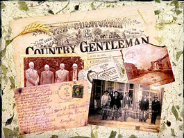 Design is the secret to more powerful artwork. Instead of struggling to make a painting work, learn how to use design principles and color organization to create more expressive art. In this workshop you will try new design ideas in your current media and experiment with monotype, collage and mixed media in a relaxed and fun atmosphere with no competition or pressure to perform. Every day begins with a short demo and ends with a class critique. Activities are based on The New Creative Artist, Exploring Color and Creative Collage Techniques.
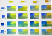 The subject of mixing green comes up several times a year in my classes and workshops. Here's the chart I demonstrated last week in my Hithergreen class on mixing a great variety of greens with the blues and yellows you already have in your paint box. It's worthwhile to take a couple of hours to make this chart so you have a reference for the different greens you can mix, at least until you become really familiar with them by using them often. I use white artist's tape to section the paper into 2-inch squares or slightly larger rectangles. Across the top I put the yellows, one per section: Winsor Lemon, Aureolin, New Gamboge and Raw Sienna are on this chart. Down the left side I place the blues: Cobalt Blue, French Ultramarine, Phthalo Blue Green Shade, and Cerulean Blue. I dampen a square and put a swatch of the yellow in that column in one corner and the blue in the row in the other corner. Then I mingle the two colors on my palette and place the mixture at the bottom of the section, teasing the colors up into the pure colors so I get variations of the mixture throughout. The chart includes spring, summer, late autumn, bright, misty, foggy and sea greens with just one blue and one yellow in each mixture. Before you begin a painting, see if you can find the greens you need on the chart and include those colors in your palette. See also my blog on
 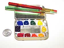 I finally found a use for my mini Altoid palettes. Today I visited an artist friend who is in rehab for a serious illness. She can't walk yet, but until she can, she is able to sit in a chair and chat or read. Dottie is a painter of bright, sunny watercolors and I would love to see her painting again soon. I gave her one of my Altoid boxes, several small brushes, a 5" x 7" pad of 140# watercolor paper, and an empty box for water. Everything fit into two small Ziploc bags. Her eyes lit up when she saw the paints.
  Subtitled "The Complete Guide to Color Theory and Application," Tom Fraser and Adams Banks's book
 Somebody in my class asked me a couple of weeks ago how to do this. Not that it's a great idea, because rainbows are so variable and tend to look hokey in your paintings, unless you happen to be J.M.W. Turner. Nevertheless, yesterday I showed them a way to do it in watercolor just by blending clean, diluted pure colors on slightly damp paper. It isn't hard to make a rainbow, but to put one in a painting and have it look realistic is a whole different thing. That takes practice. My first recommendation is to Google "rainbows" and see what they really look like. Most of them aren't complete. The colors are brighter near the ground, then they often disappear before the arc is completed. And red is always at the top, with violet at the bottom (and often hard to see). If there's a second rainbow reflected above it, the colors are reversed. And just in case you learned ROYGBIV when you were in grade school, there is no "I" for indigo in the spectrum, therefore it's actually ROYGBV. Newton must have been having a mystical moment when he described the colors--had to have seven, as in the days of Creation and notes on the musical scale.
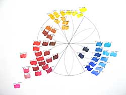
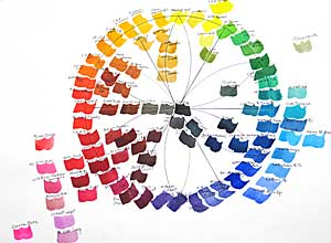 Finally I've finished the watercolor wheel I started for my class several weeks ago. I did blue first, then added red the following week and yellow a week later. (Click on the "color wheel" label below to see the three work sheets and watercolor wheels that I painted last month.) Today I filled in orange, green and violet secondary colors and the neutrals in the center. I finished it in my studio so the class wouldn't lose painting time next week. I'll show them the finished wheel, explain a couple of things and they can examine it more closely later if they wish. Mind you, I'm not advocating having or using all these colors. I want to show that there's a continuum around the color wheel that reveals temperature relativity from one color to the next. This is a good exercise for your "color eye," to see if you can distinguish between warmer and cooler colors and see how their neighbors on the wheel influence their temperature. The colors around the perimeter of the wheel are mostly high tinting-strength, high-intensity colors. Except for a few colors in the red area, outside the perimeter are the low tinting-strength, high-intensity colors. Inside the wheel are the low-intensity colors and neutrals.
 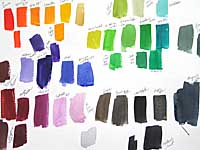 Here's the test sheet for the colors I did today. It doesn't matter whether you make a wheel or swatches, but this is a good way of learning about your paints. As I said in an earlier post, the color wheel above is similar to the one I made for my first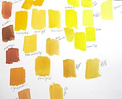
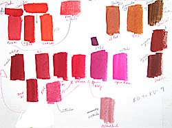 Last Monday we explored reds in watercolors, as we did last week with blues. Here's the chart that I did in class, explaining the paint characteristics of each pigment and the relative temperature as I went along. I let the class help me decide where a color belongs. I wish we had full-spectrum lighting in our classroom, because the colors tend to look "off" and I have to remember to mention this. Lighting makes a huge difference when you're exploring colors.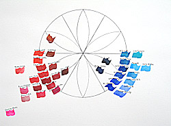

 Vicky Murry's
 I love Jean Uhl Spicer's book,