Confident Color Workshop was a blast!

Here's a link to some of the color sketches the artists did on the second day.
People playing with myriads of color ideas and subjects to paint with their watercolors is so energizing. The workshop (20 people) began with a review of basics (split-primary color mixing)and it was surprising to find many hadn't learned--or didn't remember--this simple, important method of avoiding mud in color mixing. Then we spent one day each on color harmony triads, color contrasts, color schemes, and painting light effects in color. On Tuesday night I gave a PowerPoint presentation for the Gold Coast Watercolor Society. This program shows how 30-plus artists in Confident Color use color creatively in different media, including graphic design, fibers, and mixed media.
GCWS has a fantastic facility for both workshops and demos. March 19-23 they are sponsoring Dave Daniels, a terrific artist and teacher who is a colorist supreme and not to be missed.
Gold Coast Watercolor Society brochure
Dave Daniels Web site
Labels: american watercolor society, color contrasts, color schemes, confident color, ft. lauderdale, gold coast watercolor society, triads, workshop
posted by Nita at 8:51 AM
2 comments


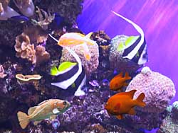 We're beginning a new series of lessons this week, based on the six color contrasts: hue, value, intensity, temperature, complements and quantity. Today is the contrast of pure hues. With this contrast you can use all colors, as long as they are pure and unmodified bright hues. You can also use black and white. It will be fun to see what subjects they come up with. I'm taking three examples of subjects: an abstract design, a row of rural mailboxes and an undersea photo I took at Monterey aquarium. The undersea photo is colorful by itself, but the new printer really shows it off. I did some Photoshopping and added two colorful fish from other photos. In the painting I will use purple for the darks and quinacridone magenta or permanent rose for the bright magentas. Fun!