Life is what happens to you while you're making other plans." --John Lennon
I'm sure I've used this quote before, but it's very appropriate right now.
Teaching three workshops in seven weeks ought to be enough to keep a person occupied, but in-between I was also baby-sitting three days a week for our grandson, teaching a weekly class, setting up the exhibition for the Hithergreen class and having my second cataract surgery. I was not much in the mood for blogging most days.
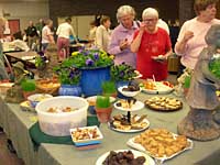
I'll start with the exhibition, Beginners & Beyond, the second for the class at Hithergreen Center. The opening was April 21. The class provided an elegant spread of munchies, but the real treat was seeing their art displayed. There are 66 paintings by 27 artists in the show, all watercolors, but varied in subject matter and style. One painting sold right away and we've been told that another venue would like to display some of the paintings after they come down on May 30. I took pictures of the exhibition, but can't display them here, as some of the artists are still practicing by painting from copyrighted art and photographs. They understand that they can't sell their work and are required to attribute the original artist. I didn't have time this year to photograph individual original pieces and make a Web page. I hope I can do it next month.
As with my first surgery in February, the implant was good, but the first three or four days were touch-and-go. This time, instead of blurred, double vision, I had a great deal of pain and blurring. But by the fourth day the eye began to clear up and I'm very happy with the results. I can even work on my computer without glasses. I can also read and drive without glasses, but will be getting a prescription to prevent fatigue and improve my distance vision. Oddly, I found an old pair of trifocals that correct my vision almost perfectly. I have a photo of me wearing these glasses in 1990 at a book-signing--imagine huge, round plastic frames. I'm glad I had the surgery. If you're considering this surgery,
Mayo Clinic has more information.
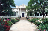
Yesterday we drove to Cincinnati to catch the "American Watercolors: From Winslow Homer to Edward Hopper" exhibition at the
Taft Museum of Art. It was fantastic. In addition to the curated show, which originated at the
Brooklyn Museum, there were images from the Taft's collection of 18th and 19th century watercolors, which made an interesting contrast. We also toured the permanent collection of the Taft, a world-class museum of 17th to 19th century painting and decorative arts in a small package. Rembrandt, Hals, Gainsborough, Reynolds, Whistler, Italian and Dutch masters--the list goes on and on, including a collection of Turner watercolors that is exquisite. The museum is easy to find and just a hop and a skip from the
Cincinnati Art Museum. And five minutes away from
Montgomery Inn at the Boat House, where we had fantastic ribs and strawberry shortcake for lunch. And that was my Mother's Day treat.
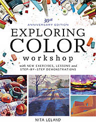
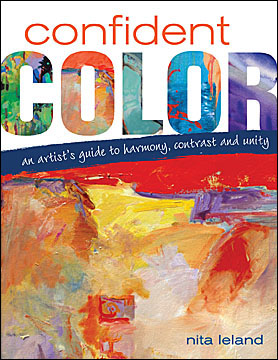 My new book is coming in August from North Light Books. Confident Color is 160 pages with 85 Try-it Activities in a spiral-bound hardcover format that stays flat for studio work. I've selected the work of 52 contemporary artists in a variety of media: acrylics, colored pencils, oils, pastels, watercolors, collage, mixed media and fibers to illustrate important color principles of harmony, contrast and unity through color schemes. Seven artists contributed detailed step-by-step demos of their color processes, including using a computer or a sketchbook for preliminary studies and mingling colors to select the best palette for a painting. Watch for my pre-publication offer of a signed copy and free shipping, coming soon on my Web site. Amazon.com is also taking pre-publication orders (unsigned, eligible for free shipping). Confident Color is almost ready to go to the printer. I'm more than a little excited about it, now that I've seen a few color-layout pages and the beautiful cover, a detail from Cheryl McClure's painting in the book. Cheryl was also the cover artist for The New Creative Artist.
Labels: art museums, cataract, confident color, exhibitions
 I can still see the glow of the setting sun on the water at Qualicum Beach, where I sat with my friends on the last night of my visit. We had a busy two-and-half days catching up on our lives and reliving our trip to New Mexico ten years ago. Among other things, we went on Saturday to a couple of outdoor markets, where I bought a funky tie-dyed apron for my workshops and a silly arm puppet for my grandchildren. I actually saw someone I remembered from one of my workshops twelve years ago, selling her art in the outdoor market.
  We had someone take our picture together at the ferry dock at Nanaimo. I flew from Nanaimo airport to Vancouver, then to Denver and Dayton. It was longer than the trip out, with a diversion to avoid the storms that hit the Midwest yesterday. Today we went fossil hunting at a state park near my daughter's house. I'm feeling like a fossil myself after the long travel day. The trip to Vancouver Island to be with my friends was worth every minute of it.


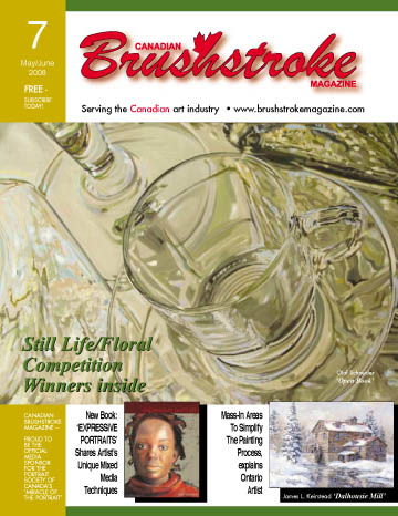
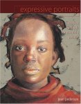 The current issue includes an article on Jean Pederson, one of my Calgary artist friends, who has recently published a book,
 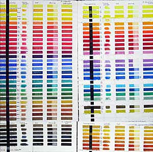 I swore I'd never do another paint comparison, but when M. Graham of Oregon came out with more than 20 new colors, I couldn't resist. The image shows my original chart on the left and the new colors on the right. While it isn't easy to distinguish the colors in the image, you can see how brilliant they are. I tested for transparency, tinting strength, reaction to salt*, and staining characteristic. I find most of the Graham pigments saturated and of a pleasing consistency. I especially like the reds in the original line, and now they have added Scarlet Pyrrol (PO 73), luscious Pyrrol Red (PR 254), Permanent Alizarin Crimson (PR 264), Maroon Perylene (PR 179)and bright Azo Orange (PO 62). Hansa Yellow (PY3) and Hansa Yellow Deep (PY97) fill the bill for cool and warm semi-transparent yellows. I also like Anthraquinone Blue (PB60), which resembles Indanthrone Blues from other manufacturers. Cobalt Teal (PB28), a light turquoise, appeals to me, while Turquoise (PB15:3+PG7) could be a little greener to suit my taste. A new range of synthetic earth pigments from yellows to reds has a lot of possibilities for low-intensity palettes. The Nickel Quinacridone Gold (PO48+PY150) lacks the glow of the Quin Gold pigment (no longer available), but is a lovely color on its own. Indian Yellow (PY110) is too orange in my opinion. Colors with less powerful tinting strength, like Ultramarine Pink (PR258), Cobalt Green (PG50), Cobalt Violet (PV14) and Ultramarine Violet Deep (PV15) work well on a delicate palette, but might be easily overpowered by many of the colors in the line. The Cerulean Blue Deep (PB36) looks more like a weak phthalo blue and doesn't appear to granulate as I would expect a cerulean blue to do.
 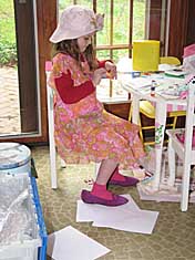 I think I've written three weeks of blogs today. The brightest lights in the entire picture are Jenna and Daniel. In this picture of Jenna she's wearing her "dress-up dress" that I bought for $1.50 at Goodwill when she was about three. It's a size 14-teen chiffon party dress and we had to pin it up to keep it from dragging on the floor and tripping her. Now it's above her ankles but it still fits over her clothes. As you can see, she doesn't quite fit into the purple pumps yet. She's wearing one of my hats, as she cuts and pastes at her little art center at Grammy's house.
 Daniel prefers wrestling with Pooh to posing for his birthday photo. He's eight-months old in this one. It was all I could do to keep him from leaping off the couch while I set up the camera. I'm discovering with Daniel that there's a little athleticism left in this old girl. I have to sprint across the room to keep up with him, crawl around the furniture, lift him like a twenty-pound free-weight. He's such a happy baby and loves to make me laugh with his juicy raspberries.
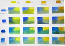 The subject of mixing green comes up several times a year in my classes and workshops. Here's the chart I demonstrated last week in my Hithergreen class on mixing a great variety of greens with the blues and yellows you already have in your paint box. It's worthwhile to take a couple of hours to make this chart so you have a reference for the different greens you can mix, at least until you become really familiar with them by using them often. I use white artist's tape to section the paper into 2-inch squares or slightly larger rectangles. Across the top I put the yellows, one per section: Winsor Lemon, Aureolin, New Gamboge and Raw Sienna are on this chart. Down the left side I place the blues: Cobalt Blue, French Ultramarine, Phthalo Blue Green Shade, and Cerulean Blue. I dampen a square and put a swatch of the yellow in that column in one corner and the blue in the row in the other corner. Then I mingle the two colors on my palette and place the mixture at the bottom of the section, teasing the colors up into the pure colors so I get variations of the mixture throughout. The chart includes spring, summer, late autumn, bright, misty, foggy and sea greens with just one blue and one yellow in each mixture. Before you begin a painting, see if you can find the greens you need on the chart and include those colors in your palette. See also my blog on