l s

Thursday, November 18, 2010

Lisa Palombo, American Impressionist


Nov 20th & 21st, 10th annual Holiday Open Studio, 55 Mountain Avenue
Caldwell, NJ 07006

Lisa Palombo Web site


Her new book, LISA PALOMBO, American Impressionist
will be available
Hard cover 12"x12" gift book
80 pages, 66 full color paintings
Foreword by Nita Leland
Introduction by Jana Martin
each book is signed by the artist
$120 + shipping

Labels: , , ,

Tuesday, May 22, 2007

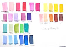
Tinting strength in watercolor paints

Last week I started a chart in watercolor class that illustrated the differences in tinting strength of pigments. The definition of tinting strength is "the power of a color to influence a mixture." A lot of artists have trouble with paint mixtures because they're trying to change a strong color with a weak one and can't get the results they want. This is true in most color media, because the pigments used in all media are the same with different binders. I finished the chart this week and indicated how you can select from one end or the other of the continuum of colors in any hue and the colors will work together. On the chart, the weaker colors are to the left of the rows, moving toward the stronger colors at the right. So you mix weak colors for delicate effects and powerful colors for strong statements. Sometimes you can mix weaker colors with middle-strength colors or middle-strength colors with powerful colors. But not weak with strong.

Labels: , ,

Tuesday, April 24, 2007

Mini-palette goes to art therapy

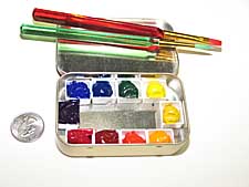
I finally found a use for my mini Altoid palettes. Today I visited an artist friend who is in rehab for a serious illness. She can't walk yet, but until she can, she is able to sit in a chair and chat or read. Dottie is a painter of bright, sunny watercolors and I would love to see her painting again soon. I gave her one of my Altoid boxes, several small brushes, a 5" x 7" pad of 140# watercolor paper, and an empty box for water. Everything fit into two small Ziploc bags. Her eyes lit up when she saw the paints.

Here is how I made my Altoid watercolor box. Several other people elaborated on the Altoid box and created fancier boxes, but mine is the easiest to make (15 minutes, including filling it with paint) and probably the least expensive. You can put any colors you want into the half-pans. I used a full palette of ten artists' colors: Ultramarine blue, phthalo blue, Hooker's green, Lemon yellow, cadmium yellow, Indian yellow, cadmium red, permanent alizarin crimson, permanent rose and dioxazine violet. After seeing her smile, I think I'll make some more palette-boxes and keep them on hand for other artists who are temporarily unable to paint in their studios.

Labels: , , , ,

Saturday, April 21, 2007

Book Review: Abstract Painting

Abstract Painting by Vicky Perry ties historical abstraction in with modern techniques in this colorful book. It isn't a how-to book in the sense of step-by-step demos, but helps the artist to see how abstraction has developed and some directions the artist might take to explore abstract concepts in oils and acrylics. The emphasis is on non-objective abstraction, leaning more toward expressionist organic design than geometric color/field. Probably not for beginners, but a very interesting book for someone thinking to explore this genre. Another book I have learned a great deal from is Painting and Understanding Abstract Art.

Labels: , , , ,

Monday, April 16, 2007

Juried exhibition

Yesterday I went to the opening of the Dayton Society of Painters and Sculptors spring show. It was cold and blustery outside, but inside the 48 High Street Gallery it was warm and companionable. There was a fantastic crowd there for the opening of the show, but also to see recent renovations to the historic building housing the gallery. The exhibit space is elegant and a far cry from what it has been for many years. The show itself is very good, although a mixed bag with some works that aren't that good, in my opinion. I understand that nearly sixty artists entered the show, with many bringing the limit of three works. Around eighty-nine paintings were selected, so there were a lot of rejects.

One situation was particularly interesting. I wonder what you think of this. An artist entered a pastel diptych, but because together they were too wide for the limitations placed on entries, he entered them separately. One half got in the show and the other was rejected. The one that got in won a ribbon--third place, I think. The mat surrounded the entire diptych, so where the two pieces were to hang together, there was no mat. The three-sided mat looked a bit strange. The artist implied that the judge was weird to accept one and reject the other of two pieces of the whole. In my opinion, it was his fault for trying to evade the size limitation. In fact, if both had been accepted, it would have been the prerogative of the hanging committee to hang them separately if they wished, as they were entered individually.

I tend to be pretty strict about artists obeying the rules of a show. When I judge a show, I expect the committee to vet the work and remove anything that doesn't comply with their rules. Invariably, something comes up. In one show the artist used collage, which was specifically disallowed, but you couldn't tell it from the slide. When the piece arrived, it was not hung. In another show, an artist sent a colorful painting matted in black. Included was a note saying that she hoped this was okay, since black is a neutral. She knew full well that the prospectus meant white or off-white, but she also knew her painting would look better in a black mat. The committee caved and allowed the painting to hang. Interestingly, I've never seen this violation--a black mat--in any show, before or since, so I'm quite sure artists understand what is meant by "neutral" in the prospectus. As it happened, I knew that this artist had bent the rules in two other shows, so her claim that her husband had taken it to the framer and she didn't know until it was too late to change it rang hollow to me. The moral to this story is "follow the rules." It isn't fair to make committees and judges disqualify paintings when you already know they don't comply.

Labels: ,

Saturday, February 03, 2007

Jan van Eyck

Charley Parker's blog describes van Eyck's Arnolfini double portrait in some detail, and also explains early techniques of tempera and oil painting as used in the 15th century. He links to several other van Eyck paintings and museum sites worth exploring. Sit back and browse awhile.

Labels: , , , ,

Friday, December 08, 2006

More Art Book Reviews

ranson skiesRon Ranson on Skies (Studio Vista, 1998) is for landscape painters in any medium who love to feature skies. The book shows techniques mostly in watercolor, but does include instruction on some other media, along with excellent photographs of cloud formations and many wonderful sky paintings. This is a great reference for landscape painters. I'm a sky freak myself and love paging through this book to look at the photos and paintings.


color&light in oilsColour and Light in Oils by Nicholas Verrall and Robin Capon (Batsford, 2004). The pages on Understanding Oils are very informative and user friendly, even to a beginner in oils like me. There aren't many swatches for visual comprehension, but the artwork throughout is dazzling, but not overwhelming as a possible goal for an artist to strive for. Verrall and Capon cover painting color and light, different types of subject matter and the working process, with a few demos scattered throughout the book in two or three stages.


digital canvasThe Digital Canvas: Discovering the Art Studio in Your Computer. (Abrams Studio, 2006.) This book by Jonathan Raimes almost makes me want to sell all my painting gear and just play with my computer. It's dazzling and I really think I could do it with this book as my text. The book has page after page of brilliant color effects with simple computer screen shots to show the tools for achieving them. Probably not for beginners, but definitely for creative computer artists.


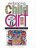
embracing child artBarbara McGuire has written Embracing Child Art. (Krause, 2001) to give adults ideas on how to encourage a child's natural creativity and ultimately help them to make a few treasured objects. There are wonderful suggestions for guiding Little Artists and helping them create projects with their own art to last a lifetime. The best part of the book is page after page of wonderful examples of child art.


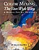
van wyk color-mixingHelen Van Wyk's Color Mixing the Van Wyk Way: A Manual for Oil Painters (Art Instruction Associates, 2000) has quickly become a classic since it was first published in 1995. She keeps the color concepts simple, emphasizing primarily color temperature and comparing a few basic palette choices for simple still lifes and portraits. This book would help beginners in oils to understand their colors and master color mixing of specific pigments.


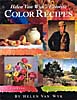
van wyk color recipesHelen Van Wyk's Favorite Color Recipes. (Art Instruction Associates, 2000) expands somewhat on the previous book and introduces a greater variety of subjects with color recipes in oil paints that are her recommendations for painting them. This book ale effects in this book are understood, the painter would be well advised to develop a more personal palette of colors.


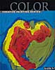
barron's colorBarron's Creative Painting Series: Color. (2005) by Gemma Guasch and Josep Asunción contains a wealth of useful information on color and numerous beautiful reproductions of masterpieces to illustrate the use of color throughout art history. I love that part of the book, but I don't think the demo paintings do it justice. Maybe it's just the design of the book. Check it out, though, because it has a lot to offer.

Once again, thanks to McCallister's Art Store for providing books for my reviews.

Labels: , , , , , , , , , , , , , , , ,

Wednesday, December 06, 2006

Art Book Reviews

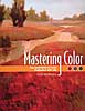
Vicky Murry's Mastering Color: The essentials of color illustrated with oils. (North Light, 2006) This book offers solid color theory applicable to all media. The book is beautifully illustrated with swatches and paintings by the author. The section on supplies and equipment is concise with a nice comparison of different ways oil-painting techniques--direct, indirect, plein air and alla prima. The basic palette is limited and very effective. There's a nice little section on color schemes, a subject often neglected in painting books. Murry explores individual colors and introduces a few design concepts, with a variety of helpful hints along the way.


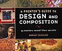
A Painter's Guide to Design and Composition by Margot Schulzke (North Light, 2006)includes the work of twenty-six contemporary masters who describe their process of designing their artwork. This is a beautiful book with lots of demos and color illustrations, but I find it a little confusing. The design-and-composition objective tends to get lost in the plethora of different techniques. I enjoyed reading it, but probably won't include it in my personal art library.


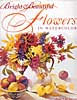
I love Jean Uhl Spicer's book, Bright & Beautiful Flowers in Watercolor (North Light, 2004.) If I were a flower painter, this is how I would want to do it. Spicer's supplies and equipment section is concise and complete. Her basic palette of colors is fairly limited and well balanced. The chapter on color covers the basics in such a way that I think beginners can grasp the concepts quickly. The chapter on composition isn't quite as accessible, but the remainder of the book, which includes various transparent watercolor techniques, tips and demonstrations, is very good. Way to go, Jean.

Labels: , , , , , , , , , ,

Friday, September 08, 2006

Mini Book Reviews

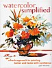
  • Having had an opportunity recently to take a second look at watercolor simplifiedWatercolor Simplified by Pat Weaver, I decided to update an earlier review. As I said before, the book may be a bit intimidating for beginners. The photos of the artist's studio are a bit too much for a "simplified" approach to watercolor. The supplies are basic, but the text seems to assume that you already know how to use watercolor. There are discussions of the Golden Mean and a good section on drawing, with emphasis on planning and value sketching. More for intermediates, I think, but rich with useful material for that level. I do admire Weaver's bold way with watercolor.


  • dramatic_lightDramatic Light: Paint Eye-Catching Art in Watercolor and Oil strikes me as a good book for artists looking to incorporate light effects in their work without laboring over every facet in a crystal vase or every ripple in the water. In other words, Patrick Howe makes painting light doable for most painters in watercolor and oil. After a good section on Preparing and Planning, which includes many tips and techniques, Howe covers Transparency, Translucence, Luminosity, Light and Reflection with demonstrations and mini-demos. The text is easy to understand and the demos illustrate the text well. The conclusion includes material on the business of art. This one is a keeper.
  • Labels: , , , , , , , ,

    Wednesday, August 30, 2006

    Catching up on my reading

    I've been so busy with my own book that I've fallen behind in writing reviews for books I've read. So I'm in "review mode." I posted two reviews this morning, but I'm up to seven now, so scroll down to see what's new.
    Gerald Brommer In Emotional Content: How to Create Paintings That Communicate Gerald Brommer discusses the differences between classic, intellectual and romantic approaches to painting. The key question is "What do you feel?" for the artist who wishes to paint more expressively. Select and edit your subject, making mini-thumbnails to record your impressions. Brommer emphasizes the importance of sketching to explore the subject, using color and temperature dominance and tonal values and textures. Watercolor collage is used in demonstrations. A sense of place, mood, weather and season can all contribute to the emotional content of your work. Brommer's books are always filled with useful tips and techniques.
    Betty CarrSeeing the Light: An Artist's Guide. by Betty Carr shows you how to create depth, form and atmospheric light in watercolor and oil paints. Carr is adept at both, as you can see from this beautifully illustrated book. Supply lists are detailed for both watercolors and oils, including advice on plein air necessities. In both media there are exercises and step-by-step demos that are clear and easy to follow. Carr advises you to learn to think in three dimensions, to observe light on form and to use value sketches to help you see light and shadow on a subject. She recommends simplification of shapes and value patterns. This is a good book withi lots of information and helpful tips.
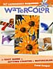
    Carol CooperCarol Cooper's book, Watercolor: No Experience Required, is an easy guide to getting started in watercolor. The supply list is basic and very good, except that it allows cheap pan colors, which I don't think is a good idea, even for beginners. Also, the beginner doesn't need so many colors; a maximum of seven should do the job, if they're the right colors. A workspace layout is shown that could be helpful to the beginner. There are numerous well-done illustrations, including hands-on photos. Demos are simple and doable. Subject matter includes landscape, flowers, still life and textures. Composition is given very little attention, but the section on color, though brief, is clear. This is a good basic book that doesn't confuse beginners with fancy techniques and tricks.
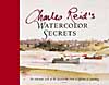
    Charles ReidWatercolor Secrets by Charles Reid is the work of a master painter. The book is filled with many sidebars of tips and tricks for Reid's spontaneous style of painting and is lavishly illustrated with sketches from his watercolor sketchbooks. His distinctive, personal approach is clear throughout in subjects of all kinds, both indoor and plein air. His supply list is brief, but more than adequate. This beautiful book is not for the beginner in watercolor technique, but it's a joy to behold.
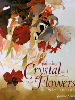
    susanna spannPainting Crystal and Flowers in Watercolor by Susanna Spann is filled with her stunning artwork and many mini-demos throughout. The book includes a detailed list of supplies, but it's clear from the beginning that this book is not for the spontaneous watercolor painter. The primary subject is special effects in still life using watercolor. Design and color are touched upon, along with painting from photographs, marketing and exhibiting. The strongest point in Spann's book, in my opinion, aside from her magnificent artwork, is her emphasis on doing thumbnail sketches to plan paintings.

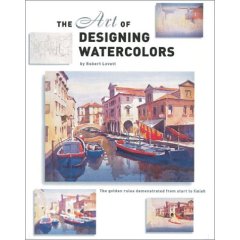
    John LovettJohn Lovett's The Art of Designing Watercolors is subtitled "All you need to know to create more powerful paintings." The book contains demos and many illustrations throughout with an emphasis on design. From the "hows and whys of design" to tools of design (the elements and principles) and design tools in action, Lovett covers the essentials very well. Only one page is designated for supplies, so beginners need to look elsewhere to understand the basics. However, this book is a good one for an artist who needs to understand how to incorporate structure into pictures for more effective expression.
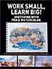
    work small learn bigWork Small, Learn Big!: Sketching with Pen & Watercolor is an International Artist Publishers' collection of preparatory studies by seventeen artists from around the world. The book is a compilation of sketches backed up by photographs and slides, emphasizing the importance of these preliminary works to the execution of fine artwork. There are numerous illustrations and step-by-step demos. Each artist has distinctive choices of materials and media. Styles range from loose and spontaneous to highly detailed with many notes. Selling tips and artists' bios are included. One of the most important messages in the book is that "Mistakes don't Matter" in the sketchbook.

    Thanks to George Bussinger at McCallister's Art Store for making these books available for review.

    Labels: , , , , , , , , , , , , , , ,

    Monday, November 14, 2005

    Water-mixable oils

    Because I'm a watercolor painter I'm attracted to the idea of oil paints that can be cleaned up with water instead of solvent. Many traditional oil painters don't have a very high opinion of this medium, but I don't have enough experience with oil painting to know the difference. Ignorance is bliss. I love painting with water-mixable oil paints. Over the past three years I've taken two brief workshops in oil painting using them. The instructor used regular oil paints in the first workshop and acrylics in the second, so there was no instruction in the water-mixable oils per se. The first time out I used too much water and Winsor & Newton paints. This last time I added some Holbein colors and used only a very little bit of water, except for cleanup. I preferred the Holbein paints. They seemed creamier and more consistent in handling from one color to another. While I respect acrylics and like to use them with collage, I think if I had to choose a painting medium other than watercolor, I would go with water-mixable oils. They would be better for travel, since you can't carry solvents when flying; and I think there might also be a benefit in plein air painting. If you want them to dry more quickly, there is a drier fluid available. I don't know if you can use Liquin and Alkyd paint with water-mixable oils, but they say you can combine them with any oil paints, so I don't see why not. However, you have to switch to solvents when you add these to the mix.

    Labels: , ,