A Butterfly Mandala
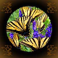 Taos artist Jerry Walter has been Photoshopping with The New Creative Artist again: "This morning I was in the garden with the digital camera and this butterfly was working hard in the larkspur and it really wanted to pose for me. So I thought "What a wonderful subject for a torn edge mandala" (Page 70). So about 20 pictures later, here it is."
The color contrast of the blue larkspur and yellow butterfly is really effective. Although we usually think of blue and orange as being the complementary colors, that's in reference to color mixing. Hilary Page lists blue and yellow as "visual complements," which have more impact when juxtaposed. I love it!
Labels: complementary, mandala, new creative artist, Photoshop
posted by Nita at 10:32 AM
0 comments