Natural pigments
I love this blog from colourlovers.com on prehistoric colors and natural pigments still in use today. The photo of the earth colors in their natural state is amazing. A student in one of my classes some years ago had collected these pigments in Italy and brought them to show us--incredibly beautiful.
Speaking of pigments, I finally got around to checking out four more M. Graham watercolors on my chart. All are richly pigmented and I liked them, except I didn't find the Manganese Blue Hue to be near enough to the original to merit the name. However, it's a beautiful color and would work well as a cyan in an expanded palette. The Cadmium Yellow Deep is rich and opaque, and I love the Permanent Green Pale. I don't care much for the phthalocyanine greens in the yellow shades, but this one is a different mixture. Clear and bright. The M. Graham Terra Rosa is opaque, like Indian Red in other brands. I like this color for Southwestern themes. My chart is complete, except for Mineral Violet. One of these days I'll run across it, I'm sure. If I have it, it is buried somewhere in the vicinity of my drafting table. Know what I mean?
Speaking of pigments, I finally got around to checking out four more M. Graham watercolors on my chart. All are richly pigmented and I liked them, except I didn't find the Manganese Blue Hue to be near enough to the original to merit the name. However, it's a beautiful color and would work well as a cyan in an expanded palette. The Cadmium Yellow Deep is rich and opaque, and I love the Permanent Green Pale. I don't care much for the phthalocyanine greens in the yellow shades, but this one is a different mixture. Clear and bright. The M. Graham Terra Rosa is opaque, like Indian Red in other brands. I like this color for Southwestern themes. My chart is complete, except for Mineral Violet. One of these days I'll run across it, I'm sure. If I have it, it is buried somewhere in the vicinity of my drafting table. Know what I mean?
posted by Nita at 2:41 PM
1 comments


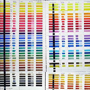 I swore I'd never do another paint comparison, but when M. Graham of Oregon came out with more than 20 new colors, I couldn't resist. The image shows my original chart on the left and the new colors on the right. While it isn't easy to distinguish the colors in the image, you can see how brilliant they are. I tested for transparency, tinting strength, reaction to salt*, and staining characteristic. I find most of the Graham pigments saturated and of a pleasing consistency. I especially like the reds in the original line, and now they have added Scarlet Pyrrol (PO 73), luscious Pyrrol Red (PR 254), Permanent Alizarin Crimson (PR 264), Maroon Perylene (PR 179)and bright Azo Orange (PO 62). Hansa Yellow (PY3) and Hansa Yellow Deep (PY97) fill the bill for cool and warm semi-transparent yellows. I also like Anthraquinone Blue (PB60), which resembles Indanthrone Blues from other manufacturers. Cobalt Teal (PB28), a light turquoise, appeals to me, while Turquoise (PB15:3+PG7) could be a little greener to suit my taste. A new range of synthetic earth pigments from yellows to reds has a lot of possibilities for low-intensity palettes. The Nickel Quinacridone Gold (PO48+PY150) lacks the glow of the Quin Gold pigment (no longer available), but is a lovely color on its own. Indian Yellow (PY110) is too orange in my opinion. Colors with less powerful tinting strength, like Ultramarine Pink (PR258), Cobalt Green (PG50), Cobalt Violet (PV14) and Ultramarine Violet Deep (PV15) work well on a delicate palette, but might be easily overpowered by many of the colors in the line. The Cerulean Blue Deep (PB36) looks more like a weak phthalo blue and doesn't appear to granulate as I would expect a cerulean blue to do.
 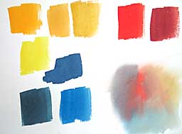 This chart shows what I did. I painted a swatch of yellow ochre at top-center. Then I made a swatch of gamboge to the far left leaving a space between them. The difference in intensity was obvious. Between the two I made a swatch of quinacridone gold, which they could see is brighter than ochre, but not as bright as gamboge. (Just below the gamboge is a cool lemon yellow, but I didn't emphasis the temperature difference, as that will be a later lesson.)