l s

Wednesday, May 14, 2008

Online Art Magazine

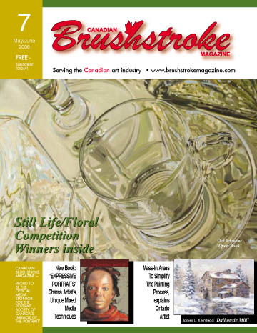
Canadian Brushstroke Magazine serves the art industry, artists and collectors with online articles and advertising. They sponsor art competitions with cash prizes (current prize winners are in the issue I've linked to) and feature articles on Canadian artists, as well as introducing new products. I signed up for a free subscription to the magazine, which looks to me like a worthwhile publication.

The current issue includes an article on Jean Pederson, one of my Calgary artist friends, who has recently published a book, Expressive Portraits: Creative Methods for Painting People. Jean's wonderful portraits have won many awards and have been selected for major exhibitions in the U.S. and Canada.

Labels: , , ,

Monday, June 25, 2007

Caravaggio on the Power of Art tonight

Read what Charley Parker has to say today about Caravaggio on Lines and Colors. I'll be interested to see which of Caravaggio's many personalities is revealed in the PBS show tonight (Monday). This artist's paintings have always seemed larger than life to me and apparently that was what he himself was like.

Labels: , , ,

Friday, May 04, 2007

Edward Hopper in Boston

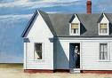
Holland Cotter of the New York Times today reviewed the Edward Hopper show at the Boston Museum of Fine Arts May 16 through August 16. I have the distinct impression that Cotter doesn't care much for Hopper. Personally, I like the big shapes and the way Hopper uses strong values and directional lighting. It isn't always a joyful light, though, as there seems to be a sad, sometimes frightening drama to Hopper's compositions. Edward Hopper, the MFA catalog of the exhibition, includes more than 150 reproductions of his art in various media. "High Noon" shown here is in our Dayton Art Institute and has long been a favorite with visitors to the museum. I love the directness of Hopper's watercolors, too.

Labels: , , ,

Thursday, May 03, 2007

Book Review: James McNeill Whistler

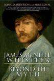
James McNeill Whistler: Beyond the Myth by Ronald Anderson and Anne Koval (1994) is a compelling biography revealing details of Whistler's life and cultural influences that are often overlooked. Whistler began with lackadaisical military training at West Point and evolved an amazing career of artistic innovation and achievement in London and Paris. He was a consummate and prolific printmaker, as well as a much sought after portrait painter. Many of the stories that resonate in the public perception of the man were outrageously exaggerated and circulated by Whistler himself, who was witty and unrelenting in attacking his critics. He consorted with many of the Impressionists in France in the early years, when their dissatisfaction with the Academy was just beginning to surface. His own rebellious nature put him at odds with both the great Academy in Paris and the Royal Academy in London. There are a few illustrations and photos in the book. I brought some Whistler monographs home from the library, so I could study the paintings and engravings in the context of this comprehensive biography. I've always liked Whistler, but this book gave me a much greater appreciation of his talent and vast accomplishments.

Labels: , , ,

Wednesday, May 02, 2007

Book Review: Painting Faces and Figures

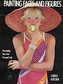
Painting Faces and Figures by Carole Katchen is one of my favorite people-painting books. Katchen shows wonderful examples of creative poses in different media by a variety of artists. There are elegant, classic styles and quirky, comedic ones with a lot in between. Working methods are described and there are some step-by-step details, but on the whole, the book is more about personal style than techniques. Carole's web site is worth a visit. Her personal style is distinctive and colorful.

Labels: , , , ,

Tuesday, May 01, 2007

Book Review: Romare Bearden

The Art of Romare Bearden by Ruth Fine was published in conjunction with a retrospective exhibition of his work at the National Gallery of Art in 2004. This is a wonderful book with essays on his life and work, as well as many magnificent illustrations, which include oil and gouache paintings as well as the collages for which he is best known. Many years ago I walked into the Gerald Melberg gallery in Charlotte, North Carolina, and saw Bearden's collage work, which had been part of a recent show. Later, friends took me to the public library to see an impressive piece he had done. I was especially interested in showing something of his work in the collage book I was working on. Unfortunately, the attorney for the estate was uncooperative, so I couldn't use the wonderful transparency Mr. Mehlberg had sent me. Nevertheless, I was so pleased to have a student bring this book to my collage workshop last year and I "had to have it" for my library. I've read the interesting text, but mostly I just love to browse the pictures. Bearden's work shows influences of his African-American experience in the South as well as the Harlem Renaissance and a post-World War II residency in Paris. I love his brilliant patterns and colors.

Labels: , ,

Friday, April 20, 2007

Traildust: The Art of James Reynolds

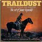
This book is loaded with cowboys, cattle and country. I became enamoured of Western art when I first began painting in 1970 and traveled to Colorado to visit family. We visited galleries in Denver and Boulder, as well as a few ski area art centers, and saw a show of the National Academy of Western Art at the National Cowboy and Western Heritage Museum in Oklahoma City. The quality of the art--Western, Southwestern and Native American--simply blew my mind. At that time such work wasn't in favor in the East, so I had no previous exposure to it. Although my preference was for Southwestern and Native American, I especially liked Charlie Russell and Frederick Remington. Among the contemporary artists, James Reynolds was a standout. His paintings glow with color and vibrate with energy and action. The book, published by Greenwich Workshop Press in 1997, consists of full-page and two-page spreads on many pages, in full color, plus informative essays by Don Hedgpeth describing the country, history or activity depicted in the paintings. The artworks are modern masterpieces in my opinion. His color is simply amazing, from alpen glow to moonlight. I've browsed this book often, ever since I bought a used copy on the Internet.

Labels: , , ,

Thursday, April 19, 2007

Book Reviews

My book-review stack has at least two dozen books on it. I'm afraid the stack might fall over and break my leg if I don't reduce it pretty soon. I read every evening and during every spare moment, but I don't seem to find time to do the reviews. Too busy writing my own book, it seems. So I'm going to take a break occasionally and write at least one review a day until I'm caught up.
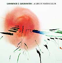
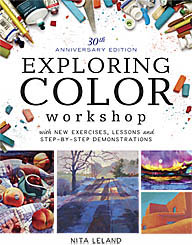
Today's book: Lawrence Goldsmith: A Life in Watercolor by Carl Little (2004). Goldsmith is among my top ten favorite contemporary watercolorists. (Don't ask. I don't actually have a list yet.) You could almost call him a minimalist. His works are often high key, awash with transparent colors that evoke the New England landscape. His flowing washes on wet paper are accented with calligraphic brushmarks and scrapings that create surprisingly strong energy and movement. Little's essay recounts Goldsmith's travels and influences and captures the essence of his personality. The painter traveled widely, but his paintings largely reflect his beloved Monhegan Island, where he kept his summer studio for many years. The book is lavishly illustrated with reproductions of many of his beautiful watercolors. Sadly, Goldsmith died at the age of 87 in 2004, just before the release of this book and the subsequent exhibition of his work. I learned of his passing and of this book when I recently went to his website to make contact about using his work in my new book. His work appears in both versions of my Exploring Color book.

I fell in love with Lawrence C. Goldsmith when I read his earlier book, Watercolor Bold & Free: 64 Experimental Ideas and Techniques in Watercolor, originally published in 1980. His work is spontaneous and luminous, two qualities I value highly. This book was a revelation to me, after having studied for so many years with watercolorists who emphasized realism and values. In 1983 I stopped by his studio on Monhegan and enjoyed a brief visit with this most gracious man. The walls of his studio were covered with his original watercolors, many quite large, and simply breathtaking. His legacy is passed on through his beautiful books.

Labels: , , ,

Tuesday, April 03, 2007

Don Andrews watercolors

Yesterday I showed my class a Don Andrews video, "Making Watercolor Glow." The guy is amazing. His color is so vibrant and what he does with granulating watercolors you would not believe until you see it. Don is a good teacher. He explains things clearly in his soft Southern accent and, of course, makes it look easy. His book, Interpreting the Figure in Watercolor is the next best thing to the video to learn about his methods. Also, Don teaches more workshops than anyone else I know, so you may have a chance to take one when he's in a town near you. Don's workshop schedule, video and a softcover edition of his book are available on his website.

Labels: , ,

Tuesday, March 27, 2007

Pat Rayman and Art-to-Art

Please read Ben Rayman's touching tribute to his wife and her special project, Art to Art, Building Friendships Through Art. Art-to-Art is the exchange of art, ideas and interests among schools k-12 around the United States. This was Pat's brainchild twenty years ago.

In an email to me Ben wrote: "In 1986 Pat was nearing her 16th year teaching art in the Delphos, Ohio public school system. She was burning with a desire to expose her students to a world beyond their own. During the initial years Pat spent much time at the library gathering school addresses, and then taking them home to write invitations. Every letter she sent was handwritten."

The response was excellent and the program continues to be successful today. Click the links above for more.

Labels: ,

Wednesday, March 07, 2007

The Ultimate Emily Carr book

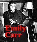
Yesterday I finally received my copy of Emily Carr. It's a gorgeous book and the first I've seen that has really good reproductions of her work. The book was produced to accompany the retrospective exhibition that began in Canada in 2006 and travels coast-to-coast through 2008. A few days ago I finished reading Forest Lover by Susan Vreeland, a fictionalized version of her life. I'm not much into playing "let's pretend" with biographies. It is well written and entertaining, but after reading nearly 1000 pages of The Complete Writings of Emily Carr, I feel Vreeland has taken too many liberties with the artist's life. I probably would have liked it better if she had given the main character a different name. Nevertheless, all this immersion into the life and art of Emily Carr has been fascinating. She was an amazing woman and artist who wrote stories and journals about her life and times (1871-1945) in western Canada that are entertaining and revealing.

Labels: , , ,

Monday, March 05, 2007

Art in Ohio

The American Watercolor Society traveling show is hanging at the Middletown (Ohio) Fine Arts Center through March 17. Some of my students have seen it and said it's not to be missed.

The Cincinnati Art Museum is showing Andrew Wyeth watercolors and drawings now through May 6. I've been told it's a wonderful show and hope to get down there soon.

"Luminist Horizons" is at the Taft Museum in Cincinnati through April 29. Looks like an all-day trip to Cincy is in order.

I'll blog the shows as soon as I see them.

Labels: , , ,

Tuesday, February 27, 2007

Painting rainbows in watercolor

Somebody in my class asked me a couple of weeks ago how to do this. Not that it's a great idea, because rainbows are so variable and tend to look hokey in your paintings, unless you happen to be J.M.W. Turner. Nevertheless, yesterday I showed them a way to do it in watercolor just by blending clean, diluted pure colors on slightly damp paper. It isn't hard to make a rainbow, but to put one in a painting and have it look realistic is a whole different thing. That takes practice. My first recommendation is to Google "rainbows" and see what they really look like. Most of them aren't complete. The colors are brighter near the ground, then they often disappear before the arc is completed. And red is always at the top, with violet at the bottom (and often hard to see). If there's a second rainbow reflected above it, the colors are reversed. And just in case you learned ROYGBIV when you were in grade school, there is no "I" for indigo in the spectrum, therefore it's actually ROYGBV. Newton must have been having a mystical moment when he described the colors--had to have seven, as in the days of Creation and notes on the musical scale.

Labels: , , , ,

Friday, February 09, 2007

Portraits vs. Caricatures

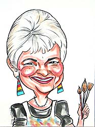
I've been thinking about the differences between portraits and caricatures and I realized that this caricature of me clearly shows the difference. It was done several years ago by Susan Moreno,one of my color workshop students who is a professional caricaturist. She took several photographs and sent the finished pastel after the workshop was over. My friends were horrified when they saw it, and I was taken aback, but when I got used to it, I realized it really does capture some of my characteristics. Compare it with a photo that was taken around the same time. She got the hair, the chin, the eyes (a little less smiling in the photo) and the nose is close. I'm not so sure about the chipmunk cheeks, but that makes the caricature funnier. The spindly neck is funny, too. And that's what I think caricature is about--exaggeration and humor. A portrait is a completely different animal. Apparently master portraitist John Singer Sargent got so tired of hearing sitters complain about small details in their portraits that he finally abandoned his lucrative practice of portrait painting, saying, "A portrait is a painting with a little something wrong about the mouth!" If you've ever done a portrait, you've no doubt heard something like that about your picture.
Labels: , , ,

Saturday, February 03, 2007

Jan van Eyck

Charley Parker's blog describes van Eyck's Arnolfini double portrait in some detail, and also explains early techniques of tempera and oil painting as used in the 15th century. He links to several other van Eyck paintings and museum sites worth exploring. Sit back and browse awhile.

Labels: , , , ,

Friday, January 19, 2007

Creative expression

Canadian artist Emily Carr was influenced by a book written by Ralph M. Pearson, How to See Modern Pictures (1925). Here is a passage from the book:

The Creative artist...begins to draw with his conceptual vision turned inwards searching the storehouse of his mind. That storehouse is well-stocked for he has made preliminary studies in plenty--probably has drawn a model accurately in order to possess himself of all knowledge of details. And now he is ready to use his material to create a picture. The inner fire burns. He comes to his canvas filled with a suppressed power that urges hand to vital, swinging expression. Does he feel the bending weight of sorrow? His hand flows the bend of sorrow into line. No thought of detail. Hardly a glance at the model. The feel of sorrow flowing into form! His problem becomes one of controlling the exuberance of spirit, of holding it to the slow, laborious process of organization, of conserving the force in him to hour after hour, and day after day, and week after week perhaps, of controlled release.... What was in him has gone into the work, where, 'if his power has been great enough', it will live forever. Thus is the felt nature of a thing eternalized into design.

Labels: , , , , , ,

Wednesday, January 10, 2007

Emily Carr, extraordinary Canadian artist

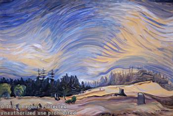
emily carr paintingSeveral years ago I ran across the art of Emily Carr at the Vancouver Art Gallery. It stopped me in my tracks. Her work is powerful and spiritual and her Northwestern subject matter is uniquely hers in the same way that Georgia O'Keeffe's Southwestern icons belong to O'Keeffe. The two were near-contemporaries, Emily being the older. Apparently they met once briefly when Carr visited an exhibit of O'Keeffe's paintings in the U.S. Like O'Keeffe, Carr was an emerging woman artist in a man's world, but unlike O'Keeffe, Carr had no Stieglitz to support and promote her. The daunting distance between her home in British Columbia and the art centers in the Eastern provinces created great difficulties, as well.
I've often come across references to Carr's writings and I'm finally getting around to reading her works. She was every bit as expressive a writer as she was a painter. Her writing is down-to-earth and yet somehow lyrical and poetic. There are a number of small volumes published, but I bought a used copy of The Complete Writings of Emily Carr. The book isn't an autobiography in the usual sense. Rather each volume of stories is a collection of reminiscences of various experiences and times in her life and her acute observations from childhood throughout her life. For more information on Emily Carr, check out the entry at Wikipedia Another good book is Doris Shadbolt's The Art of Emily Carr.

Labels: , ,

Saturday, December 30, 2006

Paint like Pollock--what fun!

A friend sent me this link: www.jacksonpollock.org. Have some fun throwing paint on your computer. Every time you click your mouse, it changes color. Right-click and press rewind to start over. This is something you can do on New Year's Eve if you're not going out!

Labels: ,

Thursday, December 28, 2006

Rembrandt and the Golden Age of Dutch Art

My son and I took in the Rembrandt exhibition at the Dayton Art Institute yesterday. For some reason I expected a small show, but it's a blockbuster and truly awesome. I tried to imagine the very small geographic area of the Netherlands as I studied paintings by the many skilled seventeenth-century artists on display in the show. Room after room of marvelous artworks, curated by subject, beginning with portraits of amazing depth and intelligence. The still lifes are rich and engaging, the landscapes luminous and atmospheric. Genre paintings of biblical times and contemporary life close the exhibit with Rembrandt's "Denial of Peter" as the dramatic finale. Interspersed in smaller spaces between painting exhibits are Rembrandt's etching and engravings, which are a worthy show unto themselves: "amazing" is all I can say about these small works. (Some have magnifying glasses attached to the wall for closer examination--what a great idea. Next time I go to a print show, I'll take my own.) There is still time until Jan. 7 to see the show in Dayton, so don't miss this rare opportunity to see works by the greatest of the great, Rembrandt. The show will move to Phoenix, Arizona and Portland, Oregon. For more about the artists and art, click the link above.

Labels: , , , ,

Monday, December 11, 2006

Georges de la Tour--One of my all-time-favorite painters

Charley Parker on his Lines & Colors blog features Georges de la Tour. I'm amazed at his mastery of chiaroscuro and his representation of light. Follow the links at the bottom of the blog for more images.

Labels: , , ,