I finally got the 15 new Winsor & Newton watercolors tested that McCallister's Art Store provided me. My tests aren't scientific and my results are subjective. I test for transparency, tinting strength, spreading quality, reaction to salt and staining property.
As I look at my chart, I'm struck first of all by the brilliance of the fluorescent Opera Rose, which is in my mind a gorgeous, though useless, color for watercolor painters. I've seen so few who could handle Holbein's Opera and I try to keep my students away from it. It doesn't reproduce well, as it is out of the gamut for 4-color printing, so artists who use it are invariably disappointed in their color reproductions.
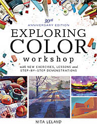
There are some very nice low-intensity pigments that would work well with the low-key palettes in my Exploring Color system of compatible colors. I especially like Potter's Pink, Perylene Green, Terre Verte Yellow Shade and Perylene Violet. Unfortunately, the Perylene Violet isn't even close to Thioindigo Violet, which it supposedly replaces.
Cerulean Blue Red Shade is a nice addition. I used to alternate with other brands when I wanted that color, although it isn't all that different from Cerulean Blue.
Phthalo Turquoise istoo close to Winsor Blue Green Shade to be worth bothering about. It seems to be an attempt to get a one-pigment blue-green, but I'd rather have Rembrandt's Turquoise Blue, a mixed pigment, on my palette to fill that slot. It sits right between Winsor Blue Green Shade and Winsor Green and is one of those colors that makes my heart beat faster. I know I can mix it with WGBS and WBGS but it's wonderful to have it right at hand when I want it.
Lemon Yellow Deep appears to be a rather delicate color, and I like it. I'm afraid it will confuse my beginning students, though, as it doesn't seem to have the tinting strength of Winsor Lemon, which they need for my
split-primary color-mixing system. The Turner Yellow may be worth further investigation. It has a softness to it that I like.
Winsor Orange Red Shade is vibrant and might make a nice change from Cadmium Scarlet, which is one of my favorites. But I don't like the Winsor Red Deep, which reminds me of Grumbacher's Cadmium Red Deep, a murky, difficult color in watercolor.
The remaining colors, Brown Ochre, Magnesium Brown, Mars Black and Yellow Ochre Light might have their place on some artists' palettes, but I don't see them anywhere on mine. They're all easily made with mixtures of other earth pigments on the palette. The black is a possible exception. I tend to be biased against black because I've never found a good one in watercolor, so I'll give it a try.
As for the discontinued colors, the only one I'll miss is Thioindigo Violet, as it's such a great red-violet. Perylene Violet is too low-intensity to take its place.
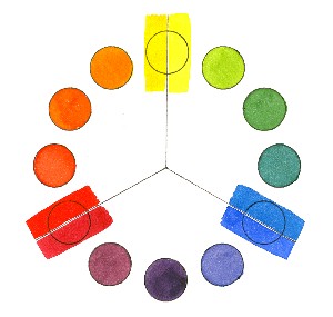
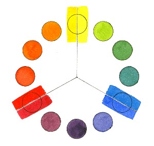
If WN's objective is to "increase the spectrum across the range," there are just two places where I feel they fall short. On my 12-pigment color wheel, made up mostly of Winsor & Newton colors, I use Rembrandt Turquoise Blue for blue-green. None of WN's colors fill that slot, as they are either too opaque or lacking the tinting strength I need. Please note that on WN's 4-color printed chart the representation of Phthalo Turquoise is misleading and looks more like the color I want than the actual paint does. (I know how hard it is to reproduce color with CMYK, but I feel that the current printed chart isn't nearly as accurate as the previous one was.)
At blue-violet I use Old Holland Blue-Violet. This is also a mixed-pigment color, but there is no WN color close to this one. Ultramarine Violet is too red and too weak in tinting strength for the colors I use in the expanded palettes in my book,
Exploring Color.
Ongoing efforts to improve colors are admirable, but I deplore the continual offering of new colors by some manufacturers as pure marketing that doesn't serve the needs of artists. Students carry around dozens of tubes of colors they don't need and can't use until they've learned basic color mixing. Once they've mastered mixing with six colors, they hardly need any others, as they can mix nearly everything they want. If artists are looking for a magic color, I tell them there is only one: Winsor & Newton Burnt Sienna. If they ever change that one, I may have to give up painting.
That said, it's always fun to play with new colors and now and then something I haven't used before jumps onto my palette and stays for awhile. Nothing wrong with that, as long as it works.
Labels: color wheel, exploring color, green, McCallister's, paint, paint quality, split primary, tutorials, watercolor


 I can tell this is going to be a good class. Aside from the fact that four people arrived late (sigh!) and three were on vacation (a given in Ohio in the winter), the orientation went well. Lots of good questions, several aha! moments and a few jaw-dropping, I-had-no-idea reactions to color facts and theories. Great fun for me! I showed slides on the history of color in art because I think it's very helpful to see where color started (30,000 or more years ago) and how it evolved from decorative and symbolic to representational and expressive. I wound up the session with the