Perception & Composition
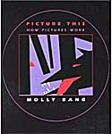
That's the subtitle of Picture This, a book on design by Molly Bang published in 1991. As Rudolf Arnheim says in his introduction, this book is an eye-opener for adults. It isn't just a picture book for children. Yesterday I guided my watercolor class through the first part of the book, in which the author selects shapes and colors to represent some of the characters and settings for "Little Red Riding Hood," explaining why a small red triangle works for Red, but a big one is too unyielding for Mother and how to make the forest background of straight, vertical trees look more threatening by tilting the trees and leaning one over to frame a corner and close Red in.  Each page is a startlingly simple visual representation of an easily digested design concept. I had forgotten I had this book until I was sorting books for my sale. I decided to try it out on my intermediate class, telling them I was going to read a bedtime story. (We meet after lunch--a good time for naps when I talk too long.) It was fun to watch the expressions on their faces as the design unfolded--the rapt attention of children would describe them, including surprise and delight at the turn of every page. I'll continue with the book in class over the next couple of weeks, as I think it's making important points in design that will stick with the students. Unfortunately, the book is out of print, but can be found online at used bookstores. It was reprinted in 2000 as Picture This: How Pictures Work and is available from booksellers in both hard and soft covers.
 Each page is a startlingly simple visual representation of an easily digested design concept. I had forgotten I had this book until I was sorting books for my sale. I decided to try it out on my intermediate class, telling them I was going to read a bedtime story. (We meet after lunch--a good time for naps when I talk too long.) It was fun to watch the expressions on their faces as the design unfolded--the rapt attention of children would describe them, including surprise and delight at the turn of every page. I'll continue with the book in class over the next couple of weeks, as I think it's making important points in design that will stick with the students. Unfortunately, the book is out of print, but can be found online at used bookstores. It was reprinted in 2000 as Picture This: How Pictures Work and is available from booksellers in both hard and soft covers.
Labels: book reviews, books, design, seeing


0 Comments:
Post a Comment
<< Home