l s

Monday, October 31, 2005

Watercolor brushes revisited

Today I did a tutorial on watercolor brushes. When I started gathering brushes together to take to class, once again I was aghast at how many I have--and how few of them I actually use. I've already written a blog about too many brushes, but today I showed my class a lot of the less common ones that are fun to play with. Like a dagger striper that can paint an entire leafless tree and all the branches and twigs with one load of color. The mop that creates cloud-like forms as you swirl it around the paper. The angle brush that fits up into the eaves of a gable on a roof. You can have a great time playing with different brushes and might find one that works well for an unusual technique, but you don't really need them. At most, you might use a hake or mottler to dampen your paper for wet-into-wet painting, a 3/4"-1" wide one-stroke (oxhair)and/or a #12-14 sable round for washes, #4-6 sable round for details and a #4 rigger or script brush for fine lines. Don't waste your money on craft brushes and don't try to get by with old, wrecked brushes, particularly if they've been used with other media. There's no harm in sneaking in a "fun brush" now and then to see what you can do with it.

Labels: , ,

Many of life's failures are people who did not realize how close they were to success when they gave up. --Thomas Edison

Labels: ,

Sunday, October 30, 2005

Art and Alzheimer's

Read The Pablo Picasso Alzheimer's Therapy in the New York Times. The implications of this article are thrilling. Several different programs suggest that Alzheimer's patients become more responsive and vital after visiting museums and looking at art. Some talk about it; others are entertained by it. These are people who show little interest or response to most other stimuli, although they are not yet lost to the devastating destruction of the mind that Alzheimer's causes.

My mother had severe senile dementia. For several years she lived in a controlled facility for the memory-disabled, including many with mid-stage Alzheimer's. Several times while she lived there I made collages with a small group of residents. The first time, I was told they wouldn't last twenty minutes, but they were with me for an hour and a half. I had selected pages from magazines I thought they might like. They loved the antique dolls, country kitchens, baby animals and food, oohing and aahing as they picked out images for their pictures. They had no problems with tearing out the images and arranging them on the page, but when some tried to use the glue stick, they couldn't remember what it was for. Once I started their hands in motion, they could do it. Every one of the eight completed a picture and was thrilled with it. A few couldn't remember their names to sign on the picture. On Valentine's Day we decorated big red hearts with doilies, which they all remembered doing as children. On another occasion we played with rubber stamps. Each time they became immersed in the task, talking about the images in their pictures and the colors, occasionally bringing up an old memory stirred up by an image. A visitor looking in wouldn't have suspected that these "artists" had memory problems.

If you'd like to do this when you visit an elderly relative or friend, here are some suggestions. First, speak to the activities director and set a time so they can have space set up for you. You might feel more comfortable for the first time working with fully functional elderly folks. Start with four people if you're by yourself, or eight if you have someone to help you. All you need is a stack of colorful pictures for them to tear up, non-toxic glue sticks and colored construction paper or white copy paper. Other embellishments, such as ribbon, yarn and stickers are fun, too.

Labels: , , ,

Art is the creation of forms symbolic of human feeling. --Susan Langer

Labels: ,

Saturday, October 29, 2005

Using compatible color triads

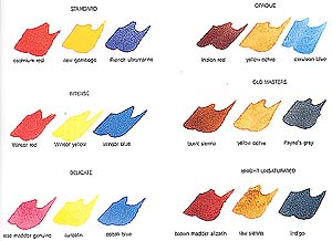
The other day I said that I don't use earth colors on my palette, except for burnt sienna. But I didn't say I never use them in painting. I love to work with compatible triads, three pigments that have similar characteristics. Here are six three-pigment combinations, loosely based on the traditional red-yellow-blue primary triad.

High-intensity colors are on the left, low-intensity on the right. Usually I limit my palette to just these three colors or their equivalents, but once in awhile I'll include viridian with the delicate colors or perhaps substitute quinacridone gold for raw sienna. You can make your own combinations, based on similarities in transparency, intensity and tinting strength of the pigments.

Compatible triads are discussed more fully on my web site and in my book, Exploring Color.

Labels: , ,

Color is the keyboard, the eyes are the harmonies, the soul is the piano with many strings. The artist is the hand that plays, touching one key or another, to cause vibrations in the soul. --Wassily Kandinsky

Labels: ,

Friday, October 28, 2005

Mixing earth colors

When I first started painting in watercolors I read all of the popular books of the time by such noted artists as Rex Brandt, Herb Olsen, John Pike, Edgar Whitney and many others. I kept notes on the artists' palettes and eventually discovered that there were certain "workhorse" colors that appeared on nearly every palette. French ultramarine, burnt umber, alizarin crimson, cadmium yellow and yellow ochre were the most common. The next tier included Prussian blue, burnt sienna, raw sienna, sepia, cadmium red, brown madder alizarin and Hooker's green. My own palette grew exponentially until there simply wasn't enough room for all the colors the experts recommended.

Fortunately, about that time I began to get a sense of what my own preferences were and the first colors to depart my palette were the earth colors. Why? Because I found I could mix them so easily starting from primary and secondary colors. I found I could make Payne's gray and burnt umber with French ultramarine and burnt sienna. Then I discovered that burnt sienna makes a lovely earth mixture with every other color on my palette. (Note: I use only Winsor & Newton Burnt Sienna.) I also found that by mixing complements (opposites), on the way to achieving neutral mixtures there is a range of earth mixtures that is nothing short of stunning.

So now I don't keep earth colors on my palette, unless I have a specific need for them in a painting.* To me the mixtures are far more beautiful. If I don't mix too much, I can achieve variations of every earth hue that add to the color excitement in a painting. That's the way I like it.

*More on this in another blog.

Labels: , , , ,

I hope with all my heart that there will be painting in heaven. --Jean-Baptiste Camille Corot

Labels: , ,

Thursday, October 27, 2005

Creativity--it's what you do

I wrote about talent a couple of days ago. You don't need talent to be creative. You may or may not "have" talent, but creativity is something you do, not something you have. You're born with creative potential and what you do with it is up to you. What is creative for one person is "all in a day's work" for another. I was leaving Curves after my workout the other day when I overheard one of the assistants say she didn't have a creative bone in her body. It stopped me dead in my tracks. I can't stand it when people say that. So I asked her a couple of questions and found she likes to experiment with cooking and gardening and makes fringed blankets for friends, picking out fun fabrics and colors that go together. She never thought of any of those things as creative, but in my view, they all point to creative thinking that can be channeled in many directions, including into art or writing or music. As I left, she said, "I never thought I was creative, but since you put it that way...." And I smiled all the way home.

Labels: ,

Nothing is less real than realism. It is only by selection, by elimination, by emphasis that we get at the real meaning of things. --Georgia O'Keeffe

Labels: , ,

Wednesday, October 26, 2005

Recycle your artwork

While I was searching for the mixed-media painting I mentioned yesterday, I ran across some old photos of earlier watercolors. Many of the originals are stashed under the bed accumulating dustballs, but others I clearly remember destroying. The ones I kept show my slow, steady progress through my first few years of classes and workshops, but the ones I tore up represented sudden daring shifts of technique or design that weren't typical of my usual work at that time. Why did I rip them up? At the time I did them, I was so excited and pleased with this new direction that I couldn't wait to show them. The reaction was devastating--"What on earth is that?" "Oh, don't change what you're doing now." "Whatever were you thinking?" I felt so unsure of myself then that I immediately destroyed the new works and stayed within my comfort zone for years. When I looked at the photos of the paintings I realized that I should have had more confidence in my experiments and gone further with them. I should have worked with those paintings until I learned all they had to teach me. I should have ignored my critics and listened to my inner voice, which urged me to move forward. I had nothing to lose and everything to gain by sticking with those paintings. I may not have resurrected them, but I could have learned from them, and when my tutorial was finished, they might have made good papers for the collage box. The most important lesson I learned--many years later-- was that I needed to trust myself more and listen to that little voice inside.

Labels: , ,

The creation of something new is not accomplished by the intellect but by the play instinct acting from inner necessity. The creative mind plays with the object it loves. --Carl Jung

Labels: ,

Tuesday, October 25, 2005

Do you know where your art is?

I've always been pretty good at keeping records of all kinds. When I started painting 35 years ago, I recorded every painting I did, including all the student work and the losers. The details helped me remember what I needed to work on. Then I started noting the colors used, paper weight, finish and manufacturer. My record book also shows what source I used for the painting and which were started in workshops. Shows and awards. Purchasers. It has been useful more than once when I wanted to reprise a color scheme in a painting or find out where a painting was. Which is why this is on my mind. Last week my editor at North Light Books requested a 4x5 transparency of one of my paintings that's going to be in my new book. I went to my trusty record book, found the painting listed and discovered that a gallery, now closed, had sold it and I didn't have the name of the collector. What made this even more frustrating was that some months ago someone in one of my watercolor classes told me they owned that painting--and I couldn't remember who had said it. I took it for granted it was in my record book, so I didn't make a note of it. A good memory and a little detective work located the owner. I picked up the painting last night and took it to the photographer's today.

There are three morals to this story. One is to ask your galleries for the names of your collectors. The second is to get quality photos and transparencies made of your best work as soon as you finish it, so you'll have them when you need them for reproductions in books, magazines or giclees. If you're lucky, you'll sell the piece, but it isn't always easy to get a collector to allow you to take it back to have it photographed, no matter what your reason may be. And the third is to keep good records. This is all part of the business of art.

Labels: ,

Monday, October 24, 2005

The discipline endured is the mastery achieved. --Edgar A. Whitney

Labels: , , , ,

Make art that says something.

In 1972 Edgar A. Whitney, the peripatetic dean of American watercolor, spoke at a meeting of a local art group in Dayton, Ohio. I quote Whitney often in my classes because what he said that evening made so much sense. I remind myself of these important points every time I paint: First of all, "Art is communication." You may not agree, but this is my belief.

If you do accept this first premise, ask yourself two important questions before you begin. First, "What do I want to say?" Second, "What's the best way to say it?"

If you don't answer the first question, you are, in effect, admitting that you have nothing to say or you don't care whether you say anything. If you are indifferent, why should a viewer be interested in your artwork?

If you do have something to say, think carefully about how to say it, so you can make a strong statement. Use color that resonates with your subject, an effective format, a design emphasis that makes your point. Don't settle for a random assembly of marks or bland color.

About art as communication: I think it matters that we show our "mudpies" to others to elicit a response. If you maintain that you're painting for yourself, then you are, in effect, confining yourself to a padded room, talking to yourself.

Labels: ,

Sunday, October 23, 2005

To me, photography is an art of observation. It's about finding something interesting in an ordinary place.... I've found it has little to do with the things you see and everything to do with the way you see them. --Elliott Erwitt

Labels: , ,

Saturday, October 22, 2005

Talent and self discipline

I'll bet you were a scribbler when you were a tadpole. So was I. Isn't everybody? I've never heard of a child prodigy artist who could draw well as a toddler. Andrew Wyeth and Pablo Picasso were both precocious and drew and painted well at a young age, but neither was born drawing. Both had artist fathers who took an interest in their training. Note that word "training." When you get that much support, you take it for granted you're talented. When you're motivated by praise, desire and single-mindedness, you can accomplish wonders. But it isn't enough just to believe you're talented--you have to work hard to develop your talent to its full potential.

Einstein said, "I know quite certainly that I myself have no special talent. Curiosity, obsession, and dogged endurance combined with self-criticism have brought me my ideas."

It also takes self discipline. Sydney Harris wrote, "Self discipline without talent can often achieve astounding results, whereas talent without self discipline inevitably dooms itself to failure."

Labels: , , , ,

Friday, October 21, 2005

Do you have talent?

There's a powerful belief that people with talent can achieve beyond the reach of ordinary mortals. Talent implies that everything is easy for a chosen few and difficult or impossible for everyone else. Those who believe they lack talent feel they are outside a charmed circle with no magic way to get in.

Well, as Richard Bach says in Illusions, "Argue for your limitations, and sure enough, they're yours." "No talent" is a self-fulfilling prophecy. Saying it makes it true.

What is talent anyway? Here are three definitions: A special natural ability or aptitude. A capacity for achievement or success. An inborn characteristic that has to be cultivated. The first doesn't amount to much without the second and third. Talent is a potential, not a guarantee of success. There's no real test for talent--it's a matter of faith and experience. Talent consists of wanting to do and believing that you can.

It requires the relentless pursuit of your creative goals. Practice, patience, perseverance. When you feel disappointed about your progress, remember that it took Beethoven twenty years to compose his "Ode to Joy."

Flaubert said, "Talent is long patience."

Labels: , , ,

Thursday, October 20, 2005

Computer haiku

This morning I came across an email post I saved from November of 2000. There are many variations of this on the web now. The haiku form of poetry consists of a strict number of beats in each line, in this case most are 5-7-5.

A file that big?
It might be very useful.
But now it is gone.

The Web site you seek
Cannot be located but
Countless more exist.

Chaos reigns within.
Reflect, repent, and reboot.
Order shall return.

ABORTED effort:
Close all that you have worked on.
You ask far too much.

Windows NT crashed.
Within the Blue Screen of Death
No one hears you scream.

Yesterday it worked.
Today it is not working.
Windows is like that.

First snow, then silence.
This thousand dollar screen dies.
So beautiful.

With searching comes loss
And the presence of absence:
"My Novel" not found.

The Tao that is seen
is not the true Tao, until
You bring fresh toner.

Stay the patient course.
Your ire is of little use.
The network is down.

A crash reduces
Your expensive computer
To a simple stone.

Three things are certain:
Death, taxes, and lost data.
Guess which has occurred.

You step in the stream,
But the water has moved on.
This page is not here.

Out of memory.
We wish to hold the whole sky,
But we never will.

Having been erased,
The document you're seeking
Must now be retyped.

Serious error.
All shortcuts have disappeared.
Screen. Mind. Both are blank.

Labels: ,

Artist vs. student watercolors

My recommendation is always to use the best paint you can. Cheap paint has additives that weaken the pigment load. You have to use more paint and brush strokes to get the intensity you want instead of getting it right the first time, as with richer artist colors, which take far less paint to make intense color.

Is there any advantage at all to using cheap paint? Here are some scenarios:

You like pastel tints and hate staining colors. Buy cheap pan paints and hope they don't fade.
You love intense, staining colors and don't care about the quality. Use cheap tube colors made with synthetic dyes. Test for lightfastness.
You love richly pigmented, dense, velvety color. Use paints that don't have ox gall in them.
You hate pale washes and want rich color from every brush stroke. Use well pigmented artist colors.
You like to use unusual, exciting colors. Choose from manufacturers that have more than 50 colors in the line.
You use pouring techniques to build up thin layers of paint. Use small amounts of artist colors or large amounts of cheaper paints.
You use heavy layers of paint. Use cheaper paints if they don't show a tendency to crack.
You like a creamy, non-sticky consistency to paint. Avoid honey-based paints.
You like watercolors that won't dry and crack when left on the palette. Avoid cheap paints.

My personal preference is for paints that are highly pigmented and creamy, not juicy. I've tested many brands of watercolor and my A-list consists of Winsor & Newton (not Cotman), Holbein and Daniel Smith. Also of high quality are Rembrandt, Rowney, Old Holland, Sennelier and Schmincke. Included in the top tier are Maimeriblu and M. Graham. Artists all have their preferences, so this is a matter of opinion and experience, not carved in stone.

Labels: , , ,

I am a painter. I'm also an art lover who gives myself advice when I paint; it's always bad. --Pablo Picasso

Labels: , ,

Wednesday, October 19, 2005

Neutral colors--an oxymoron

Neutrals are achromatic, meaning they have no color. Black, gray and white. Anything else is chromatic, having color, from shocking pink to beige. At least that's how it's stated in color theory. But artists have their own ideas about neutrals and usually this means they're looking for a color bias instead of a flat black, gray or white: a bluish-black, a greenish-gray or a pinkish-white. These are more interesting than the neutrals you find in a tube of flat black or gray paint. So how do you mix exciting neutrals?

The rule in color theory is that neutral gray or black is the result of mixing two complementary (opposite) colors on the color wheel. It works in theory, but not in paint. Very few colors can be described as exact opposites and almost none are true hues in the color scheme sense. Sometimes you get black or gray when you mix, but often you get brown or umber. The paint colors are actually "near complements" and make a mixture with a bias toward one of the two colors in the mixture. This color combination makes a more vibrant mixture.

One thing to remember about mixing neutrals is to use only the colors that are already in your painting. Plan your colors before you paint to make sure you can get your full range of values, color and neutrals. Mingle the colors you've chosen. Don't decide at the last minute to throw in a tube neutral or it will stand out like a sore thumb.

Labels: , , , ,

Live as if you were to die tomorrow. Learn as if you were to live forever. --Ghandi

Labels: ,

Tuesday, October 18, 2005

Urban Myth: Blue and Yellow Don't Make Green

Have you fallen for that one? If so, you probably don't mix greens but use tube greens like phthalo, Hooker's or sap green instead to be on the safe side. It's likely that your greens all look pretty much the same and are somewhat unnatural-looking. No matter what your subject matter, if you paint realistically you want your greens to have the variety you see in nature.

Let's debunk the myth about blue and yellow. There are innumerable beautiful pigment variations of these two colors that will make every green you can possibly imagine. A simple rule of color theory will help you mix the green you want: When mixing a secondary color (green) from two primaries (blue and yellow), avoid the third primary (red), which is the complement (opposite) of the secondary mixture (green).

For example, to mix bright greens use cool pigments: phthalo blue and cadmium lemon or Winsor Lemon. To mix low-intensity natural greens, use ultramarine and any warm yellow, such as New Gamboge, cadmium yellow medium or Indian yellow, which all have a hint of red that knocks the intensity down a bit.

If you still like to use tube greens occasionally, tone them down by mixing with any color that has a reddish cast, such as burnt sienna, or a touch of alizarin crimson or cadmium red.

Labels: , , , , ,

Monday, October 17, 2005

Prints and reproductions

In the previous blog (before the quotation) I mentioned four-color process printing without describing the differences between original prints and reproductions. Here's a link to my web site article on that subject.

Labels: ,

An idea that is developed and put into action is more important than an idea that exists only as an idea. --Buddha

Labels: , ,

Problems with color in art prints

An artist asked me recently why his art prints seemed duller than the original painting. We discussed his palette and found what I believed to be the culprits: Opera and French Ultramarine. Opera is a bright fluorescent pink. Like all fluorescent colors, Opera is outside the "gamut," or range of colors that can be reproduced with accuracy. French Ultramarine isn't fluorescent, but it can't be reproduced accurately with four-color process and ink-jet printing, which use cyan, a greenish-blue. Most greens mixed with French Ultramarine and yellow are somewhat grayed in printing because of the red bias of this blue pigment. If you know your color theory, you know that mixing all three primary colors neutralizes color mixtures.

It's disappointing to spend time on a painting that turns out well but reproduces poorly. To get the best colors in prints, create your painting with colors similar to those used in printers' inks: magenta, yellow and cyan. In recent years manufacturers have offered artists good matches for these colors in pigments. Quinacridone Magenta is a close match, but you can also try Permanent Rose or any other bluish-red. Any yellow that isn't too orange or too green will work, such as Transparent Yellow or Hansa Yellow Light. The best cyan I've found is Winsor Blue Green Shade, which is about the same as Thalo Blue. You need a greenish-blue. Using a limited palette of "safe" colors will assure that your print will match your painting.

Even if you don't plan to print, it's wise to use a somewhat limited palette; you don't have to worry about the color gamut. Here's more on limited palettes and using triads in painting.

Labels: , , , , ,

Saturday, October 15, 2005

When heart and skill work together, expect a masterpiece. --C. Reade

Labels: , ,

Friday, October 14, 2005

Blockbusters

The December "Artist's Sketchbook" magazine includes interviews of three artists (including me) concerning the Perfect Creative Day. Couldn't have been more timely for me. I'm still not sure there is such a thing.

Time flies when you're waiting for the plumber. Or not. Wednesday morning I listened to the snake crawling down our vent to open up a clogged kitchen sink--to no avail. Waited all afternoon and into the evening till he called at 9:30 p.m. to say he would come right over. No, I don't think so. Thursday morning they showed up and finally got the job done. Later that evening my husband noticed there was water on the floor of the furnace room, seeping into the family room carpet at the baseboards, possibly a backup from the backup. No way to get a plumber before the weekend. Oh, well.

Clogbusting got me thinking about blockbusting for artists. I absolutely can't work with people running in and out of the house, even with the knowledge that they are going to be leaving sooner or later (usually later). The thought of being interrupted repeatedly during creative work drives me nuts, so I don't even start. I do filing, sharpening pencils, check-writing and other non-art tasks, but I hate it when I lose a day or more waiting for home repairs to get done.

Speaking of blockbusters, I should go to the article on my web site and follow my own good advice.

Labels: , ,

Wednesday, October 12, 2005

Teachers open the door, but you must enter by yourself. --Chinese proverb

Labels: , ,

Tuesday, October 11, 2005

Van Gogh's drawings at the Met

Here's a rare opportunity to see the seldom displayed drawings of van Gogh. Read the review in the New York Times for details on the exhibit opening next Tuesday, October 18:

http://www.nytimes.com/2005/10/11/arts/design/11gogh.html

Labels: , , ,

Vincent van Gogh's illness

I've just finished reading a fascinating book about van Gogh. There are numerous theories on the cause of his erratic behavior and suicide. A cursory search of the Web suggests that research done in the 1980s and 1990s holds the key to his illness--and it wasn't epilepsy, bi-polar disorder or schizophrenia. According to Dr. W.N. Arnold, Professor of Biochemistry at University of Kansas Medical Center and author of Vincent van Gogh: Chemicals, Crises, and Creativity, the illness of Vincent van Gogh was a congenital disease, acute intermittent porphyria (AIP). This debilitating genetic disease is characterized by sensitivity to light and other neurological abnormalities, including psychoses, hallucinations, convulsions and paralysis. The disease can be aggravated by poor nutrition, smoking and use of alcohol. There is substantial evidence that van Gogh drank absinthe and took excessive doses of camphor oil to relieve insomnia and pain. When he was institutionalized, his diet and habits improved and so did his symptoms. It's clear from his letters to his brother that his episodes of illness were extremely painful and something he dreaded, which may have been what led him to suicide. Another theory is that he was in the grip of an attack of AIP and accidentally shot himself, but there are no medical records to support either theory. There are some indications that his brother Theo and sister Wil may also have suffered from AIP. Dr. Arnold maintains, "He was wonderfully creative because of intelligence, talent, and hard work. He was a genius in spite of his illness - not because of it."

Labels: , ,

Monday, October 10, 2005

Watercolor breakthrough

I'm just winding up an 8-week beginning watercolor course (Watercolor for the Terrified) with one more week to go. We've been through all the wash and brush drills, values, perspective, color mixing. This is a pretty typical class. Some "get it" right away and others have to work a little harder, but on the whole, during critique this afternoon I felt that everyone is catching on. They're appreciating the difference between spontaneous and overworked and have got the idea of letting colors blend rather than overmixing. I teach at a senior center and although the class is bright and active, their priorities are different from most classes. They travel, take time off, have more than the usual number of illnesses and surgeries, so it's difficult to keep the momentum going sometimes. I'm starting my fourth year at the center. In two weeks I'll be teaching an intermediate class. We'll have more challenging activities and several returning students are more accomplished watercolor painters who keep me on my toes. I enjoy the beginners, but I'm looking forward to mixing it up with the new class.

Labels: ,

Sunday, October 09, 2005

Ramblings on watercolor and gouache

Both watercolor and gouache are water media. Theoretically, the difference between them is that with transparent wc you work light to dark laying thin glazes and washes on paper; gouache is opaque (dense), so you build up layers with brushstrokes, working dark to light. In actual paints, however, the distinctions are not so clear. Pigments used in all media are generally the same, so if you're using a certain color in watercolor, it's made from the same pigment used in gouache, oil or acrylics.

It's confusing to watercolor painters to learn that some pigments in transparent watercolor are highly opaque, for example, the cadmiums, cerulean blue and chromium oxide green. These pigments are naturally opaque, so they have more covering power than most watercolor paints. But they aren't as dense as gouache. Gouache has additives that make the paint more dense and opaque.

A gouache painting looks more like an oil or acrylic than a watercolor, although it's possible to make a watercolor that looks like gouache simply by using less water and more paint. The concern with either method is that thick paint may crack or break off the surface, which is one reason a more rigid support is needed, such as heavy illustration or watercolor board.

Transparent watercolor as a pure medium takes a lot of abuse these days from artists doing mixed watermedia and gouache. They claim watercolor's old-hat and everything has already been "done" in the medium. I don't agree with that. I love the splash and spatter of watercolor and the texture of the paper, the richness of a fine wash. There's nothing, absolutely nothing, as fine as a pure watercolor masterfully painted. I'm disappointed when I go to big watercolor shows and find most of the paintings appear to be acrylics or opaque watercolor. I can remember when the best artists in the country painted pure transparent watercolors and they were amazing.

I'm going to try some gouache, because I really haven't given it a fair trial yet. But I can't see myself giving up my watercolors.

Labels: , , ,

Saturday, October 08, 2005

Update on "Fabrications" by John Emery

I've learned that the Emery exhibit will be open until October 21 at the Dayton Visual Arts Center in Dayton, Ohio, so if you're within driving distance of Dayton, make an effort to see it. Watercolor painters, especially, will find it fascinating. My review of the exhibit, with a link to the artist's web site, is in my blog archives under September 25 (near the bottom of the page).

Labels: , ,

We act as though comfort and luxury were the chief requirements of life, when all that we need to make us really happy is something to be enthusiastic about. --Charles Kingsley

Labels: , ,

Friday, October 07, 2005

Workshop Day Five

Donna's lecture today was a reiteration of many valuable points she made throughout the workshop. She emphasized finding your creative self, your design motif, your brushstroke, your subject and using that to guide your creative development. She showed the class a number of illustrations of the work of artists from the past who have been her inspiration, chief among them being Vuillard and Diebenkorn. I understand that yesterday afternoon she did a wonderful critique of student work, which I missed because of a death in the family. I also missed the afternoon class today, but I feel that the workshop was tremendously helpful to me. I appreciated her sharing her process of developing a design for a painting. I also found her demonstrations of gouache painting very informative and enjoyed experimenting a bit with the medium, but haven't decided how much more I'll do with it in the future. Donna Zagotta's workshop was one of the best I've ever had, and I've taken many.

Labels: , , ,

Thursday, October 06, 2005

Workshop Day Four

Today Donna did a demo on gouache, illustrating the differences between transparent watercolor and gouache. You work light-to-dark in watercolor and dark-to-light in gouache. Watercolor is lightened with water; gouache is lightened with white gouache. Watercolor is darkened through mixtures; gouache is darkened through the use of dark, bright pigments. Too much water weakens the covering power of gouache, so she taps a sponge to remove some of the water from her flat brush before she picks up pigment. She did a partial demo, then sent us back to work and continued with her painting after lunch. I find it hard to watch demos for 3 hours, even with breaks. Most students seem able to make the transition from design analysis to putting paint on the paper, although I haven't seen any masterpieces yet, including my own. I decided I had rushed into color too quickly yesterday, so today I did a black-and-white positive/negative shape plan with paint, followed by a three-value plan that I liked. I used a different color scheme from yesterday and got about halfway through the small picture. Still too soon to tell how it will turn out. I can understand why one might choose to use this medium for the opacity and brushstrokes, but I miss the spontaneous splash and transparency of watercolor. Donna used to do pure transparent watercolor but now she tends to be somewhat dismissive of the medium, and I have a hard time with that. I feel watercolor should be honored for its own qualities, just like pastel or colored pencil are, and not downgraded just because it has limitations compared to some other media. To each her own, right?

Labels: , , , ,

Wednesday, October 05, 2005

Workshop Day Three

Today we were allowed to paint, but not until we had taken our subject through all of the design analysis steps we did with the newspaper clipping. That part took most of the day, with Donna circulating throughout the room guiding students toward the best design for their subject. She's very good with artists at all skill levels. Some remarkable things happened. One of my students did an extraordinary piece--her first use of white paint as gouache. Another did her painting upside down and turned a ho-hum painting of Canada geese into an energetic, colorful picture that just happened to have geese as the subject. A third artist was doing excellent studies, so Donna challenged her to see how many ways she could find to design the value pattern. The results were amazing. I'm working from a small photo of an elderly woman sitting on a bus-stop bench under a protective umbrella, clutching her sweater and purse. I did a dozen or so preliminary same-size design studies, about 5" x 5", starting with a contour drawing, then an outline drawing, followed by the delineation of positive and negative shapes. As per Donna's instruction, I did additional line drawings followed by analysis of value relationships. As the day wore on, I finally copied my design to watercolor paper and painted it, using white paint for the first time in my watercolor life. Guess what? I didn't die. Tomorrow Donna has promised us a demo using white to make gouache, as opposed to using the more opaque pigments in transparent watercolor. Sounds exciting to me. See you tomorrow!

Labels: , , , ,

Tuesday, October 04, 2005

Workshop Day Two

Are you sure it's only Tuesday? Seems like we've learned a lot in only two days. Today the emphasis was on value. Donna stated that the most important thing in the painting is value. I've heard this a hundred times and have said it myself over and over in my teaching. But no one else, including myself, has broken the subject down to make it possible to see value in so many different ways. This gives the artist an incredible number of creative options. We've been working from a black-and-white newspaper clipping. Yesterday we did five or more different shape renderings; today we did four or more different value renderings. Every exploration revealed something about the subject that wasn't evident before and each one seemed more exciting. Tomorrow we'll work with our own photograph, taking it through the shape and value analysis to arrive at a small painting--we hope.

Tonight Donna demonstrated for the Fairborn Art Association, sponsors of the workshop. She briefly explained what we've been doing at the workshop and how she had arrived at the point where she would begin a small painting of two pears. She worked from a photograph and an earlier painting of the subject. The abstract design was simple and elegant, the color very exciting. Her style is controlled, but not stiff. She'll finish her painting tomorrow.

Labels: , , , , ,

Monday, October 03, 2005

Workshop Day One

On Saturday I promised to post something about the workshop I'm taking this week with Donna Zagotta, an accomplished watercolorist from Brighton, Michigan. The workshop is titled "Creative Design and Expression." So far the workshop is excellent and exactly what had I hoped for. It isn't about techniques, although I look forward to her demonstration of gouache painting later in the week. It's about establishing a foundation of good shapes on which to hang everything else, from color and value to technique, with the goal of expressing yourself: Who You Are. Donna is well organized and knowledgeable about her subject. I've always been aware of the importance of Shape in design but have never had any book or instructor who illustrated this more clearly. Can't wait till tomorrow to see what Donna has to say about value.

Labels: , , , ,

Art lives between the known and the unknown, communicating what it discovers in this ambiguous territory. --Duane Preble, Professor Emeritus of Art

Labels: ,

Sunday, October 02, 2005

Too many brushes

I have more brushes than I can use in my lifetime. As a watercolor painter, I have mostly wash brushes, flats and rounds, liners and some specialty brushes like edgers and fans. But I also have acquired a number of oil-painting brushes, a separate set for acrylics, and a selection of beautiful Oriental-painting brushes. What I've learned is that less is more. Whatever medium an artist works in, it does no good to have a fistful of brushes if you haven't mastered the brushstrokes with a few.

Oils and acrylics are less familiar to me than watercolor. I know that you must keep your oil and acrylic brushes separate and not use the same brush for both. I've observed and been advised that it's not a good idea to use bristle brushes for acrylics because the bristles swell up with water and get floppy. Also, they aren't made to be soaked in water and may come loose at the ferrule. So it appears that bristle brushes are the choice for oil painters, along with some sable and other soft hair brushes for blending.

Acrylic painters are advised not to use expensive watercolor brushes, which are easily damaged if not properly cleaned or if used for scrubbing paint onto canvas. Even when used in an aqueous manner, acrylics are hard on sable and sabeline brushes or any brush that is a blend of synthetic fibers and hair. Synthetic brushes are the best choice for acrylics, with varying length of heads and long handles for oil-style painting and shorter handles for watercolor style. You must keep your brushes clean, no matter what medium you use. You can partially restore a brush that has been left to dry with acrylic paint or medium in it by soaking it in isopropyl alcohol and washing with warm water and soap, but you can't bring it back to its original condition. So be sure to keep your acrylic brushes damp while working and clean them thoroughly when you're finished for the day.

I could paint in watercolor forever with three brushes--one-stroke, round and rigger. I learned to paint with a light oxhair 3/4" flat one-stroke brush. This brush, with a head about 1 1/4" long, was the master of all strokes. You could do amazing, streakless washes, beautiful drybrush on the right paper, and even fine lines with the corner. You literally didn't need another brush to do a good, spontaneous transparent watercolor. Now you can't get anything even close to this brush in the catalogs and art stores. Wash-brush heads are much shorter and made of a blend of fibers that doesn't hold as much water and paint. This is why I have one-stroke brushes custom-made for my classes. For finer detail I use a #6 or #8 sable round brush. A good sable brush holds a lot of paint and still makes a beautiful fine line. Many artists use synthetics now, which do detail nicely, but most don't hold as much fluid as a good sable brush. I like a #4 or #6 script, liner or rigger brush to make long, thin lines. The only other brushes I use quite a bit are a striper (a funny-shaped brush that looks like a dagger) and a hake. The striper holds a lot of paint and water and makes a line that goes on forever. I also use a 2"-3" hake brush to dampen my paper or make big gestural marks on a large sheet.

I have just a few synthetic brushes--flats. I use them for exploring paints, when I don't want to flood the small patches of color. Synthetic flats are great for getting straight edges on architecture. They have other uses, but they don't make good workhorse brushes for me.

I've tried to boil the subject down to a few personal observations. If you have suggestions, I hope you'll comment.

Labels: , ,

When intuition and logic combine to direct our action, as they do in a work of art, we discover our most authoritative individual voice. --Eric Booth

Labels: ,

Saturday, October 01, 2005

An art adventure

Looking over the supply list for the workshop I'm taking next week, I'm wondering what on earth we're going to do with newspaper photos and dried out markers. We're supposed to bring our usual materials, plus the photos, markers and good quality tracing paper. I'm guessing a design exercise. We also need a tube of white gouache if we want to try our hand at opaque painting after our instructor's demo. I'd like to give it a shot. I'm pretty much a purist in transparent watercolor, but this will be a chance to see how opaque watercolor works. I think I have everything I need now, but I live less than a half hour away from the workshop and can easily get my hands on anything I might have forgotten. All I need to do now is pack it up and throw it in the car. I'll keep you posted about the workshop.

Labels: ,