Problems with color in art prints
An artist asked me recently why his art prints seemed duller than the original painting. We discussed his palette and found what I believed to be the culprits: Opera and French Ultramarine. Opera is a bright fluorescent pink. Like all fluorescent colors, Opera is outside the "gamut," or range of colors that can be reproduced with accuracy. French Ultramarine isn't fluorescent, but it can't be reproduced accurately with four-color process and ink-jet printing, which use cyan, a greenish-blue. Most greens mixed with French Ultramarine and yellow are somewhat grayed in printing because of the red bias of this blue pigment. If you know your color theory, you know that mixing all three primary colors neutralizes color mixtures.
It's disappointing to spend time on a painting that turns out well but reproduces poorly. To get the best colors in prints, create your painting with colors similar to those used in printers' inks: magenta, yellow and cyan. In recent years manufacturers have offered artists good matches for these colors in pigments. Quinacridone Magenta is a close match, but you can also try Permanent Rose or any other bluish-red. Any yellow that isn't too orange or too green will work, such as Transparent Yellow or Hansa Yellow Light. The best cyan I've found is Winsor Blue Green Shade, which is about the same as Thalo Blue. You need a greenish-blue. Using a limited palette of "safe" colors will assure that your print will match your painting.
Even if you don't plan to print, it's wise to use a somewhat limited palette; you don't have to worry about the color gamut. Here's more on limited palettes and using triads in painting.
Labels: color, green, paint, palette, prints/reproductions, tutorials


1 Comments:
Hi Nita!
I was reading about your book 'Exploring Color' (Paperback) on its Amazon.com page; it looks like a good book and has fantastic reviews. Congratulations!
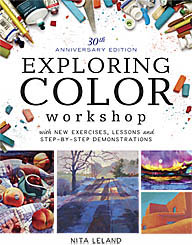
What the blurbs or reviews did NOT say, however, was if this book concentrated mainly or totally on the Red/Green/Blue spectrum, or if it covered mixing colors, shades, tints, etc. in Cyan/Magenta/Yellow?
That is the color scheme I work with, as a silk artist as most dyes primaries are based on CMY. I am desperate to find a book with goodly number of recipes, in proportions or parts per, using CMY (of course :) for different colors, shades, tints and tones.
Could you please advise me if 'Exploring Color' covers CMY (as well as RGB -- I should learn color theory and mix proportions/recipes with that certain spectrum too).
If not, could you possibly point me towards a book that does cover CMY color mixing?
If you could help me in my urgent quest my gratitude would be beyond bounds, and you would indeed make a certain individual VERY HAPPY! :D
I'll check back here to see if I got an answer, but if you like you could also email me at StarAcrux@yahoo.com, as I don't yet have a google account.
Great blog here, BTW. I have it bookmarked to visit (and learn from) often! :)
Thanks so much in advance,
& Take Care!
Emmy
Post a Comment
<< Home