When I was ten, I learned from the Andrew Loomis book,
Fun With a Pencil, that the features on a face have to be in proper proportions to look right. So last Monday for my watercolor class, I began with proportions. There is no perfect proportion, but you can generalize to begin with, then look for differences to create a likeness. I divide the head in half between the top of the skull and the chin, somewhere around the brow bone. The tip of the nose is about halfway between that line and the chin. The mouth is about 1/3 of the way between the nose and chin. Also, there are usually about 5 eye widths across the head. The inside corner of the eye lines up with the side of the nose; the pupil of the eye lines up with the corner of the mouth.

I demonstrated one style of watercolor portrait technique, which I learned from Homer O. Hacker, A.W.S. I painted the blue iris of the eye first, then used Davy's gray and cerulean blue to develop the shadows around the eye, cheeks and neck. After blocking in the planes on the head, I tinted the flesh with color glazes, yellow ochre and cadmium red with a bit of burnt sienna in deeper areas. I brightened up the flesh tones with glazes of permanent rose around the cheeks, brow, chin and tip of the nose. I painted just a little of the hair and did no refining of the features or shadows under the jaw. The demo was about 30-40 minutes.

I also showed the class how to enlarge a photo using a grid that I printed on transparent film. I made these grids in Microsoft Word using "tables" to create grids 8" x 10", 5" x 7", and 4" x 6". The squares on the grids are 1". It's very easy to enlarge your picture, as long as you use the same number of squares vertically and horizontally. I keep my grids in transparent sleeves and slip my photos inside, taking care not to let the photos shift while I'm transferring my image.

I've been wanting to do this portrait of my granddaughter, taken when she was about 3 years old. I printed an 8" x 10" photo to use with my grid. Out of curiosity, I printed two black-and-white images. One is unedited and shows the natural value patterns on her face. The other is a posterized version that breaks up the lights and darks, making it easier to see highlighted areas. It also gives a clearer picture of some of the detail in her eyes.

I placed the 8" x 10" photo into the transparent sleeve. As it turned out, my old HP printer had printed my original out a little larger than 8x10, but the cropping wasn't a problem for my composition. I blocked in my drawing on a sheet of tracing paper, enlarging the squares to 1.5 inches. I used a
Prospek drawing tool, an inexpensive proportional drawing tool, to check critical dimensions, such as the width of the pupils and the placement of each eye.

This is the drawing I'll transfer to watercolor paper using a lightbox or graphite paper. (It still needs a little work around the chin.) It's close enough that I think I can capture the likeness as I paint. The photos I took this afternoon for this post are all slightly distorted, but you can get the general idea of how proportions and grids work in painting portraits. I hope this will help someone.
Labels: american watercolor society, grid, likeness, portrait, proportions, prospek


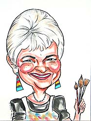
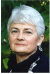 I've been thinking about the differences between portraits and caricatures and I realized that this caricature of me clearly shows the difference. It was done several years ago by
 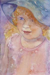 A friend of mine recently had a portrait commission rejected. The person she did it for was extremely rude in calling it a "caricature." Of course, the artist was disappointed and hurt at the reaction. I seriously doubt that she will want to try to make it right. I wouldn't, under the circumstances. I have great admiration for artists who do commissions of any kind, because there is so much pressure to perform with a commission. The stress is unbelievable. It's even worse for portraits, where a likeness is expected, and rightly so. One of my instructors told us not to worry about the likeness, as long as the portrait looked human. Good advice. Unless it's a commission. This portrait of my Little Artist isn't a perfect likeness, but it captures her spirit.