M. Graham paints
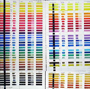
 I swore I'd never do another paint comparison, but when M. Graham of Oregon came out with more than 20 new colors, I couldn't resist. The image shows my original chart on the left and the new colors on the right. While it isn't easy to distinguish the colors in the image, you can see how brilliant they are. I tested for transparency, tinting strength, reaction to salt*, and staining characteristic. I find most of the Graham pigments saturated and of a pleasing consistency. I especially like the reds in the original line, and now they have added Scarlet Pyrrol (PO 73), luscious Pyrrol Red (PR 254), Permanent Alizarin Crimson (PR 264), Maroon Perylene (PR 179)and bright Azo Orange (PO 62). Hansa Yellow (PY3) and Hansa Yellow Deep (PY97) fill the bill for cool and warm semi-transparent yellows. I also like Anthraquinone Blue (PB60), which resembles Indanthrone Blues from other manufacturers. Cobalt Teal (PB28), a light turquoise, appeals to me, while Turquoise (PB15:3+PG7) could be a little greener to suit my taste. A new range of synthetic earth pigments from yellows to reds has a lot of possibilities for low-intensity palettes. The Nickel Quinacridone Gold (PO48+PY150) lacks the glow of the Quin Gold pigment (no longer available), but is a lovely color on its own. Indian Yellow (PY110) is too orange in my opinion. Colors with less powerful tinting strength, like Ultramarine Pink (PR258), Cobalt Green (PG50), Cobalt Violet (PV14) and Ultramarine Violet Deep (PV15) work well on a delicate palette, but might be easily overpowered by many of the colors in the line. The Cerulean Blue Deep (PB36) looks more like a weak phthalo blue and doesn't appear to granulate as I would expect a cerulean blue to do.
 On the whole, I like M. Graham colors very much. One of the ingredients is honey, a traditional method of watercolor manufacturing. The consistency of the paint is very nice--creamy and easily soluble in water. Some colors may seem a little stickier than others, but this may be the nature of the pigment. The new colors give a much needed boost to the available range in watercolors. M. Graham watercolors are more reasonably priced than many imported brands and give good value for the price. I have favorite colors among many different brands. For more information on this paint, see handprint.com.
*I don't recommend using salt for fine-art watercolors, but the effect can be used for illustration, note cards and crafts, in which case it's important to know which pigments will react to salt in a damp wash.
Labels: Graham, paint quality, pigment, watercolor


2 Comments:
Nita, thanks so much for making yourself do the whole M Graham test. I have tested about six or seven of them and love 'em so far. Is there a way to download that images in hi-res? I opened it in P-shop but couldn't read the writing. I think I'll post my note to Aquanet too. Thanks. Martha Keim-St. Louis
I didn't save the images in high-res. Even if you could see them, they wouldn't look as much like the real paint swatches as you might hope. It's always better to do your own swatches.
Post a Comment
<< Home