This week's lesson--intensity
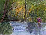
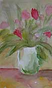
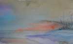
Intensity contrast is a little harder to grasp, because people often confuse value and intensity. Value is the lightness or darkness of a color, on a scale between white and black. Intensity is the purity or "grayness" of a hue. Earth colors are low intensity colors. Here are three of my students' sketches illustrating how a touch of bright color is enhanced by low-intensity hues.
Labels: hithergreen, intensity, watercolor
posted by Nita at 10:16 PM
![]()
![]()


1 Comments:
Great Art....
Post a Comment
<< Home