People who use this tired cliché don't realize that they're actually saying, "I like only what I know." They're missing the rich experience of art by not opening their minds to art of all kinds.
The more I learn about art, the more art I like. I visit websites, museums, galleries, art schools, art fairs; I read magazines and art monographs to see works that have stood the test of time and new works on the leading edge of the visual arts, experimental work by developing artists, and current trends in fine arts. My appreciation of all types of art has grown by leaps and bounds.
Artwork that flouts academic standards or offends public taste usually attracts a lot of attention, but is it art? Is it good or bad? In spite of all the rhetoric for or against, only time will determine what is "good" or "bad" art. Ignore what the critics say: decide for yourself what you think about art. Don't stop looking at art because you're afraid of what you might see, and don't limit yourself to viewing art you already know you like. You might miss something wonderful. Study art history, and look at art at every opportunity. Visits to exhibitions greatly enhance your appreciation and understanding of art.
A work of art is more than a visual sensation. An artist's personality, technical skills, and knowledge of design merge to reveal that artist's unique concept in visible form. Sometimes the only way you can begin to decipher an artist's meaning is to overcome your own misconceptions: First, the idea that you have to like it in order to appreciate it; second, that if it isn't similar to your art, it has no merit. People who feel threatened by new art are stunting their own growth. Artists who try to validate their art by finding fault with art that's different are doomed to mediocrity. Those who think they have "arrived" are probably nowhere.
Whether or not you "like" a certain artwork has no bearing on its merit as art. Art isn't always pretty. Some is difficult--even painful--to look at, yet it succeeds because the artist has used the tools of art--design, materials, and technique--masterfully to underscore a deeply felt truth. Try to see beneath the surface of the object, to imagine the artist's experience while making it, his or
her unique viewpoint. Your own struggle to become an artist gives richer meaning to what you see and allows insights into processes and possibilities. Enter the experience with an open mind and you will leave it with a fresh perspective on your own art.
"Art is an experience, not an object." Robert Motherwell
Labels: bad art, good art, motherwell, quotation
 On January 9 of this year I commented on one of my favorite books, The Seven Spiritual Laws of Success by Deepak Chopra. I listed my version of the seven laws, which you can read by searching "seven laws" on my blog. Yesterday I watched the new DVD of The Seven Spiritual Laws of Success
 This week I've been hard at work on the new book. The art is coming in, so I'll be busy selecting what I want to use in the book. Also, the slides from the Montana Watercolor Society will be arriving shortly, so nothing else will get done until those are on their way back to Big Sky country. Our granddaughter was here all afternoon on Thursday and we had a delightful time together. We didn't really "do art," but she tends to get to her little table and scribble something before she leaves. At the moment, the scribbles are little faces with big smiles. I love it! She was here this afternoon, too, and we did paint-blot pictures with tempera. How she loved the effects of the prints on the folded paper! She designated a giftee for each picture, aunts, uncles and cousins, plus the always included grandparents. A friend of mine stopped by while Jenna and I were out in the yard. As we talked, Jenna moved to the yard behind us and quietly played and danced a little dance by herself. Later, I asked her what she was dancing and she said, "Nothin'." Her little secret.
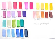 Last week I started a chart in watercolor class that illustrated the differences in tinting strength of pigments. The definition of tinting strength is "the power of a color to influence a mixture." A lot of artists have trouble with paint mixtures because they're trying to change a strong color with a weak one and can't get the results they want. This is true in most color media, because the pigments used in all media are the same with different binders. I finished the chart this week and indicated how you can select from one end or the other of the continuum of colors in any hue and the colors will work together. On the chart, the weaker colors are to the left of the rows, moving toward the stronger colors at the right. So you mix weak colors for delicate effects and powerful colors for strong statements. Sometimes you can mix weaker colors with middle-strength colors or middle-strength colors with powerful colors. But not weak with strong.
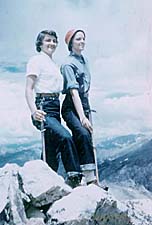 When I was in college, over the summer of 1953 I attended the
 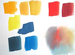 This chart shows what I did. I painted a swatch of yellow ochre at top-center. Then I made a swatch of gamboge to the far left leaving a space between them. The difference in intensity was obvious. Between the two I made a swatch of quinacridone gold, which they could see is brighter than ochre, but not as bright as gamboge. (Just below the gamboge is a cool lemon yellow, but I didn't emphasis the temperature difference, as that will be a later lesson.)
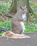 I've been trying for weeks to get a good photo of this dude. He is one of six or eight resident grey squirrels that nibble and tussle under our bird feeders. Note that I said "grey" squirrels. They are all uniformly grey--no fox squirrels anywhere around. I suspect that one of his parents is an albino squirrel that shows up from time to time. In certain light and when he has his tail bushed out, it's very pink--you can see both red and white hairs in it. I wonder if this is as unusual as I think it is. He seems to be as frisky and healthy as the others.
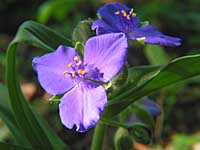 When we first cleared out the honeysuckle in the woods in 2002, it looked hideously barren and I was afraid we had made a big mistake. About a month later, a lone Ohio spiderwort bloomed, which gave me hope there might be more dormant wildflowers just waiting for some sunshine. The next year there were two spiderwort plants in different places. They never multiplied until this year. Now there are five. What a treat!
 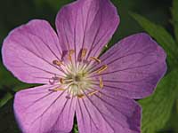 The wild geraniums are also apreading robustly from one small clump at the back of the woods and are now found in patches along with the bluebells and toothwort. They are so colorful and fill in after the bluebells have finished blooming. They are surrounded in some places by may-apples, whose little nodding flowers are just beginning to open under their green umbrellas.
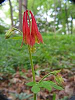 Some critter ate my merry-bells, which now may be gone forever. But it missed the wild columbine, an intriguing flower. I made a rough, winding path through the woods, bordered by wildflowers that are spreading from the top of the hill to the base. Each day I'm finding only one or two garlic-mustard plants getting ready to bloom, but I have to be vigilant. I was told that this pest releases hundreds of seeds and every one of them is viable, so even one plant can do a lot of damage. My neighbors are helpful and are pulling them from their gardens before they set seeds.
 Holland Cotter of the New York Times today reviewed the
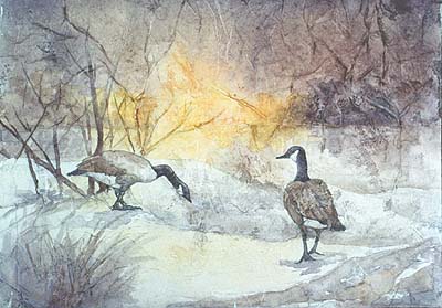 I crumpled a piece of rice paper into a ball, then flattened it out. To adhere the rice paper, I brushed fluid acrylic matte medium liberally onto a piece of 140# cold press watercolor paper. Then I placed the rice paper on the surface, allowing some of the wrinkles to remain. I patted it down with a damp sponge so the rice paper would make contact and bond with the watercolor paper. I usually use a soft brayer for this, but didn't have it with me yesterday. That's all there is to it. Wait until it is dry so you don't get acrylic medium in the hair of your good watercolor brushes. It's fun to see what watercolor paint does on this surface, crawling into the ridges in some places, making dark crinkly lines and almost disappearing in other areas.