Painting rainbows in watercolor
 Somebody in my class asked me a couple of weeks ago how to do this. Not that it's a great idea, because rainbows are so variable and tend to look hokey in your paintings, unless you happen to be J.M.W. Turner. Nevertheless, yesterday I showed them a way to do it in watercolor just by blending clean, diluted pure colors on slightly damp paper. It isn't hard to make a rainbow, but to put one in a painting and have it look realistic is a whole different thing. That takes practice. My first recommendation is to Google "rainbows" and see what they really look like. Most of them aren't complete. The colors are brighter near the ground, then they often disappear before the arc is completed. And red is always at the top, with violet at the bottom (and often hard to see). If there's a second rainbow reflected above it, the colors are reversed. And just in case you learned ROYGBIV when you were in grade school, there is no "I" for indigo in the spectrum, therefore it's actually ROYGBV. Newton must have been having a mystical moment when he described the colors--had to have seven, as in the days of Creation and notes on the musical scale.
Labels: artist, color, rainbow, tutorials, watercolor
posted by Nita at 6:41 PM
0 comments
![]()
![]()
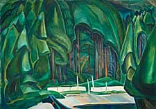 It seems fitting that I would discover a retrospective exhibition of Emily Carr's work just when I've been immersing myself in her writings and her art on the Internet. The
 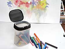 Here's a great container for watercolor crayons and Prismacolor sticks. The plastic jar shown is an empty coffee container that held Nescafe Taster's Choice gourmet instant coffee. Their regular instant coffee comes in a slightly taller jar. The labels can be easily removed and no coffee odor remains when the jar is washed. The lid snaps on tightly and pops open with a push-button. The frosted plastic sides are semi-transparent, so you can see what you stored inside the jar.
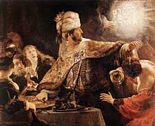 Several weeks ago when I was reading Emily Carr's writings I came across her reference to a book called
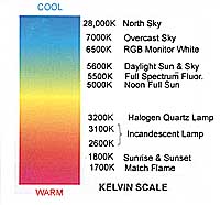 When I set up my studio in 1983 I consulted a lighting specialist who advised me to buy fluorescent lighting that was 5500 degrees Kelvin. Whatever that meant. I followed his advice and found that the lighting was ideal for my color studies and painting and have recommended to my students that they use this kind of lighting in their studios. A couple of weeks ago I showed my class what a difference it made in my color charts to see them under a portable Ott-lite. The classroom has regular fluorescent lighting in it. I went to the Internet and found several charts, which I combined into the one you see here. The best lighting for artwork is in the range of 5000-6000K. The Color Rendering Index (CRI) should be 70 or higher for excellent, 60-70 for good color matching. Anything under 60 is unacceptable. There are several companies that make lights that meet these specifications. Google
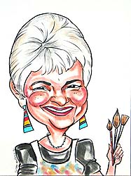
 I've been thinking about the differences between portraits and caricatures and I realized that this caricature of me clearly shows the difference. It was done several years ago by
 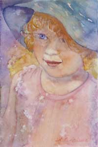 A friend of mine recently had a portrait commission rejected. The person she did it for was extremely rude in calling it a "caricature." Of course, the artist was disappointed and hurt at the reaction. I seriously doubt that she will want to try to make it right. I wouldn't, under the circumstances. I have great admiration for artists who do commissions of any kind, because there is so much pressure to perform with a commission. The stress is unbelievable. It's even worse for portraits, where a likeness is expected, and rightly so. One of my instructors told us not to worry about the likeness, as long as the portrait looked human. Good advice. Unless it's a commission. This portrait of my Little Artist isn't a perfect likeness, but it captures her spirit.
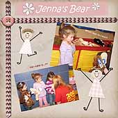
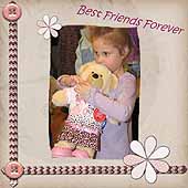
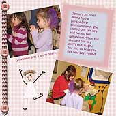 But Scrapbook Max! is so easy and the selections of templates, embellishments, backgrounds and objects is huge. I decided to keep an open mind and got to work. I began with a template called "Girl Friends" that had five pre-designed pages. I selected nine photos from Jenna's Build-a-Bear party to tell the story of her new friend, Genevieve Bear. The first and last pages seemed too busy for my taste, so I found a simpler template for the background of those pages and resized some of the flowers, making them a bit smaller. I liked the paper dolls and other embellishments, which you can see in the photos.
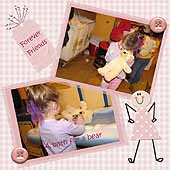 Once the photos were in place, I wrote captions and a short journal entry. I chose a funky font and a contrasting color for the text. I moved, cropped, resized photos and tilted the captions, using both the menu bar and the icons, which are very easy to find. The whole thing went together in a snap. I'll admit that it helps to be computer-savvy, but I think most people who are reasonably comfortable with a computer will find this progam easy to manage.
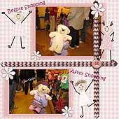
 Registered members may share their original designs for embellishments and pages in template libraries. The web site also offers a free newsletter. Additional booster packs may be ordered online. You might want to try the
 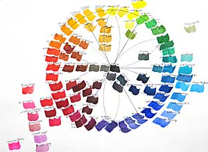 Finally I've finished the watercolor wheel I started for my class several weeks ago. I did blue first, then added red the following week and yellow a week later. (Click on the "color wheel" label below to see the three work sheets and watercolor wheels that I painted last month.) Today I filled in orange, green and violet secondary colors and the neutrals in the center. I finished it in my studio so the class wouldn't lose painting time next week. I'll show them the finished wheel, explain a couple of things and they can examine it more closely later if they wish. Mind you, I'm not advocating having or using all these colors. I want to show that there's a continuum around the color wheel that reveals temperature relativity from one color to the next. This is a good exercise for your "color eye," to see if you can distinguish between warmer and cooler colors and see how their neighbors on the wheel influence their temperature. The colors around the perimeter of the wheel are mostly high tinting-strength, high-intensity colors. Except for a few colors in the red area, outside the perimeter are the low tinting-strength, high-intensity colors. Inside the wheel are the low-intensity colors and neutrals.
 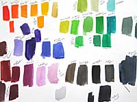 Here's the test sheet for the colors I did today. It doesn't matter whether you make a wheel or swatches, but this is a good way of learning about your paints. As I said in an earlier post, the color wheel above is similar to the one I made for my first